This is actually not a bug, but a (in my opinion quite serious) shortcoming.
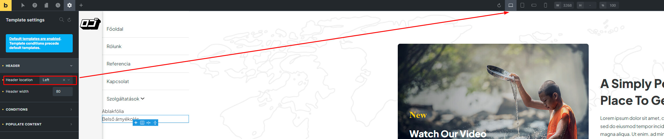
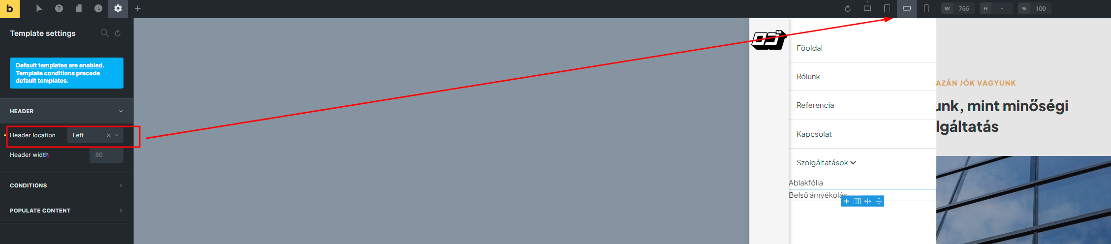
The new menu / header builder is really great, but there is still no option to change Responsive view within the template setting!
Practical example:
I’d like to use a left side header, but it’s really confusing in a mobile view, so it would be nice to switch to the “classic” top header layout.
This can currently only be achieved with @media query custom css tricks, as was the case with the original header builder.