Header builder: Full control over sticky header behavior + responsive support

Hi bricks team,

If you agree, during the life of Bricks, the development of the Header builder has been neglected and currently, a sticky header in Bricks has many limitations. For example:

  • Sticky header applies to all header sections.
  • It is not possible to control the adhesive behavior at different Breakpoint.

Suggestions for improvement

It would be great if we could have control over the header details, i.e., control the behavior of the sticky header in each section separately. For example, we have a header, we want it to be sticky only on desktop. Or in another scenario, we have a two-row header, we want the bottom row to move up after a little scrolling.

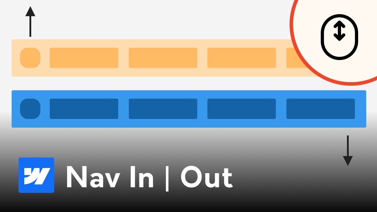
What new features are needed?

  1. Two new triggers for interaction: scroll up and scroll down.
  2. Responsive support for Interaction triggers.

Please watch the video below to better understand this feature request.


and

Cheers

6 Likes

yep

because of that reason I always use my own snippet

native only shows scrolling class thats it and it is good for basics but basics are not good enough on most cases :slight_smile:

scrolling-up and scrolling-down classes are needed too.

4 Likes

Looks like it is neglected again :frowning:

+1. Definitely need lots better control and options for this.

1 Like

You can achieve this using only CSS—swap the logo, shrink container height, second-row sticky . Bricks already provides built-in classes for scrolling, sliding, and slide-up, so you can simply use those.

Tweak it according to your needs.

/** Glassmorphism header on initial load / sticky reset **/
header.brx-sticky.on-scroll:not(.scrolling) {
    backdrop-filter: blur(4px) saturate(180%);
    -webkit-backdrop-filter: blur(4px) saturate(180%);
    background-color: rgba(241, 241, 241, 0.36);
}

/** header on top of body content on initial load / sticky reset **/
header.brx-sticky.on-scroll:not(.scrolling), header.brx-sticky.on-scroll.scrolling:not(.slide-up) {
    position: fixed;
    top:0;
    left:0;
}

/** header items on initial load / sticky reset **/
header.brx-sticky.on-scroll:not(.scrolling) .header__container--buttons, header.brx-sticky.on-scroll:not(.scrolling) .brxe-woocommerce-mini-cart {
  background-color: rgba(245, 245, 245, 0.5);
}

/** header sticky background **/
header.brx-sticky.on-scroll.scrolling {
    background-color: #000;
}

/** header row 1 height on initial load / sticky reset **/
header.on-scroll:not(.scrolling) .header__container {
  height: 90px;
  transition: height 0.2s;
}

/** header row 1 shrink height on sticky **/
header.on-scroll.scrolling .header__container {
  height: 60px;
  transition: height 0.2s;
}

/** header row 1 items - title and logo show/hide on initial load / sticky / sticky reset **/
header.on-scroll:not(.scrolling) .header__container--title, header.on-scroll.scrolling .header__container--logo {
  opacity: 0;
  transition: opacity 0s;
}

header.on-scroll.scrolling .header__container--title, header.on-scroll:not(.scrolling) .header__container--logo {
  opacity: 1;
  transition: opacity 0.2s;
  color:#fff;
}

/** header second row sticky **/
header.brx-sticky.on-scroll.scrolling:not(.slide-up):has(.header__container--row-2) {
  transform: translateY(calc((100% - 56px) * -1));
}

/** other header item ..... **/
2 Likes

nice
it is not as powerful and simple as direction classes

but I like it good css solution :slight_smile: