Forms - Horizontal checkboxes / select / radio buttons

Hey there, is it possible to have checkboxes / select / radio buttons on forms show up horizontally or to define columns?

Examples:

This is supposed to be a scale for people to pick from.

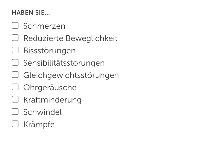
Or in the case of checkboxes with many options to choose from, it would be ideal to have an option to them show in columns. You can pick multiple, so a dropdown wouldn’t work.

Thanks!

use CSS

ul.options-wrapper {  display: flex;  }
ul.options-wrapper li {  flex-basis: 60px;  }

OR for column

ul.options-wrapper {
    display: grid;
    grid-template-columns: repeat(4,1fr);
}

Thank you!!!

This is a great solution, although the alignment of the list items is a bit messed up (I can probably fix this with more css though).

Would there be a way to do both alignment types within the same form?
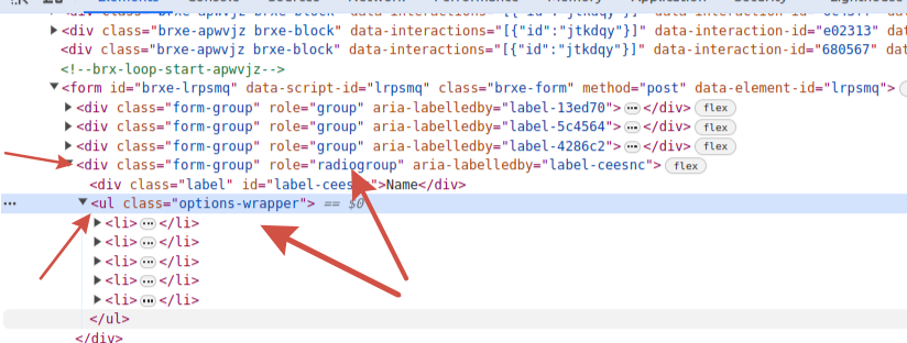
I can see that ul tags have some sort of reference to the label field so maybe that is a way?

<ul class="options-wrapper" role="group" aria-labelledby="label-eadkzm">

I can’t seem to find a way to target them specifically.

you can use nth-child(2)

BUT I think that this is a flaw in the widget. Because we must identify the elements unambiguously.

my change file element/form.php

// $this->set_attribute( "field-wrapper-$index", 'class', [ 'form-group', $field['type'] === 'file' ? 'file' : '' ] );
   $this->set_attribute( "field-wrapper-$index", 'class', [ 'form-group ' . 'group-' . $field_id, $field['type'] === 'file' ? 'file' : '' ] );

result

formm

I will try that, thanks!

Would changes made to the form.php be preserved if I use a child theme?

Check and report here. You may need to register the widget as a separate component. There is information in the academy and in the child theme file.

another option

ul.options-wrapper[aria-labelledby='label-dqfnvz'] {
1 Like

Ohh that is a great hint, although targetting the aria-labelledby attribute didn’t work, I managed to target the different groups by using:

ul.options-wrapper[role="radiogroup"]

ul.options-wrapper[role="group"]

This is sufficient for me since all I wanted is to be able to target radio select groups and checkbox groups seperately. Awesome! Thank you!

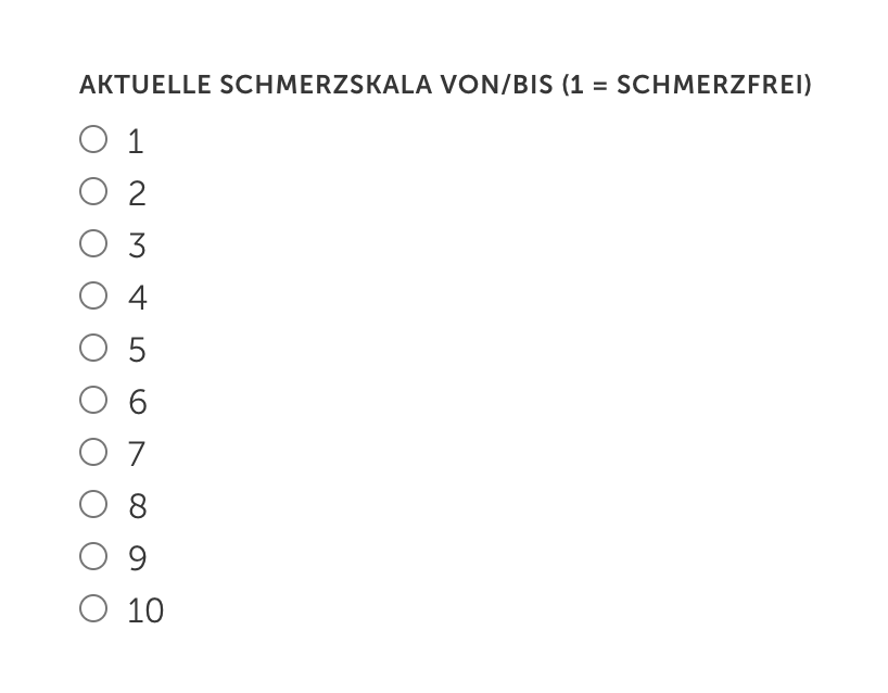
Somehow the first item of each group is weirdly misaligned but I will figure it out. Might have to do with ACSS or some other weird thing that is interfering here. But this works fine:

Edit: it was a margin-top applied to all fields except the first one

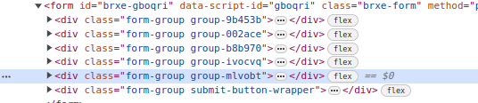
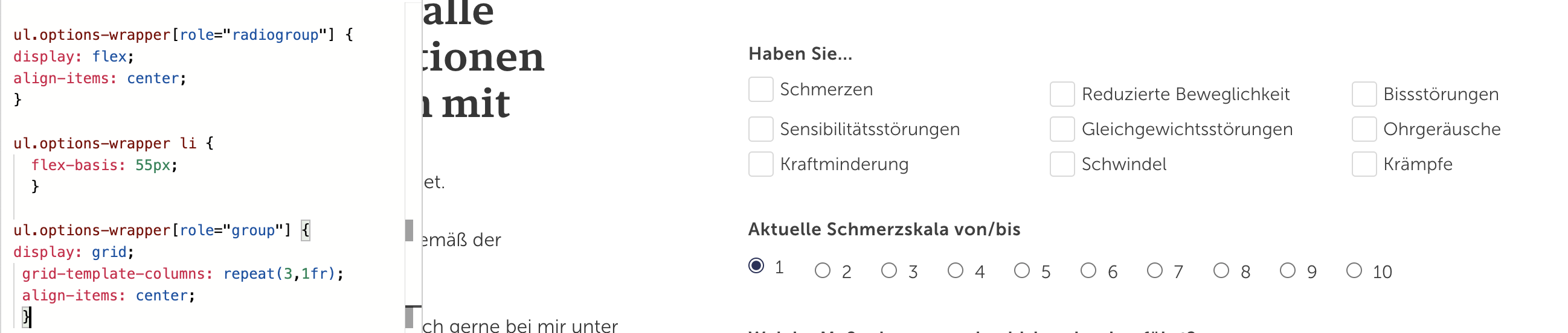
This additional CSS helps keep a singular checkbox field (like a confirmation at the end of a form) to stretch over the entire width of the grid, since the above CSS would make it occupy only the first grid column. Maybe that’s useful for someone else as well.

ul.options-wrapper[role="group"] > :only-child{
  grid-column: 1/-1; 
}

So this:

Turns into this:

1 Like

Unfortunately, this CSS solution seems to have stopped working entirely with the latest Bricks Update.

@thomas @timmse Have you changed something about how the form fields work? :confused:

I’m sorry, I don’t understand, what are you pointing out here?

Specifically, targetting the individual types of fields with [role=“radiogroup”] / [role=“group”] doesn’t work anymore. So I’m back to only being able to target all types of ul.options-wrapper lumped together. Something must have changed.

I’m showing you what you asked, which is that the structure has changed.

now

`div[role="radiogroup"] > ul.options-wrapper`
1 Like

Ohhh. Sorry, I couldn’t figure it out. This works. Thank you!