Browser: Chrome 124
OS: Windows 10
URL: temp dev site
Video:
this has been on my mind for a while now. this needs to be fixed.
the flex CSS default behavior should be just staying side by side.
Browser: Chrome 124
OS: Windows 10
URL: temp dev site
Video:
this has been on my mind for a while now. this needs to be fixed.
the flex CSS default behavior should be just staying side by side.
Just set the flex-wrap to nowrap
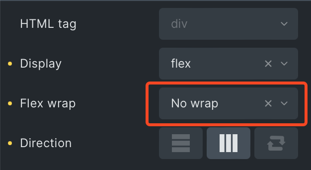
default value is no wrap that’s what I am trying to show here…
it is changing on breakpoint.
In most cases on small breakpoints you would want the containers to wrap.
It seems logical for the visual builder.
Personally I want control over responsive
I don’t want any container to decide responsive for me.
I agree with you, I would also prefer to define all the things by myself. But this will make the builder less easy to use to most users, there must be some default values, and this is always a compromise.