Here’s a recently launched website for one of our clients. https://fairplay.ai/
8 Likes
Looks great, I like the navigation menu design
1 Like
Thanks so much! Might have to redo it with 1.8 coming soon.
Hi my friend, how did mega menu on this web site? Can you suggest any tutorial video link?
1 Like
Here you go: Bricks 101 - Part 33 - Mega Menu with No Plugin - BricksBuilder Wordpress Tutorial - Bricks Builder - YouTube
1 Like

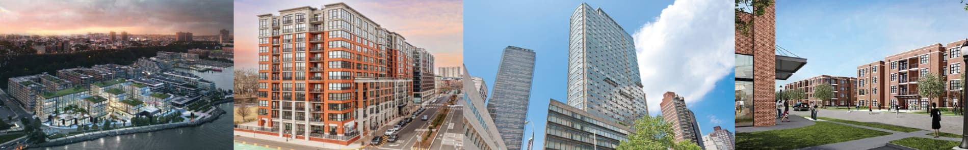
I have this banner image (below) that I’m trying to make it responsive while keeping the entire picture not being cropped off
Below is what happens to my image as the width gets smaller
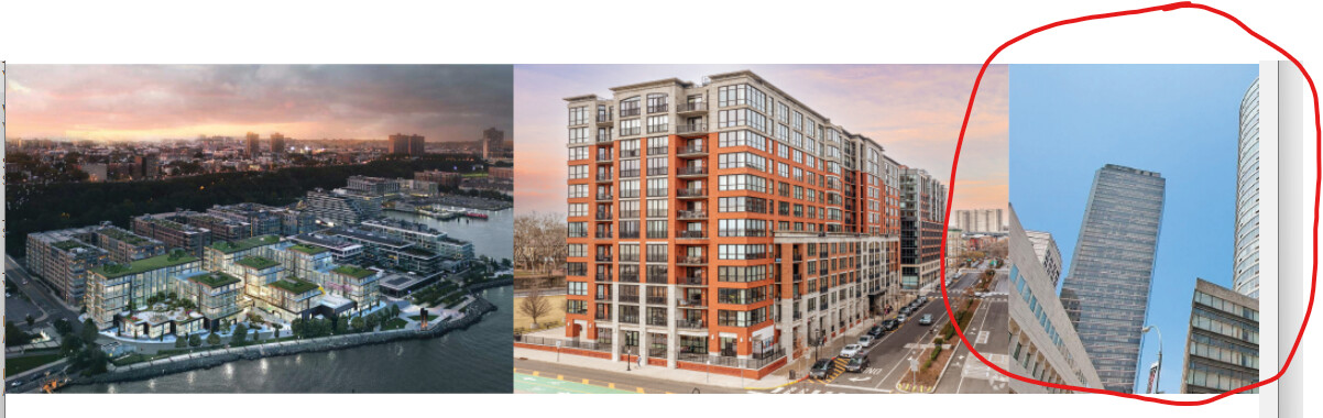
Technically, that image isn’t responsive, it’s a different image altogether. =)
I would recommend that you do one of the following:
- Create another set of images sized for smaller screens that displays on mobile.
- If you want to keep the same aspect ratio for the images, you can force the width of the images (define a fixed width and not a percentage) and then make sure to set overflow-x:hidden on the containing parent div/section.
I think 1. is the easier approach.
1 Like
Clean design. I like it! I am curious what third party plugins you found useful for the functionality of the website that blends well with Bricks?
Thanks so much! Bricks Extras is a biggie. It’s used throughout the website for things like parallax, read more expansion, and a couple of hover interactions. Good stuff.