Fantastic that the time has come and filtering and ajax search is so well done in the first version.
In changelog I read about feedback rally.
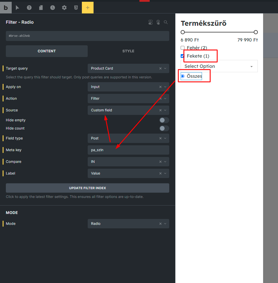
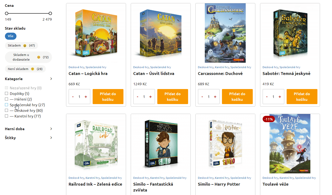
Filter - Checkbox
It works flawlessly, on all taxonomies and fields that I tested, but I miss one thing that is available in Filters - Radio. Changing Mode. There we have the option to choose between Button and Radio. In checkbox this would also be very useful.
This will allow users to achieve a simple effect as shown below:
In this case, 3 types of product categories are marked, and it looks much nicer than just a checkbox with a chevron.
In addition, it would be useful to have a class for the active element (active/checked) so that you can style these results element. I see that Filter Radio adds such a class when it is in Button mode. This should also be in Checkbox.
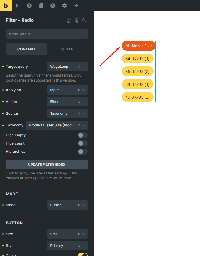
Filter - Checkbox/Radio
You might want to consider adding a choice to display individual values with the option to set this to flex. Of course you can do this in custom css, but many users would appreciate this with the ability to click out in the panel.
(Optional) A nice addition would be the option to style the decorators themselves for the checkbox/radio. Doing it through custom css on input[type=checkbox] attribute, input[type=radio] is always clumsy
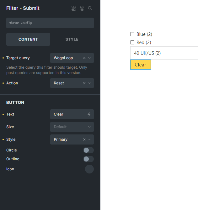
Filter - Submit
A minor improvement in terms of UX.
In the case of resetting, it would be useful to be able to set the button to appear only when any data is entered in the field of any filter. Then the user would know that he/she can reset something, but in this case the button does nothing when displayed without any values, so it is redundant.
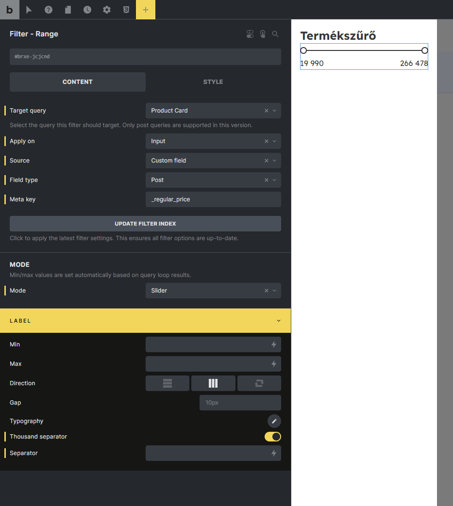
Filter - Select
(in the next major releases or maybe soon?) I know it’s already asking a lot, especially when it comes to this feature, but a step that would push the filtering and the UX itself with this feature to a higher level would be option to drop the native checkbox, with the ability to stylize custom list expansion and with ability to type text in field (with autosuggestions).
When we think about scalability and we have, for example, 50 categories of taxonomy or whatever in our store, a native HTML select viewer is just inconvenient.
In this case, the ideal is a list, for example, with a height of 400px with scroll and the ability to enter the text we are looking for. Then we have a UX closer to Bricks 2.0, and not yet with 1.x in front (I write lightly joking).
What I’m missing at this point
Of course, I understand that this is an experimental version and the first approach to a topic that will certainly be expanded.
But I’m posting here a few of my quick thoughts about the next functionalities.
Optionally, it would be good to have a list of active tags/taxonomies that are currently filtered with the option to remove a single active one.
This is especially needed when you plan to filter on some sidebar/slide-out overlay with filters, and on the page where you have the results displayed then above the query list you have a quick view of which filters are active.
This is useful when you want to build filters/facets which are not overwhelmed by the number of filtering possibilities, but you just want to hide something on the sidebar. This makes the store clear and minimalistic, while the UX of the site/store loses nothing.
I think if you do it already, it’s to close the polemic of which filtering plugins to choose to work with bricks😜. Then we have a modern approach to digital design.
btw. a fantastic release that brings what I’ve been waiting for for a long time, it’s really good! Big congratulations to the entire Bricks team!
 )
)