Feedback for Components, Image Property and Value Property

Started testing the components. First of all great work team well done :clap::clap:

Time to polish this for prod use.
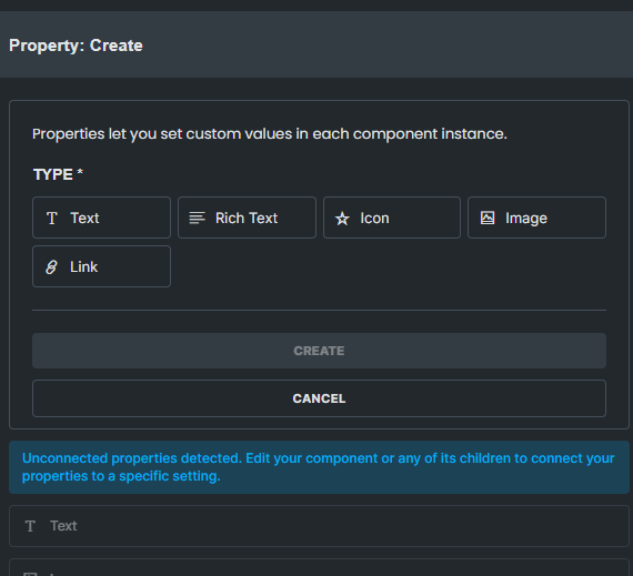
Feedback 1:
Image propery only connects to the Image element. (but image element is not the only place we can show images)
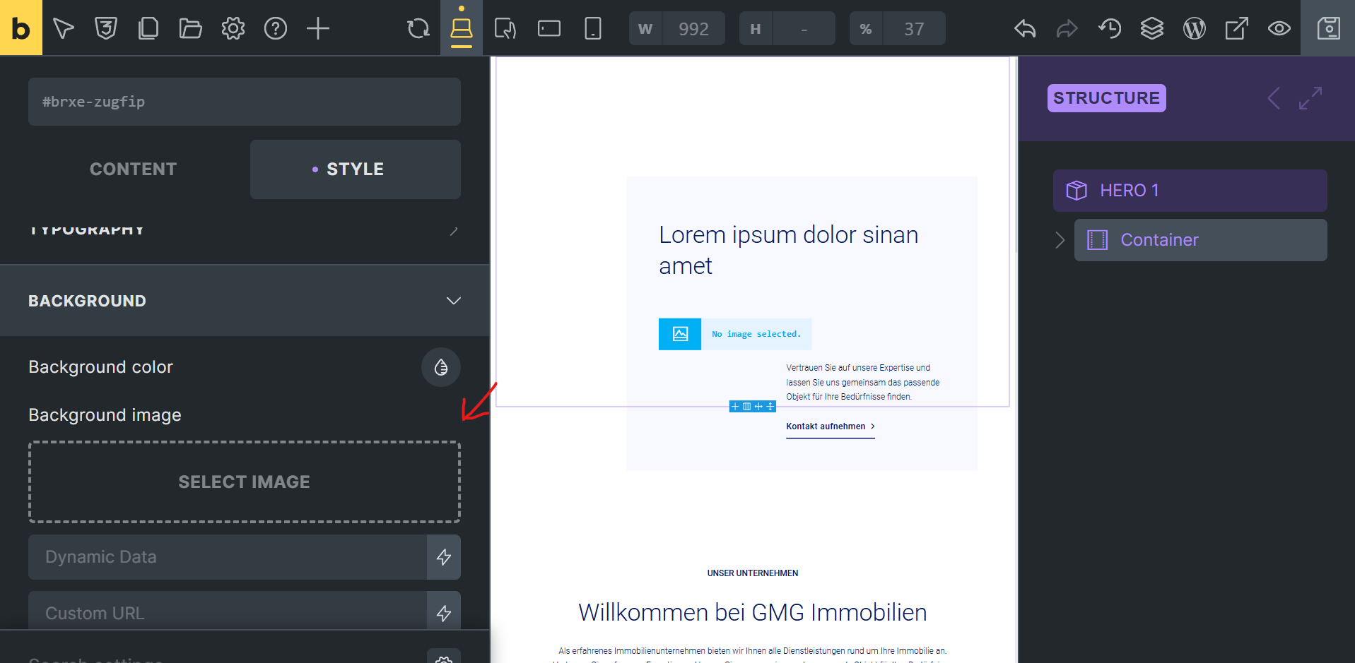
I build lots of image sections with background so I can put text or other elements top of the backgrounds. I think using css backgrounds very common I dont need to write much examples about this.

Image Property needs a possibility for connecting to Background Images.


Feedback 2:

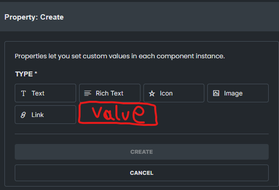
Yes we want to lock the users for sizes, design decisions and styles when creating components. But I think we need one more property for some edge cases.

Value Property
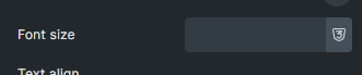
With value property we ca nconnect the font-size, spacing, width or height for rare cases that we need to give control to the user.

Doesnt matter how PERFECT the components are clients always needs more control in some edge cases. I think Value Property and ability to connect to the most or even all css fields can solve this issue and gives us more freedom to create powerfull components.

image

image

Feedback 3

Advance Dropdown Property for static select list and ability to connect anywhere text or image (and maybe values?)

just like form dropdown select field we can add only static options so user can select the existing texts or images.

last year we were giving some development support for one of the biggest german brands they were using adobe cloud sites on there they had lots of existing components some of the components didnt even have freedom to change texts because they have determined and finalized mottos, slogans, posters or brand titlesā€¦etc
when building pages we were only able to select existing assets for those components.
On enterprise level this is very common because changing one color or even one title on a page needs to be approved every time.

9 Likes

I came to report the same thing. Why forget the background image.

1 Like

Points 1 and 2 feel absolutely necessary and point 3 would be a fantastic feature :slight_smile:

1 Like

Thereā€™s a couple of things missing to take it to the next level.

  1. A ā€œvalueā€ field as you suggest will do a lot of heavy lifting. For example itā€™s quite common to have to override the top padding in a section to tweak space between elements. Having a value field would let you insert a default and then override it easily. That would let us use the same section component without having to make a second copy that has no padding at the top.
  2. The ability to use the values in conditions for items in the component. If you were to combine that with a true/false toggle property field type and a select dropdown property field type you could do some amazing things that would be really client friendly.
  3. Lastly it would be nice to have some organising in the component view - e.g. a button needs a link and text property - it would be nice to be able to visually link these and separate them from the other properties visually.
3 Likes

Agree with the suggestion for a ā€˜valueā€™ field, or some way to expose settings for the style & layout properties.

Iā€™ve installed it locally and started to work with the new components feature, which Iā€™ve been very eager to use. My first thoughts:
The interface and workflow for editing are, on first pass, really beautifully designed and implemented. Creating, editing, and exposing properties was all absolutely seamless. Fantastic job here, Bricks team.

A few other features I would love to see implemented:

  • nested components: this one is big for me. A simple use case is creating a branded button with an icon and hover animation, and then nesting that into a card elementā€¦ but many other & more complex use cases can be imagined for a fully components-based system

  • conditional elements which can be toggled on/off (might have missed this, still exploring)

6 Likes

My rant about components is that we canā€™t see an actual dynamic tag used for property.
For example, in JetEngine components when I create a property I got something like {je-component__my-property-name} and then I can include it wherever is dynamic data supported, and the most important in condition rules.
Bricks components are very limited at current state.

3 Likes

I am still not sure about nestable components
I am on the fence for that one

but all the other recommendations everyone spot on. :+1:

Hey all,

thank you for your suggestions. Iā€™ve read through all of them and they are great. Iā€™ll present them to the team, so we can decide about them :slight_smile:

@Illarion, Iā€™m just not sure if I understood your suggestion completely. What do you mean you canā€™t see the actual dynamic tag used for a property?

Thanks!

1 Like

I am also unclear on the use case for nested components. This initial implementation is simple and clean. Fantastic that editing is done in situ. What is the value proposal for nested components (I worry about complexity for the sake of fun).

There are definitely a lot of use cases for nested components, and flexibility is key! They can make editor editing much smoother and more intuitive. Hereā€™s an extreme example from a Webflow user that shows the potential: x.com.

You may have whole sections or areas of the site be components as theyā€™re being used multiple times and always need to be synced. (testimonial section for example),

Within that section you might include something like a large CTA button that is also being used elsewhere.

Ideally, youā€™d have this as a ā€˜button componentā€™ inside the ā€˜testimonal section componentā€™, so you could make edits to the button inside that section, knowing itā€™s being changed everywhere else where itā€™s being used also.

For example, you need to change the icon for all CTA buttons on the site, regardless of where theyā€™re being used, even when inside other components.

5 Likes

Hi @Matej

I create a control (property) for component:

And I can choose it in dropdown and put anywhere, incuding conditions
ŠøŠ·Š¾Š±Ń€Š°Š¶ŠµŠ½ŠøŠµ
Oov0IqA3wj

It similar to bricks, but in bricks itā€™s predefined with ā€˜plus buttonā€™, which is a bit limited

1 Like

Hi @Illarion,

oh, yeah, thanks, I get it now :slight_smile: So, the ability to use ā€œspecial/component-specificā€ dynamic tags inside the components.

That is something that already crossed our mind, but Iā€™ll make a proper idea entry in our tracker, then we will see :slight_smile: Itā€™s definitely useful.

Thanks,
Matej

3 Likes

was testing stuff. found a issue.

only content role given editor users able to edit the component properties. not good.

only content editing role should only able to edit the content.

After my first try I have a some feedback / Ideas too, as wel as a question.

Feedback:

  1. Would be very nice to be able to open and close component properties when editing an instance of the component. Making these behave like accordeons:
    Screenshot 2025-01-10 at 10.11.43
  2. The value property as described above would be awesome, as well as some style variables like color / bg color etc.
  3. I love these components, but for my team to really start using them, we need a lot more options in the properties. Baby steps, I know, but at this moment the use case for agencies are very slim. Still love the work that has been done so far!

Question:
I made a component to simulate ā€˜team member cardsā€™, all very basic.
If I want them to display next to each other inside my ā€˜flexā€™ in 3 collums, but I have 5 cards. What do I do best?

  • I donā€™t see an option to set the width of the block on component instance level
  • I can set the width on the component level, but what if I want to use the same block on twe different places, one time in 2 colums and the other time in 3 colums? How do I overwrite that components width (or other props) on instance level?
1 Like