I’ve tried the Components feature in Bricks, and while it’s a great start, I found it quite limited in its current state. Here are some ideas and suggestions that could make Components far more powerful. I’ve also included a screenshot for reference:
Image Property to Background Image
Currently, you can’t connect the image property to a background image. This functionality should be possible to allow more flexibility in design.
Gallery or Video Components
The ability to create a component specifically for a gallery or video would be a game-changer for dynamic and reusable elements.
Dedicated List Field
Adding a specific field type for lists would be very useful. It could streamline the creation of repeating structures or collections.
Numeric Fields for CSS Sizes
Introducing a number field that could directly influence CSS properties like size, padding, or margins would provide more control and reduce manual input.
Color Picker for Dynamic Styling
A field for selecting colors dynamically, for example, to set different card background colors, would enhance component reusability.
Conditional Logic
Add conditions, such as:
If a field is empty, hide the corresponding element or replace it with fallback content.
Similar to dynamic visibility.
Toggle Fields
Include a toggle field to show or hide specific elements when activated. This is essential for creating more interactive components.
Styling Variations
Support for multiple style variations within a component. For instance:
Different border-radius settings, background colors, or other CSS properties based on user-selected styles.
Nested Compoents
The ability to nest components within one another would unlock hierarchical design possibilities, enabling more modular and reusable structures.
Cwicly has implemented probably one of the best component systems, which can serve as a great source of inspiration.
@thomas to get a better idea of how it works, you can also watch the last few minutes of this video (from 11th minute onwards), where Brendan shows Cwicly component functionality that’s missing in Bricks: https://www.youtube.com/watch?v=DOxcUQWtreo&t=665s
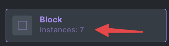
Also, I noticed that there are instances showing how many times a component is used, but it only displays on the actual page, not across all sites. It would be useful if it did, or if you could show the specific page URLs where it’s used, similar to Webflow.
A couple more quality of life improvements that Bricks should – in my opinion – adopt from cwicly:
Components in Gutenberg
I know this has been mentioned as a possibility for 2025 on the Bricks 2.0 announcement, but I want to emphasise how much of a game changer this is for the client editing experience. Any component in cwicly is automatically accessible in the Gutenberg editor because cwicly natively builds on top of Gutenberg. I’d love to see the power and ease of use of Bricks’ components being harnessed inside Gutenberg as well.
Property groups
Provide an easy way to organize component properties into semantic groups, each group with its own descriptive title. This is especially useful for complex components (like an entire section component) and/or for client editing
Responsive CSS properties
Especially for margins and paddings, it’s very useful to be able to adjust them for mobile.
@Matej How is it best to provide feedback on the Components. Should we add to the post or create a new post. How granular is it helpful to be in terms of separating requests that relate to components?
Do you mean the “advanced dropdown”, so that you will be able to add “light” and “dark” select, and the component will show “light” or “dark” version? This is logged as an idea for now, but we have not started working on this yet. So, don’t expect it so soon.
Thanks for the question! If you find a bug in Components, then it’s best to open a topic in Bugs category (or send the support email), but if it’s an improvement idea, then you open a topic in Feature Requests / Improvements
Now, when you choose to open a topic, we prefer that it’s one issue = one topic, so that way, we can connect it to the internal task, and we exactly know what is going on
For example, if you figure out that elements don’t render in the components… you will open one bug report, and say that components don’t render, you obviously don’t want to to open 10 topics, just to say that “Basic text is not rendering in component”, “Heading is not rendering in component” and so on.
The same goes for requests. If the requests are connected, then yeah, open one, and explain all of them, but other than that, we prefer one topic = one feature request. And even if you open multiple topics at once, that’s totally fine by us. If we will feel that we should merge them, we will mark some of them as duplicates, and link to the proper one.
So, overall, one request/bug = one topic, but if you are ever in dilemma, feel free to ask before
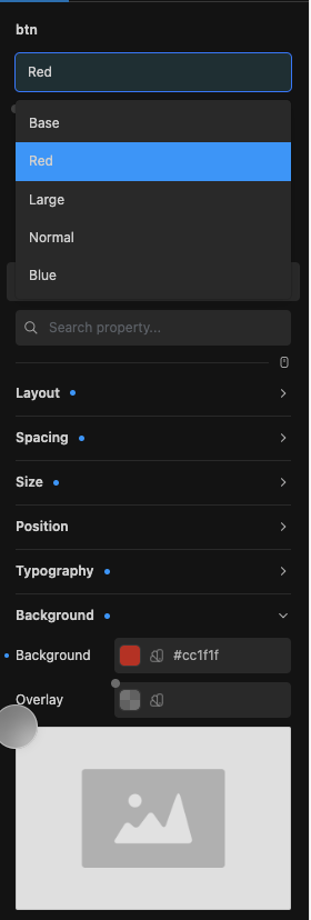
Here’s an example from Cwicly: You are able to add styles to components. For instance, let’s say we have a button. If I click on “Design,” I can select the color red and modify everything in the CSS accordingly.
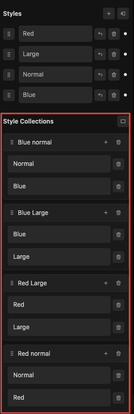
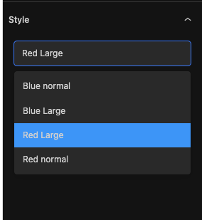
I can adjust other properties, such as size—for example, making the button large. In the Style Collections, you can combine multiple styles into a single collection. This allows you to map styles like a normal blue button, a large blue button, or a large red button.
This is for example how the red large button would look like
it would be useful to have the ability to hide icons or switch between them using a selection option.
Currently, the components feel somewhat incomplete. I hope they are prioritized for further development, particularly when integrated with client editing capabilities.
@Panag Thanks for providing detailed examples from cwicly! I strongly agree that the current implementation of Bricks components, while a good start, still feels pretty incomplete.
Having components at all is a very nice addition to Bricks, of course, but coming from cwicly the gap is still very noticeable and I believe that Bricks can adopt many/most of cwicly’s components’ features. Especially since cwicly’s components were launched in September 2023 and since then have received many rounds of feedback from the community, ultimately leading to a well-rounded user experience covering most highly relevant use cases and pitfalls for components. I think that Bricks could use all the insights that came from launching and refining cwicly components over 16 months to leapfrog the development of Bricks components and reach stable, fully featured version of components much quicker.
I know that components are not the top priority for many Bricks users, but for me it’s an essential part of delivering high value, maintainable websites for my clients and the current components are too limited in that sense.
At least for me, it would be very helpful to have an overview over which improvements to components are being actively worked on right now and set to launch with Bricks 2.0 and which ones have low priority and are only marked as ideas. @Matej I know you’ve shared more details on specific feature requests here in the forum, but I feel like a fair amount of people in the community would benefit from a bit more transparency and details on exactly which features we can realistically expect from components for Bricks 2.0 (and from future releases in Q2, Q3 and Q4).