Hello dear reader,
thank you for taking time and interest in my inquiry <3
I am a beginner in Website design / coding. Therefore dont hesitate to reason with me when my logic is flawed, much appreciated.
Goal:
Product Section / Archive Page;
A slider with {woo_product_gallery_images}. In Mobile my grid is only 1 Product per row & I want the costumer to be able to go through all gallery images without visiting the single Product page.
This is the Layout right now:
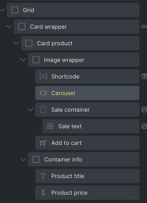
I have the following problem with the carousel:
In my dream I am able to set the image within the carousel to: width/height: 100%, object-fit:“cover” and it automatically adapts its own size relative to the size of the “image-wrapper”.
That solution is working very well and responsive when I do the same with an Image Element - except then I dont have the slider.
The only way to set “object-fit:cover” seems to be with “adaptive-height” on +
.brxe-carousel .swiper-autoheight .image {
height: 300px!important;
object-fit: cover;
}
Since the grid itself is responsive to different media width, setting up a height for all breakpoints seems counter - intuitive to me; It is not fully responsive no more, because the width changes while the height is set. In my dream I can set the height of “adaptive-height” to the dynamic height of its parent, the “image-wrapper”. I have tried a lot of different solutions to this problem:
I have tried the nestleable Slider - I used almost the same layout as presented, just setting up the slider where the carousel is right now. The {woo_product_gallery_images} does only load the first image of that gallery. - I think that has something to do with the query loop which loads “products”, those are singular and thus making {woo_product_gallery_images} load only one picture - I cannot articulate properly the logic right now but the site code said it loads only “1” image, even though I target the whole gallery.
To conclude, I feel like there might be, or should be an easy solution to have a slidable product gallery within the Archive. Please help me to see where my logic is flawed or which options I might have set up wrong.
What seems to be the only solution presented to me right now:
use adaptive height
set up specific heights to breakpoints
set up a width ratio to the height? - or set the same width since I want a 1/1 ratio.
But I feel like that is less responsive than my solution with just an image. With an image the whole design was fully responsive. What’s the way to go to achieve the same with a Slideable image?
Kind regards,
Lebowski