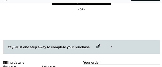
I am creating a services based product, and using Square as a payment option. Inside the Square payment, if I enable digital wallet, it leaves a huge gap and the google / apple pay is literally behind the menu, and leaving big gap below. I don’t see any way to edit this. My top section has 100px for the margin for menu to show. How do i address this?
I hope someone reads this and get back :). I also have done a test, and the order summary page after completing the order looks messy, and behind the menu. I don’t know what page or block I need to use to present this better. After making a purchase, I don’t want the user to get upset.
