To be honest, my first thought is that this makes no sense. This is what media queries are for. If you want different CSS on an element at different breakpoints… do one of two things.
Have one class you add to X element, and use media queries to trigger different stuff / adjust settings for that class.
or
Add 3 classes to the element so that Class-1 only acts on breakpoint 1, class-2 at breakpoint 2 and so on.
Then add 1,2 and 3 to the element - css will only kick in on X breakpoints.
re1 - Don’t understand your assertion that it’s hard to maintain… given it’s how we’ve been doing it for years, and it’s easier to maintain than some custom class-swapping script.
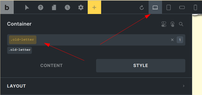
You can add a class, make innumerable css changes in the STYLES panel, different on all breakpoints, and that’s it.
If what you want to do is unique to a very limited set of elements… or can’t be done with the style panel… you can do this:
Add class “.my-class” to the element. Remain in desktop view. Add custom CSS to the custom CSS element.
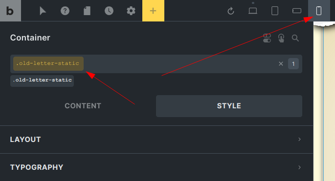
Switch view, add the unique custom css to the element in that breakpoint. Repeat for all breakpoints.
The custom css is ‘remembered’ for that class and breakpoint. Then if you change breakpoint px widths it won’t matter.