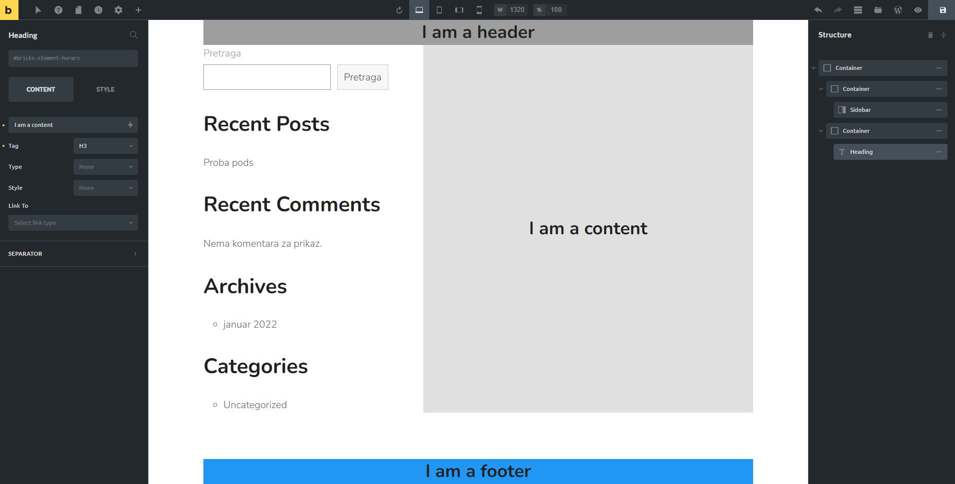
Created a CPT and built a template with header, footer and 40% right sidebar with navigation. I also set the template to use WordPress content on the 60% left side.
The question I have… how do I go about designing elements in Gutenburg? Various styled boxes, custom button appearance, etc.
Technically, this is outside the scope of Bricks Builder, however, my conundrum is caused by how Bricks Builder templating works.
If you build a template for a CPT with a header, footer and fixed sidebar (Table of Contents) and try to use Bricks Builder as the content, you are not able to see how that content will look within the left 60% side where that content is designated to go. It would cause a lot of previewing to make sure it looks OK. I.E. Without the content on the right showing, imagine a full-width button on a widescreen monitor when trying to structure content.
So, I decided to use Gutenburg as the content for the left side. How do I create styled content that is globally available?
P.S. I wish Bricks Builder would allow us to create a single page template for header, footer and sidebar and “Edit with Bricks” under a page with that template visually present. If you hover over content that belongs to the template, you’d see “Edit Template” come up. I’d imagine the ability to link the header and footer template to any single page template so that people could create multiple templates with different headers and footers if needed.