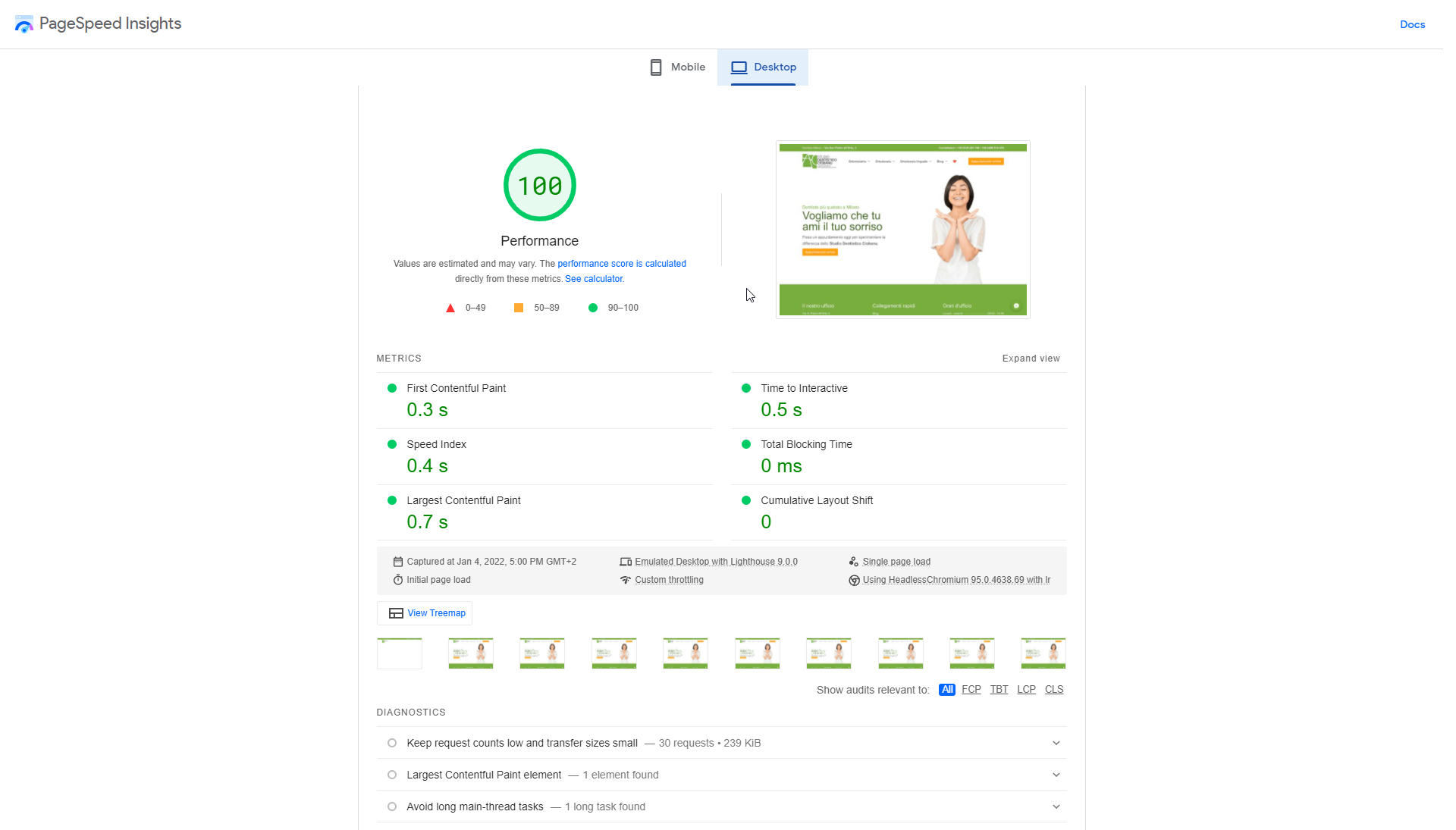
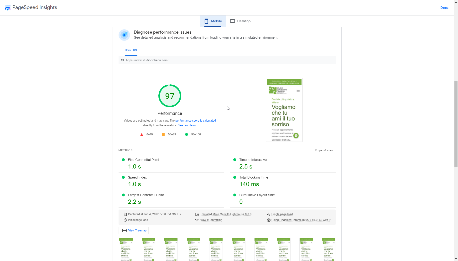
I am working on this website for a client and I was looking for some feedback. Any feedback is welcomed. Perhaps there is something I missed or still needs work, please let me know.
PS: Content is not all done yet. Content-wise, it still needs some love and will be adjusted in the following weeks
Thanks for sharing your new project. Here are a couple of pointers from me that I hope might help
Firstly, I like the hero on the homepage. It is the strongest part of the website, as is the menu.
I think, however, that the structure after that does not flow that well. You have the green banner Screenshot by Lightshot which I don’t think is needed as you have done an excellent job integrating the address and contact number into the header. Also, it looks like a footer.
I would use this significant space for one of two things:
A signpost section named ‘our services’ with cards to the top-level pages of your main services ( Odontoiatria, Ortodonzia, Ortodonzia Linguale
Or because dentists are very personable service (people worry/scared about dentists) Is to show an image of the primary dentition or dental team and a paragraph of a ‘mini about us’ (how we are friendly, serving the community for x amount of years, etc.) This will help give the website visitors confidence. You could then put number 1 below that, followed by the testimonials section, which builds trust.
I am not sure if you have been building the inner pages yet or just added the text content, but I would try to break this up into sections that are more enjoyable to read (nobody enjoys reading big blocks of text).
Wow. That’s great feedback. Thank you. I’ll see what I can do about that green banner and replace it with something more useful like a short paragraph about the doctors and perhaps a picture.
What I was thinking when I made it so green and wide is to be a “shoulder”/“support” for the bottom of the image in the hero section. As if the image pops from under it, sort of.
You are correct, about the inners pages. They are still a work in progress as we’re figuring out the final content. So far it’s just a “single” template on all that pulls in the title and text from Gutenberg and adds that CTA at the end for the appointments.