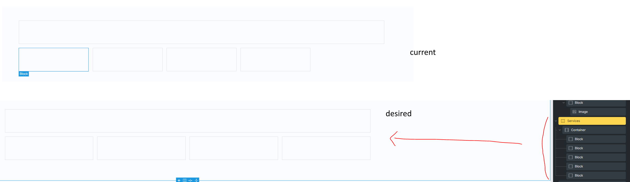
I am really new to CSS Grid, and have been scratching my head trying to figure out how to achieve the layout below.
So 1st block will be full width (spaning across the full width of the container).
And the remaining 4 blocks fill up the 2nd row evenly.
I am using the below setting through Bricks Builder, but the 4 blocks on the second row isn’t evenly spanned.
grid-template-columns: 1fr 1fr 1fr 1fr 1fr;
.block1 {
grid-column: 1 / -1; /* Spans from the first column to the last column */
}
.block2 {
grid-column: 1 / 2; /* Occupies column 1 */
}
.block3 {
grid-column: 2 / 3; /* Occupies column 2 */
}
.block4 {
grid-column: 3 / 4; /* Occupies column 3 */
}
.block5 {
grid-column: 4 / 5; /* Occupies column 4 */
}
Image