Regardless of what you think of Kevin and Etch, he does highlight an exciting new CSS feature that enables a more responsive design workflow. In the comments, he also mentions that Etch will be releasing features in the coming weeks to support the use of @container queries inside the builder.
I’m not sure how they’ll implement this or how it could be implemented in Bricks just yet, but I think it’s worth starting a discussion. Maybe there are already some internal ideas on this topic, or even features in progress, but hearing from the community can only help.
One important caveat with this feature, however, is current browser support. Can I Use reports a global coverage of just 92.76%, which some might see as too low for adoption. That said, coverage will naturally increase over time, since most unsupported cases come from outdated versions of browsers like Chrome and Safari.
All in all, @container queries seem like a step forward for modern responsive design. While adoption may take some time, starting the conversation early can help shape how we approach and eventually integrate this feature into our workflows, and, essentially, into Bricks.
Yeah, we’ll probably need some basic controls to set the container-type & container-name per element and then a more advanced switcher (like the viewport switcher) to create custom queries per container. If one of those queries is then selected, all changes made to any selector will then only be applied to that container query. I am not sure how to make this UX / DX friendly, though.
That could definitely be tough for Bricks because if you want to use the style panel in the context of a container query, this is going to be essentially like unlimited “breakpoints” and each one creates a new style panel context for styles.
Of course you could ignore the style panel but it means users can only do container query styles from pure CSS, but you can already do that now so what really needs to change?
All Bricks can do is maybe add a container query “helper” into the CSS box, with some logic to automatically enable the parent to set a container-type perhaps.
But hey, if they want to create a way to make container queries ad-hoc on any given element, with context switching in the style panel, I’m all for it. It could get messy though. Now you have to recognize if you’re in the ID context, a class context, a psuedo element or interation context, breakpoint context, and now also a container query context. And of course you will be in both a container query context as well as the various class contexts you may be working on under that container. And what if they are in a breakpoint context plus container query context plus class context?
I don’t see how this can be done all that cleanly, there is a lot going on!
Not so much a trend, but because browser support will be approaching 95% which is where many people start considering new CSS as useable (still will be too early for many depending on visitor demographics)
Before any UI is built for handling container queries, it’s already relatively simple to add for simple use cases, like changing the styling/layout of cards/boxes based on their current available space… has to be done in the CSS settings for the element…
Where you’d just replace ‘.container’ with the class/iD of whatever element you’re basing as the container to be used for the query width. (or use a relational selector to choose a higher up parent/grandparent for the container, like :has() )
The above CSS would mean… when the chosen container element width is below 50rem, change the direction of the current element (as selected by the current class/ID) to column and then back to row if it goes under 20rem.
Have to be careful with container queries though, make sure you don’t add them to just any parent of an element. It can’t used on an element where the container width is dependent on the child element size, like a div wrapped around a heading, for example.
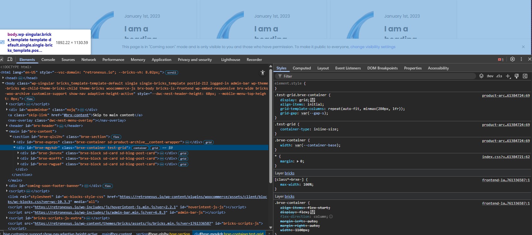
CSS looks correct, but remember @container (max-width: 600px) means that it’ll only apply when the width of the container is less than 600px, so it wouldn’t be visible when it’s 1890px wide (as in your screenshot). Use min-width if you want it to apply above it.
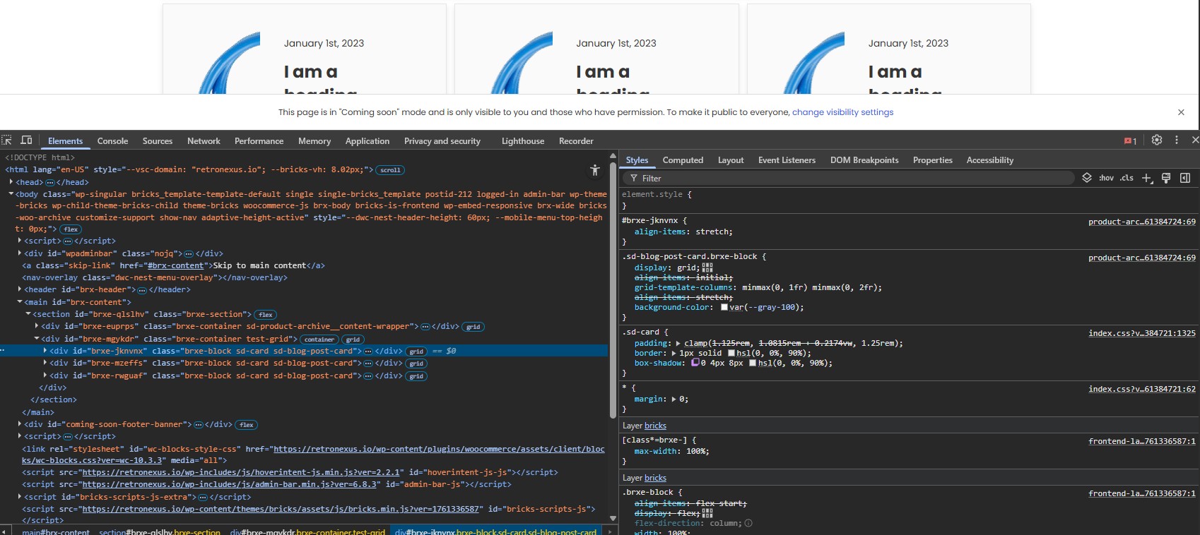
edit - if you were trying to change the style based on the card size, not the grid size, then you’d apply the container-type part to the card itself.