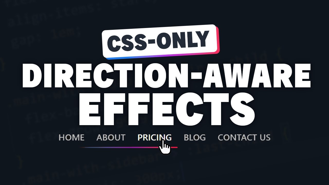
Hey guys and gals, Kevin is back with another fun CSS tutorial. This time he showed us how to create a really slick direction-aware navigation underline effect using only CSS.
Right off the bat I was intrigued by the idea of making elements respond differently based on which direction you approached them from. Kevin broke it down step-by-step, using custom properties to animate the underline’s width, position and delay. This made the code super readable and will really help me build similar interactions in the future.
At first the underline just grew from the center on hover, but then Kevin added the magic of CSS selectors like :hover + li to shift it left or right. Seeing it smoothly slide over as I navigated was so satisfying. He even handled focus states and fallbacks gracefully.
The best part was when he wrapped everything in a @supports query. This made the effect fall back to a simple grow animation on older browsers, while preserving the directionality where possible. Such a clever way to progressively enhance.
All in all, this was a really fun deep dive into some advanced CSS tricks. Kevin’s explanations were clear without being overwhelming. I feel like my knowledge of CSS anatomy and animation has really leveled up thanks to this tutorial. Definitely going in my back pocket for future projects. Nice work man, can’t wait to see what you come up with next!
