I want to set my container element to have a width of 100%, but then I would like to set the inner content (everything inside the container) to have a maximum width of 1300px.
In Oxygen, normally I could set a global pixel value for the inner content of a div/section which allows background colors/images of each section to fill the width of the page, while constraining the elements inside the section to a specific value.
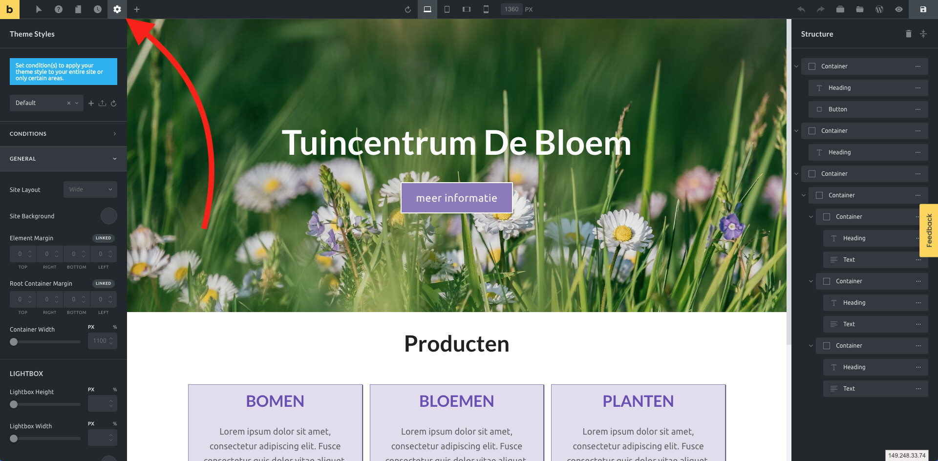
I tried going to the theme styles in Bricks and setting a Max width there, but for both the Container option and the Content option, it affects the entire element, rather than there being an inner-content element that constrains the elements inside the container.
Do I have to manually setup up a separate container inside of a container to achieve this constrained inner content?
So I had that set already, but it would constrain the entire container for some reason.
I poked around a bit more and found out I needed to set my Container element to be 100% width. Only then did the background of the container span the width of the page and the inner content remained constrained.
Not sure if this will help you, but to achieve what you want you must use two containers: one with 100% width and the inner with constrained width (eg. 1200px).
I think this changed in the 1.2 Containers update. I use 2 containers now. 1 at 100% width, and 2 inner I use custom css ‘max-width:1120px’ as surely the ‘width’ command would forces 1120px regardless of device size?
Or does ‘width’ on a container actually render as ‘max-width’ ?
I also wondered if this would work for a 1 container solution
My bad on this! Yes it’s a 2 container solution not a single container one for the most part.
I’ve actually created utility classes for .outer-container and .inner-container which now have everything acting exactly how I want (outer is 100% wide content centered, inner is limited to the side width with 50px LR padding on desktop, 30px LR padding on tablet, and 20px LR padding on mobile - works perfectly for me)
To anyone else stumbling across this thread - I thought I was having an issue with this as well. Couldn’t figure out why my inner containers were expanding all the way to the edges when my outer container had a width of 100% set (and global width was set to 1100px).
After goofing around for 15 minutes with it I realized all was operating as it should, but my inner container didn’t have an alignment set. In my head I was expecting the inner containers to automatically be centered, but in reality it was aligning against the left edge giving the appearance that it too was expanding out to 100%.
In short - check your inner container alignment settings if you think you’re having a similar issue as the one outlined here.