Container Width 1100px by default but smallest breakpoint is 768px width.
By default when window is less than 1100px, the content fits to all width. And if I go to next breakpoints after all devices the smallest is 768px… so between 768px and 1100px the content fits the width of the window.
Another point:
If I want that the containers after main content has some margin and I use the template “Container width”, but it applies to all containers… this can break a lot the design.
A fix is to add a custom class to all containers I want to use as inner-contents.
Why not to create a element that has this inner class directly? so you know that when you modify this container its about the containers that behave as a inner content of the main content…
if not, what ways you suggest to procede with will width sections? with different backgtounds??? Because if I apply margin or paddin to main content I will have a white space around…
sorry, I don’t get it. There are currently 4 Breakpoints in Bricks:
Desktop: > 992px
Tablet Portrait: <992px
Mobile Landscape: <768px
Mobile Portrait: <479px
With the margin and padding for containers: you can add a default root container margin and padding in your theme styles that apply to every root container (.bricks-container.root). The root container is always the outermost container (similar to a section). A best practice is to prefer padding instead of margin, especially for left and right spacing.
Thanks for the answer. The problem is that if you have deeper inner sections that need to respect that size or margin is then it generates a whitespace.
So the best solution I used is to have a class “inner-container” and set the max-width to 92vw, for example. This way, it doesn’t matter how deep it is this container, always will fit the layout margins you want, while the parent has a justify-center.
So what I think wold be great, is to have an element as a container that always has this inner-container class , and then from the theme settings be able to modifiy this container max-width and this way control the layout of all the site. This is how I did it and worked pretty well here: https://onesta.salwebs.com/home-bricks/
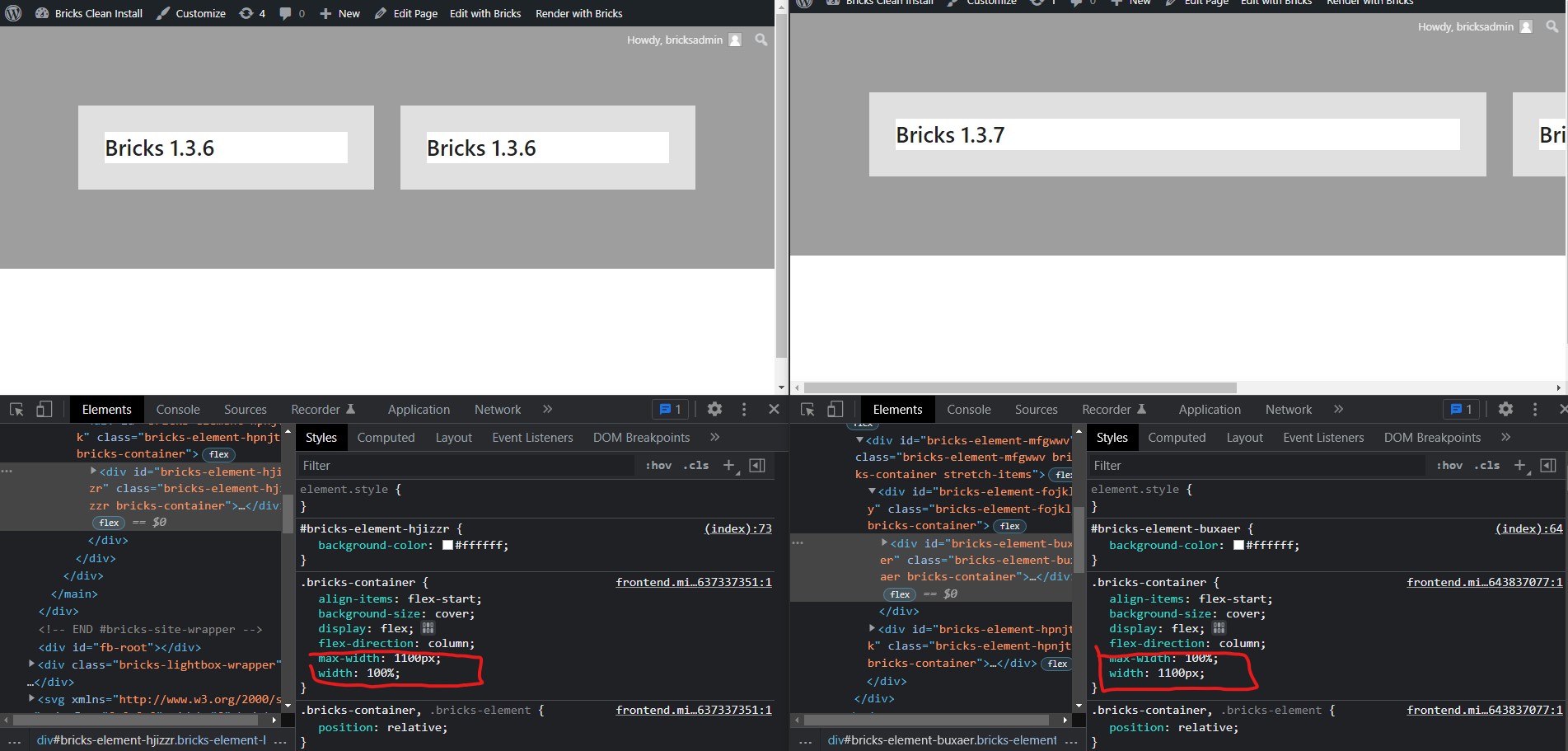
Here is the issue we are seeing: Up through 1.3.6 the .bricks-container class had a max-width dictated by the “container width” setting in theme styles (defaulting to 1100px) and a default width of 100%.
In 1.3.7 the width is now getting the default 1100px setting with the max-width now set to 100%. In the attached screenshot we installed a barebones Bricks theme, with no custom theme styles set, no widths declared, and only using the flex-direction, column-gap and padding properties. The unfortunate side effect of this simple CSS rule change is that more deeply nested containers are now pushing beyond the bounds of the parent containers and breaking layouts.
It would be nice to see an bricks-inner-container class added or something similar so there was a better distinction for nested layouts.
Hi @pbeachler I am pretty sure this is what is causing my site to break in 1.3.7 too. I have a feeling it might have something to do with this from July 21 where container and content width seems back to front in theme styles .
I am waiting for @timmse to fix one of my pages to check the issues and hopefully confirm what the cause is as this hasn’t been communicated in the release notes. They only mentioned fixed heights.