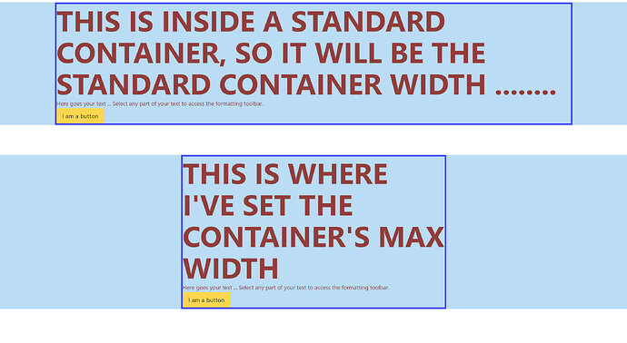
I’m trying to find out the best standards % or REM for Container Max Width, when I have content that I only want displayed in a smaller width. Like an area in a hero, so I don’t want the Heading and text to fill most of the screen, width wise but rather a small block;
I think I have 2 options;
Container Max Width Option 1: Set this at as 60% in a class then override at the ID level for tablet/phone breakpoints to something like 90%.
If I just set a class with 60%, it looks fine on a desktop but on tablets and especially phones, it looks way too small, width wise.
Option 2: I think this is the better option. For Max Width, use REM in a class, something like 70REM. Then I won’t need to use breakpoints.
Is option 2 generally the better choice? Or is there some other way that’s better?
Thanks!

