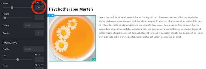
Hi Guys,
I’m planning to rebuild my site with bricks, but I am stuck now, cause I can’t get the behaviour of container height that is needed:
An example would be the 2 column layout from this site in Bricks 1.2 RC2:
The height of the column gets adapted to the text: When the width of the page gets smaller, the columns get higher.
In brizy it was no problem to achieve this behaviour, but after fiddling around in bricks I found no way. I assume this is nothing special, so it has to be possible.
Thankful for any input!
In Bricks 1.2, image and text blocks are treated like containers. (The default HTML tag is a div.) This means they behave like columns. In your example you could work with percentage values, for example, to control the size of both elements/columns respective to each other.
The screenshots show a couple of examples. In mobile view – smaller than tablets – it’s usually best to stack the elements, of course. So you need to switch the container behavior to from horizontal to vertical and make both image and text 100% wide. For spacing I added some padding. In horizontal view, to the right of the image; in vertical view, below the image.
Thanx very much for this detailed response!
You’re welcome. Good luck with your project!


