Be great to use conditions to hide/show elements based on screen size - in particular with headers on tablet / mobile / desktop when you need to move things about and even display things very differently - it would be great to remove as much html as possible without just CSS hiding it?
4 Likes
I’m afraid the condition by any builders can’t detect screen size.
Hmm, fair OK.
No better way this could be done?
Only PHP can hide the HTML output.
So, to hide those elements(not html) on mobile, you can only achieve it with breakpoints styling. With :nth-child
Cheers Jornes. I use that already dude, I was meaning more like when your menu is completely different on different screen sizes.
Fully support the idea!  Excessive html that is hidden via display: none in templates is unnecessary. This is a bad practice, especially for seo. Why would search engine crawlers download useless code? If you have a lot of such code, you will have unobvious problems.
2 Likes
Just a simple example but something like this with PHP - but built into a nice UI within Bricks say? 
<?php
$user_agent = $_SERVER['HTTP_USER_AGENT'];

if (preg_match('/mobile/i', $user_agent)) {
    echo '<div class="mobile-content">This is content for mobile devices.</div>';
} else {
    echo '<div class="desktop-content">This is content for desktop devices.</div>';
}
?>
1 Like
It seems this still isn’t available a year and a half later and I hope this is something that can be added. In the mean time, I was considering blending tailwinds, but i’m not so sure how well it would work.
1 Like
I already suggested implementing the Mobile Detect library. This would be a good option.
4 Likes
This is a shame. Elementor has had this feature for years.
I assume that the main reason why this feature is request is to have a mobile and desktpo version - two distinct elememts - and then show only one based on breakpoint.
For this scenario display: none is enough to do it.
Do you guys have other “reasons/scenario” where you will need conditions ??
1 Like
this is not enough. With this approach we get a lot of hidden html elements
No it hasn’t. It uses display: none for the viewport, same as bricks
2 Likes
The issue is that if a user resizes a viewport, anything that wasn’t rendered conditionally on the original viewport won’t render in the updated viewport as conditions run before the page is served
1 Like
Like @Pete said,
there is a difference between a condition performed in PHP (build time) and in CSS/JS (runtime). These are 2 distinct phases and with different information available.
The build time happens in the WP server and terminate with the HTML that is then sent to the browser. At build stage only User-Agent string is know and can be used to determine the “condition”.
At this stage is not possibile to know the size of the screen, because the build phase happens before the runtime phase on the browser - where the screen exists.
If - for example - a “mobile-only” CTA section is not rendered at build time because the user-agent is “desktop” that CTA section is not present in the html.
If then the user shrink the browser window to a resolution of a “mobile” phone the CTA section will not appear because it doesn’t exists.
Usually is better to use display none and media query for mobile/desktop conditional visibility of sections, and avoid conditional html using the user agent
Jacopo
Yes, it will be a technical problem. But why in practice would a user reduce the screen from a desktop to a mobile? No one will do that. Maybe only in some exceptional cases.
Because the user might be using a 1366px laptop, and resizes to half width to open another app/window - reducing the viewport to <683px. Not a wildly unlikely scenario.
1 Like
This is precisely why we must have two solutions for determining screen size. One through the User-agent and the second through the window size. Then we hide elements as standard through breakpoints and additionally “manually and personally” hide loaded elements through User-Agent
I asked the neural network to solve this problem. She gave me 2 plug-in variants. But none of them wants to work. 
1 variant
/*
Plugin Name: Bricks Builder Breakpoint Visibility
Plugin URI: https://example.com/
Description: Adds the ability to hide/show Bricks Builder elements based on the selected breakpoint.
Version: 2.0
Author: Your name
Author URI: https://example.com/
*/

// Getting all the available Bricks Builder breakpoints
function get_bricks_breakpoints() {
    $breakpoints = bricks_get_breakpoints();
    $options = ['' => 'Always visible'];

    foreach ($breakpoints as $key => $value) {
        $options[$key] = $value['label'];
    }

    return $options;
}

// Adding a new field to the Bricks element settings
add_filter('bricks/elements/controls', 'add_breakpoint_visibility_control', 10, 2);
function add_breakpoint_visibility_control($controls, $element) {
    $controls['breakpoint_visibility'] = [
        'tab' => 'content',
        'group' => 'general',
        'label' => 'Visibility at breakpoint',
        'type' => 'select',
        'options' => get_bricks_breakpoints(),
        'inline' => true,
    ];

    return $controls;
}

// Removing an element from the output based on the selected breakpoint
add_filter('bricks/element/render', 'filter_element_render', 10, 2);
function filter_element_render($render, $element) {
    $settings = $element->settings;
    $breakpoint = $settings['breakpoint_visibility'] ?? '';

    if (!empty($breakpoint) && !wp_is_mobile() && !is_admin()) {
        $current_breakpoint = bricks_get_current_breakpoint();

        if ($breakpoint !== $current_breakpoint) {
            $render = null;
        }
    }

    return $render;
}
2 variant
/*
Plugin Name: Bricks Builder Breakpoint Visibility
Plugin URI: https://example.com/
Description: Adds the ability to hide/show Bricks Builder elements based on the selected breakpoint.
Version: 2.1
Author: Your name
Author URI: https://example.com/
*/

// Registering the plugin settings
add_action('bricks/settings/register', 'register_breakpoint_visibility_setting');
function register_breakpoint_visibility_setting() {
    bricks_register_setting(
        'general',
        'bricks-breakpoint-visibility',
        'breakpoint_visibility',
        [
            'label' => 'Visibility at breakpoint',
            'type' => 'select',
            'options' => get_bricks_breakpoints(),
        ]
    );
}

// Getting all the available Bricks Builder breakpoints
function get_bricks_breakpoints() {
    $breakpoints = bricks_get_breakpoints();
    $options = ['' => 'Always visible'];

    foreach ($breakpoints as $key => $value) {
        $options[$key] = $value['label'];
    }

    return $options;
}

// Adding a new field to the Bricks element settings
add_action('bricks/elements/controls', 'add_breakpoint_visibility_control');
function add_breakpoint_visibility_control($controls) {
    // We find the index of the group "general"
    $general_group_index = array_search('general', array_column($controls, 'group'));

    // Inserting a new field after the group "general"
    array_splice(
        $controls,
        $general_group_index + 1,
        0,
        [[
            'key' => 'breakpoint_visibility',
            'tab' => 'content',
            'group' => 'general',
            'label' => 'Visibility at breakpoint',
            'type' => 'setting',
            'setting' => [
                'group' => 'bricks-breakpoint-visibility',
                'key' => 'breakpoint_visibility',
            ],
            'inline' => true,
        ]]
    );

    return $controls;
}

// Removing an element from the output based on the selected breakpoint
add_filter('bricks/element/render', 'filter_element_render', 10, 2);
function filter_element_render($render, $element) {
    $settings = $element->settings;
    $breakpoint = $settings['breakpoint_visibility'] ?? '';

    if (!empty($breakpoint) && !wp_is_mobile() && !is_admin()) {
        $current_breakpoint = bricks_get_current_breakpoint();

        if ($breakpoint !== $current_breakpoint) {
            $render = null;
        }
    }

    return $render;
}
3 variant
/**
 * Plugin Name: Enhanced Bricks Builder Breakpoint Visibility
 * Description: Adds the ability to hide/show Bricks Builder elements based on all breakpoints, including custom ones.
 * Version: 2.3
 * Author: Your Name
 * Requires at least: 5.0
 * Requires PHP: 7.0
 */

if (!defined('ABSPATH')) {
    exit; // Exit if accessed directly
}

class Enhanced_Bricks_Breakpoint_Visibility {
    private static $instance = null;

    public static function get_instance() {
        if (self::$instance === null) {
            self::$instance = new self();
        }
        return self::$instance;
    }

    private function __construct() {
        add_action('init', [$this, 'init']);
    }

    public function init() {
        if (!$this->is_bricks_active()) {
            add_action('admin_notices', [$this, 'bricks_not_active_notice']);
            return;
        }

        add_filter('bricks/elements/controls', [$this, 'add_breakpoint_visibility_control'], 10, 2);
        add_filter('bricks/element/render', [$this, 'maybe_render_element'], 10, 2);
        add_action('wp_footer', [$this, 'add_screen_width_script']);
    }

    public function is_bricks_active() {
        return class_exists('Bricks\Elements');
    }

    public function bricks_not_active_notice() {
        ?>
        <div class="notice notice-error">
            <p><?php _e('Enhanced Bricks Breakpoint Visibility plugin requires Bricks Builder to be active.', 'enhanced-bricks-breakpoint-visibility'); ?></p>
        </div>
        <?php
    }

    public function add_breakpoint_visibility_control($controls, $element) {
        $breakpoints = $this->get_all_breakpoints();
        $visibility_options = ['' => esc_html__('Always visible', 'bricks')];

        foreach ($breakpoints as $key => $breakpoint) {
            $visibility_options["hide_on_{$key}"] = sprintf(esc_html__('Hide on %s', 'bricks'), $breakpoint['label']);
        }

        $controls['_visibility'] = [
            'tab' => 'style',
            'group' => 'visibility',
            'label' => esc_html__('Breakpoint Visibility', 'bricks'),
            'type' => 'select',
            'options' => $visibility_options,
            'multiple' => true,
            'inline' => true,
            'description' => esc_html__('Select breakpoints to hide this element', 'bricks'),
        ];

        return $controls;
    }

    public function maybe_render_element($output, $element) {
        $settings = $element->settings;
        $breakpoint_visibility = isset($settings['_visibility']) ? $settings['_visibility'] : [];

        if (empty($breakpoint_visibility)) {
            return $output;
        }

        $current_breakpoint = $this->get_current_breakpoint();

        foreach ($breakpoint_visibility as $hide_on) {
            $breakpoint = str_replace('hide_on_', '', $hide_on);
            if ($breakpoint === $current_breakpoint) {
                return ''; // Don't render the element
            }
        }

        return $output;
    }

    private function get_all_breakpoints() {
        if (method_exists('\Bricks\Breakpoints', 'get_breakpoints')) {
            return \Bricks\Breakpoints::get_breakpoints();
        } else {
            // Fallback для старых версий Bricks
            return [
                'desktop' => ['width' => 1200, 'label' => 'Desktop'],
                'tablet' => ['width' => 768, 'label' => 'Tablet'],
                'mobile' => ['width' => 0, 'label' => 'Mobile'],
            ];
        }
    }

    private function get_current_breakpoint() {
        $breakpoints = $this->get_all_breakpoints();
        $screen_width = $this->get_screen_width();

        foreach ($breakpoints as $key => $breakpoint) {
            if ($screen_width >= $breakpoint['width']) {
                return $key;
            }
        }

        return 'mobile'; // Fallback to mobile if no matching breakpoint found
    }

    private function get_screen_width() {
        return isset($_COOKIE['bricks_screen_width']) ? intval($_COOKIE['bricks_screen_width']) : 1920;
    }

    public function add_screen_width_script() {
        ?>
        <script>
        function setBricksScreenWidthCookie() {
            document.cookie = "bricks_screen_width=" + window.innerWidth + "; path=/";
        }
        setBricksScreenWidthCookie();
        window.addEventListener('resize', setBricksScreenWidthCookie);
        </script>
        <?php
    }
}

function Enhanced_Bricks_Breakpoint_Visibility() {
    return Enhanced_Bricks_Breakpoint_Visibility::get_instance();
}

Enhanced_Bricks_Breakpoint_Visibility();
Does anyone have any idea how to make this work? 
I did it anyway
Use it at your own risk. It works through Conditions.
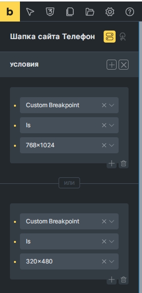
Thanks Claude 3.5 Sonnet 
<?php
/**
 * Plugin Name: Bricks Breakpoint Visibility
 * Description: Adds breakpoint-based visibility condition for Bricks Builder
 * Version: 1.0.6
 * Author: Your Name
 */

if (!defined('ABSPATH')) {
    exit;
}

class BBV_Breakpoint_Visibility {

    public function __construct() {
        add_action('init', array($this, 'init'));
        add_action('wp_enqueue_scripts', array($this, 'enqueue_scripts'));
        add_action('wp_ajax_bbv_set_current_breakpoint', array($this, 'set_current_breakpoint'));
        add_action('wp_ajax_nopriv_bbv_set_current_breakpoint', array($this, 'set_current_breakpoint'));
    }

    public function init() {
        add_filter('bricks/conditions/options', array($this, 'add_breakpoint_condition'));
        add_filter('bricks/conditions/result', array($this, 'check_breakpoint_condition'), 10, 3);
    }

    public function enqueue_scripts() {
        wp_enqueue_script('bbv-breakpoint-visibility', plugins_url('js/bricks-breakpoint-visibility.js', __FILE__), array('jquery'), '1.0.0', true);
        wp_localize_script('bbv-breakpoint-visibility', 'bricksBreakpointVisibility', array(
            'ajax_url' => admin_url('admin-ajax.php'),
            'nonce'    => wp_create_nonce('bbv_nonce'), // Создаем nonce
        ));
    }

    public function set_current_breakpoint() {
        check_ajax_referer('bbv_nonce', 'nonce'); // Проверяем nonce

        $width = isset($_POST['width']) ? intval($_POST['width']) : 0;
        $breakpoints = $this->get_breakpoints();
        $current_breakpoint = 'desktop';

        usort($breakpoints, function($a, $b) {
            return $b['width'] - $a['width'];
        });

        foreach ($breakpoints as $breakpoint) {
            if ($width >= $breakpoint['width']) {
                $current_breakpoint = $breakpoint['key'];
                break;
            }
        }

        setcookie('bricks_current_breakpoint', $current_breakpoint, time() + 3600, '/');
        wp_send_json_success();
    }

    public function get_breakpoints() {
        return get_option('bricks_breakpoints', []);
    }

    public function add_breakpoint_condition($options) {
        $breakpoints = $this->get_breakpoints();
        $breakpoint_options = array();

        foreach ($breakpoints as $breakpoint) {
            $breakpoint_options[$breakpoint['key']] = esc_html($breakpoint['label']);
        }

        $options[] = [
            'key'     => 'custom_breakpoint',
            'label'   => esc_html__('Custom Breakpoint', 'bricks'),
            'group'   => 'other',
            'compare' => [
                'type'    => 'select',
                'options' => [
                    '='  => esc_html__('Is', 'bricks'),
                    '!=' => esc_html__('Is not', 'bricks'),
                ],
            ],
            'value'   => [
                'type'    => 'select',
                'options' => $breakpoint_options,
            ],
        ];

        return $options;
    }

    public function check_breakpoint_condition($result, $condition_key, $condition) {
        if ($condition_key !== 'custom_breakpoint') {
            return $result;
        }

        $current_breakpoint = $this->get_current_breakpoint();

        $compare = isset($condition['compare']) ? $condition['compare'] : '=';
        $value = isset($condition['value']) ? $condition['value'] : '';

        if ($compare === '=') {
            return $current_breakpoint === $value;
        } elseif ($compare === '!=') {
            return $current_breakpoint !== $value;
        }

        return $result;
    }

    private function get_current_breakpoint() {
        return isset($_COOKIE['bricks_current_breakpoint']) ? $_COOKIE['bricks_current_breakpoint'] : 'desktop';
    }
}

new BBV_Breakpoint_Visibility();

function bricks_breakpoint_visibility_script() {
    ?>
    <script>
    (function($) {
        if (typeof bricks !== 'undefined' && bricks.is_builder) {
            return;
        }

        function setBricksBreakpoint() {
            var width = $(window).width();
            $.ajax({
                url: bricksBreakpointVisibility.ajax_url,
                type: 'POST',
                data: {
                    action: 'bbv_set_current_breakpoint',
                    width: width,
                    nonce: bricksBreakpointVisibility.nonce // Передаем nonce
                },
                success: function(response) {
                    if (response.success) {
                        console.log('Breakpoint updated');
                    }
                }
            });
        }

        $(window).on('load resize', debounce(setBricksBreakpoint, 250));

        function debounce(func, wait) {
            var timeout;
            return function() {
                var context = this, args = arguments;
                clearTimeout(timeout);
                timeout = setTimeout(function() {
                    func.apply(context, args);
                }, wait);
            };
        }
    })(jQuery);
    </script>
    <?php
}
add_action('wp_footer', 'bricks_breakpoint_visibility_script');