Hi there, I have created a card component with an icon property. I can change the icon for each component instance but when I set the Icon “width” (I’m choosing SVG as the source within the Icon property) it affects all icons across all instances of the component. So I cant tweak the icon sizes relative to eachother. I see in the DOM this is because every icon in each instance has the same ID.
Hi,
Thanks so much for your report!
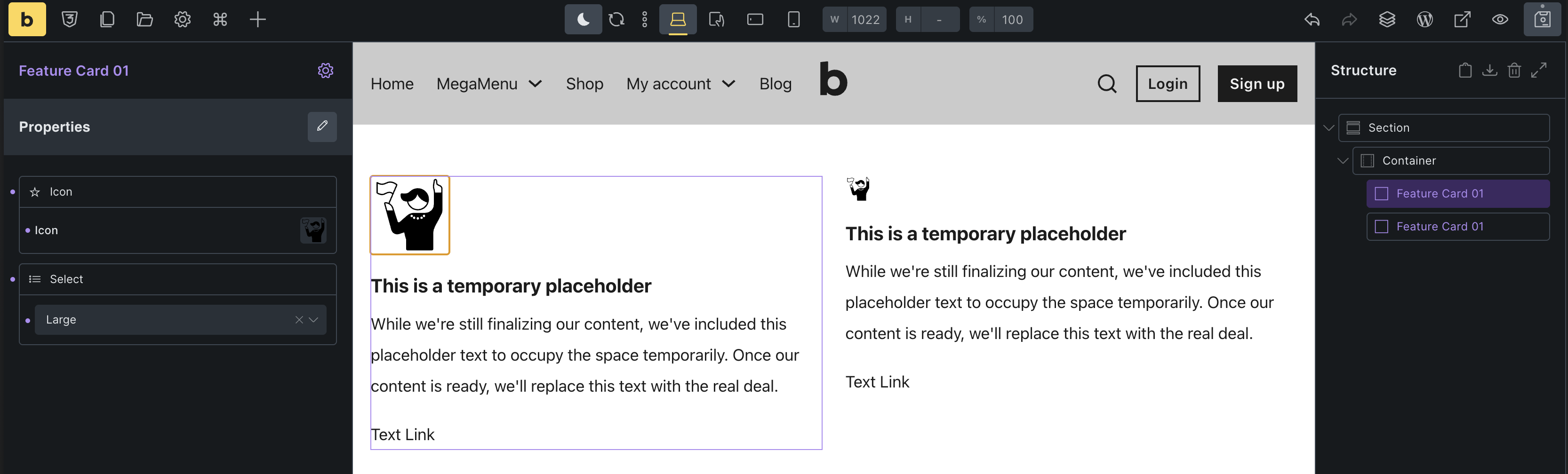
Changing the style (in your case the width) inside of the component affects all instances. That’s the expected result in the first place. However, you can create an “icon size” property (type select) and add sizes like this:
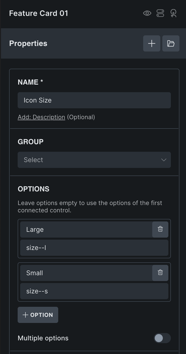
There are two ways to assign the property to the icon:
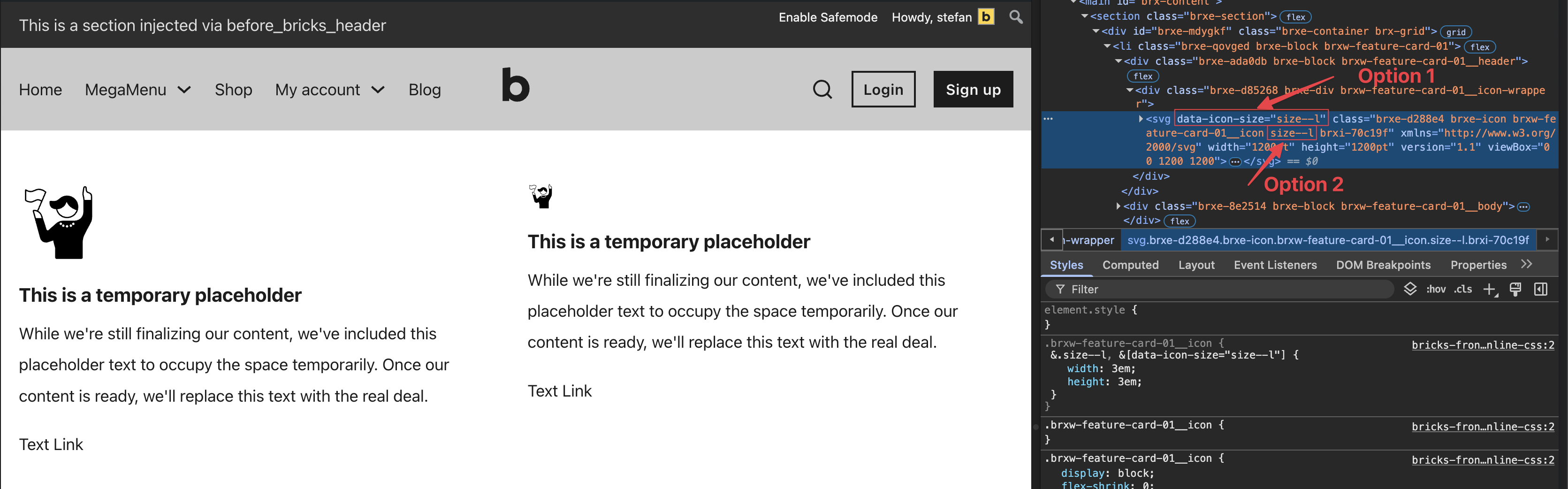
Either use an attribute selector such as data-icon-size, or an additional class. Both can be linked to the icon element under style » attributes, or style » css » classes..
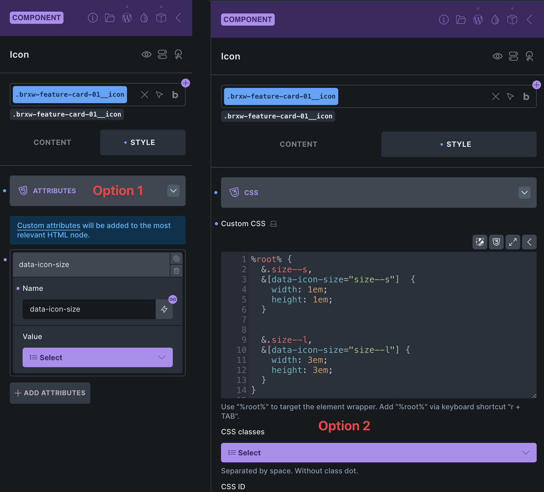
Then you just need to add the appropriate styles, and you can now change the size of the icon per instance. Depending on which option you choose, you will of course only need the attribute selector or the class in the styles. In my example, both are included:
/* Icon Element » custom CSS */

%root% {
  &.size--s,
  &[data-icon-size="size--s"]  {
    width: 1em;
    height: 1em;
  }

  &.size--l,
  &[data-icon-size="size--l"] {
    width: 3em;
    height: 3em;
  }
}
Best regards,
timmse
Thanks for the detailed reply, but I don’t understand. I am changing the values of the Icon property on a particular instance of a component. Why wouldn’t it just work? Isn’t the whole ideal of offering an Icon property so I can use all its Icon settings for just that instance?
This has me now paranoid other component property settings won’t work at an instance level and I have to use workarounds. I feel nauseous at the idea of setting up those classes to work around this and I will feel very unprofessional explaining to my client he has to do it this way.
Clearly the perfect way it would work is you click on the component instance, click on your Icon property and then adjust the setting for that icon in the native controls.
“Why wouldn’t it just work?”
it’s because width is CSS.
Component props are for changing the HTML (the content, attributes, configuration settings, classes) for each instance.
CSS is inside a stylesheet, seperate to all this, and only applies to the selector (class/ID) it’s been assigned to. Component instances will have have the same classes as each other, they’re copies, unless you add props to add custom ones.
“This has me now paranoid other component property settings won’t work”
It’ll only be anything related styling that doesn’t (anything you’re setting that is adding CSS and not changing the content). That’s when you’d set up property for class or other attribute if you need two instances to have different styling.
2 Likes
Sounds like you are presenting internal Bricks limitations as desirable user experience. I should be able to set the Icon on the component instance and then use the controls that come with that Icon property as expected. I’m disappointed that the team isn’t acknowledging this. e.g. “Yeah that would be what you’d expect, and it would be ideal. But we can’t because of the way it works under the hood, so here are some workarounds.”
It’s how components/props work generally, not specific to Bricks or anything WP related.
I was just explaining it again as I saw you didn’t quite pick it up from the first explanation offered.
There was no ‘presenting’, just offering information about how it works.
Maybe the Bricks team will build in a workaround, to make it work more how you initially expected, but it’s typically not how components work in general.
2 Likes
Fair enough. As I see it they are instance level controls affecting other instances. It’s chaos. Instance level controls should affect the instance. Or hide those controls because they are confusing.
Icons often need a quick size tweak relative to each other so I find it inconvenient.
And I have a hard time believing other polished systems with components do the same thing. Got any examples?
Thanks for the educational tidbit.
Webflow would be a good example, when you try to style something only for one instance, the way it’s done is by adding a new class to only that instance and then applying those styles to that class. (adding a class = changing the HTML output)
For a WordPress example, check ‘Builderus’ with their ‘Component Variants’ video, where the style varients are done by setting class properties or attributes.
The same can be done in Bricks, each instance can have a different class via the class property, then we can change any style settings for just that instance by styling with that class. But without any extra class, each instance will be exactly the same.
CSS can’t differentiate between two things exactly the same, all it’s doing is looking for the selector and applying styling. So the selector needs to be different. (different class or some different attributes), props can be used to change these.
But back to Bricks, the simplest way to think about it - only none-style settings can be set per instance. Anything style related, you probably need to be adding a class property and styling with that (or using attributes which was the other option suggested).
Hopefully makes sense 
1 Like
Thanks. I appreciate your time. Do any of those examples offer component instance level controls that don’t work correctly and end up modifying other instances instead? (What I consider chaotic and confusing). If Bricks just removed those then it would be a lot cleaner rather than leaving them there to disappoint and confuse.
Might be worth adding as a feature request. I had a quick look through the current available properties, and the width/height/color inside of the icon is the only one where this applies. No other ones include style options as far as I could tell.
Ok thats good to know. Thanks David. I appreciate you taking the time.