Bricks Version: 1.3.2 Browser: Safari 14.1.1 OS: macOS URL: nah
EDIT: Changed from bug to feature request. Request: Bricks currently uses WP’s default 100vw srcset sizes for all images (assumes all images are displayed at 100vw or max out at the asset resolution chosen in the editor). WP does this, because it has no way of knowing the size of the image in the frontend since it is defined by the theme. Bricks however knows exactly at what size the image is displayed at each breakpoint. This can be calculated either by a fixed px width set in the image container, or by calculating the container’s width and subtracting all the margins and paddings of its parent containers. The sizes attribute of Bricks therefore should use correctly calculated values for better loading speeds and sharper images. Original post:
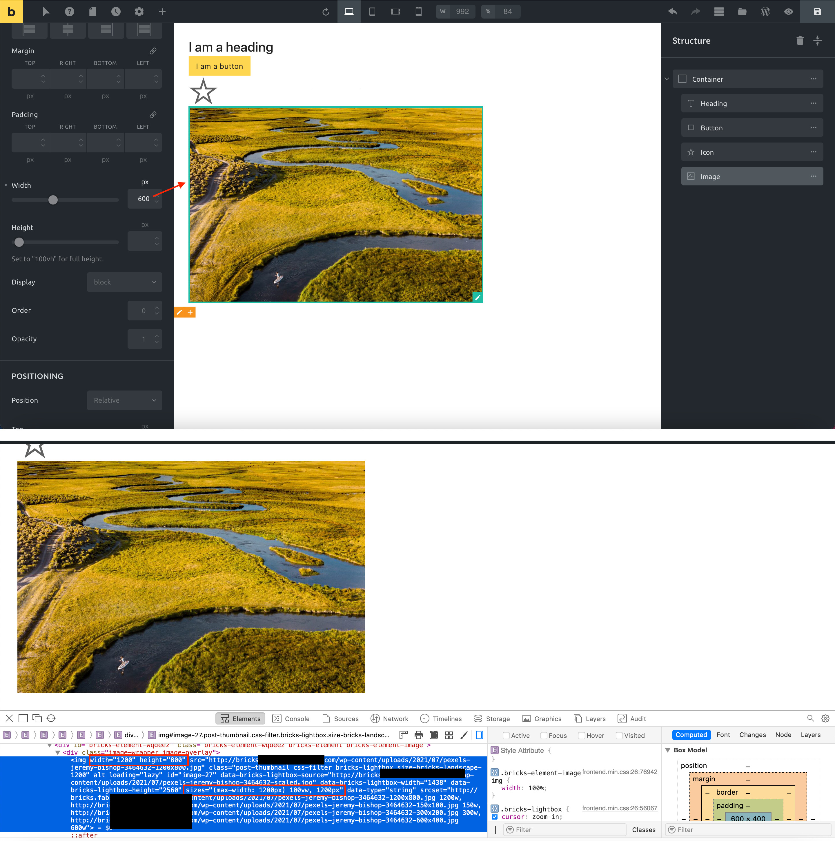
When adding an image the image size and its srcset size is set to the resolution of the source file, not to the actual width of the image (set in the style options of bricks). This way the frontend thinks the file is displayed at full width (in the screenshot 1200px wide) and therefore loads a large image size (in the screenshot 1200px or even 2400px for @2x hdpi screens), even though it is only displayed at 600px. At least it maxes out at 100vw, still far from perfect.
Solution: Override the width, height and srcset sizes of an image if a value is set in the bricks style options of the image element. Simple
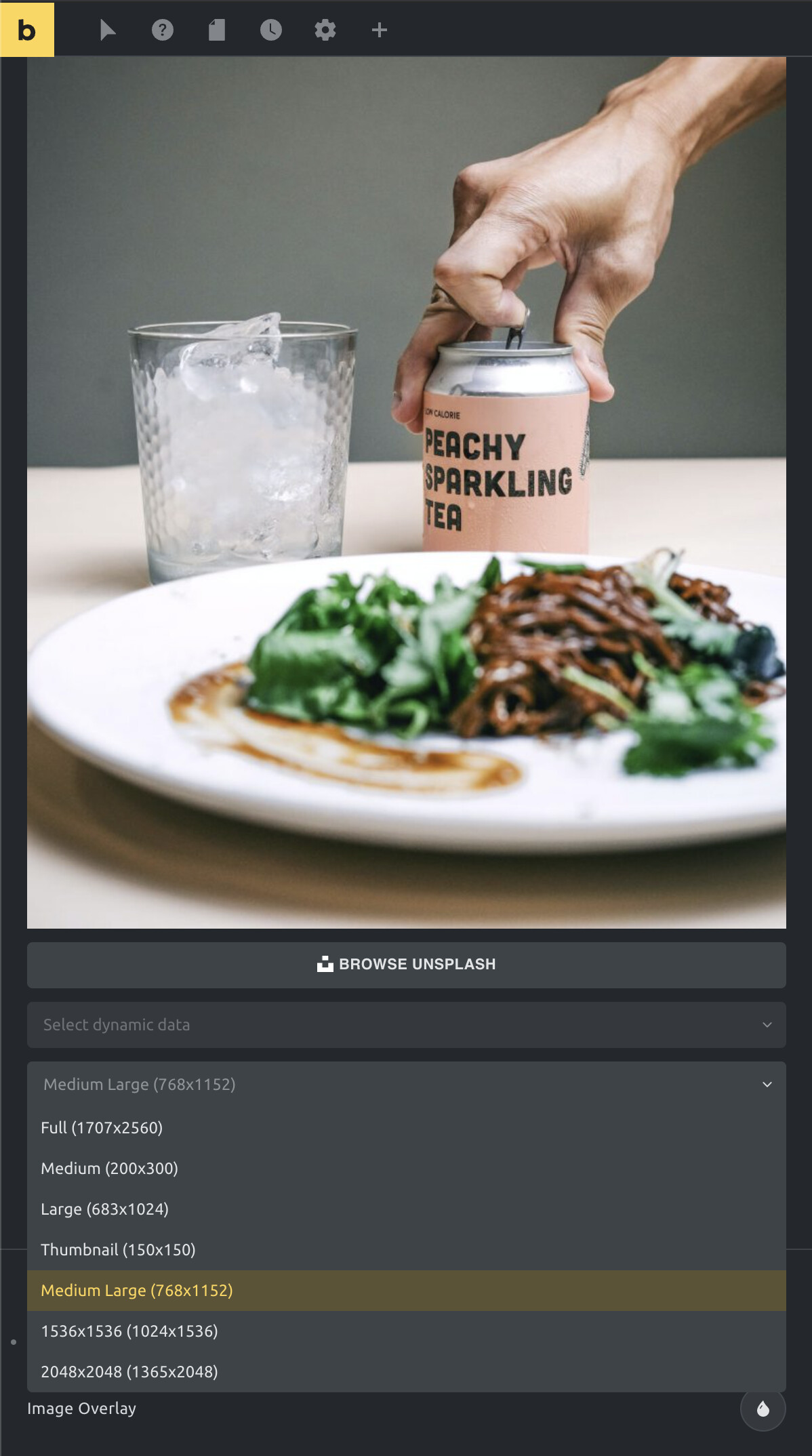
Interims solution: Use an image resolution that is as close to your target size as possible. You must have a @2x version with double the chosen size available in your theme for hdpi screens to not get a blurry image.
The width and height settings under Style » Layout does not belong to the actual image width and height, rather than to it’s wrapper div. You can set the initial size of the image after adding the image (see screenshot) and this size should be as close as possible to the maximum width and / or height (depends on your layout) of the image wrapper (Style » Layout), so it doesn’t get blurry or pixelated. If the browser window is smaller, the srcset comes into play and chooses the best matching (smaller) image size from the set. If it is wider, your image will stay as it is because your max-width of the container is 600px (maybe the browser will pick a larger image for retinas).
Please correct me, if I misunderstood the problem.
Hey Timmse, yes you are right. The problem is that this does not work for responsive pages. Let’s say you have an image that has 33vw width on desktop (e.g. 3 columns of 3 images), 50vw on tablet (two columns) and 100vw on mobile. If you would do SRCSET right, you would add something like this to the sizes:
Now the browser knows that the image is 33vw on screens lager than 861px, 50vw on screens larger than 481px and 100vw on smaller screens. And it can load the correct resolution accordingly. What Bricks is doing is adding this to the sizes:
sizes="(max-width: XXXpx) 100vw, XXXpx"
XXX is the width you chose from the dropdown in Bricks. This is the “cheap ass” version of srcset that is not taking the actual display (container) size into consideration, it just assumes that it is displayed at 100vw on all breakpoints, at max at the width of the asset you choose in the Bricks sizes dropdown. If it is displayed larger than the selected asset size on some breakpoints, you are out of luck, it maxes out at the px of the asset. If it is displayed smaller than 100% of your screen (30% or 50% in a column), you are out of luck, it will still load the next best version that is 100% of your screen or bigger.
Long story short: Bricks really should calculate the actual srcset sizes.
Aaah now i got your point!
However, this is more of a feature request than a bug, as this seems to be the “default” WordPress srcset handling. But that doesn’t mean it can’t be done better
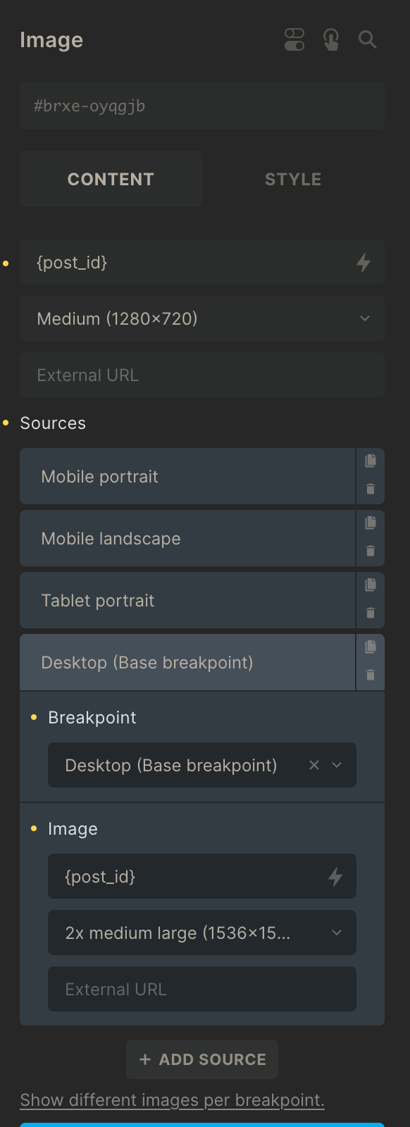
I think what should be possible is that you should be able to select the image size you want to load per breakpoint… I think that is the only solid way it will load the size you want for that screen width.
It is already possible for many styling options right… we can set for example a font size for the default screen width, select the large breakpoint and choose a different font size , m width etc.

 I just changed it from a bug to a feature request with a different title.
 This should definitely have higher priority.