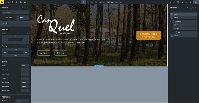
Today I noticed that when changing the Height of the page previewed in the builder the remaining blank space that isn’t being used is displayed in a gray color which doesn’t look great in my opinion as it doesn’t integrate well with bricks color scheme nor doesn’t have any indication to let the user know that this area has been created just to push the content up and simulate a smaller screen.
My suggestion is to change its color to the gray of the interfice. And maybe add an icon or some text.
