I have been working on bricks for 3 years now and the user interface is great, but I think the interface needs some polishing to make it seem like a more mature product at the same time and also help builders achieve their goals.
I don’t know what the opinion of other users is, but many elements are too large and there is no need for such large input fields or general parts of the interface with so much spacing. Particularly since we don’t always work on large screens, and we make changes to clients’ sites (or they themselves) remotely.
That’s why I’m thinking whether it’s worth going a little further than what has been proposed as UI Revamped with Bricks 2.0.
---------- Why?
Basically, the user should mainly focus on what is visible in the canvas. The place where the final product is created, and the interface should be a helpful friend, not a buddy we have to fight with.
---------- Element sizes and spacing
Unfortunately, in my opinion, there is currently too much scrolling to find a particular field and resizing of the side panels to type something. Input fields and select fields look the same, have too much height / line-height, are at times too narrow (especially when we have long clamp or var rules).
The structure elements are also very large and tall, so that when we have a larger DOM, we have to really spread the panels wide, and as a result the canvas becomes tiny.
I often catch myself shrinking the whole interface through browsers to the 80% level so that I can work comfortably in the builder interface, but that’s not a solution when you’re checking the final front-end and have to restore it to 100% to see what the client will see.
These are just some of the pain points that, at first glance (at least in my opinion), make Bricks look like an immature product for people who have already been exposed to more tools, i.e. visual page builder.
------------ Color scheme of builder
On top of that, I’d love to hear your opinion on the color scheme of the interface. o While I think yellow is a great choice and direction, a color palette that goes to a shade of navy blue, or is some tint of blue, is something strongly distracting when creating in canvas.
Colors like grays, blacks and whites are always prominent in graphics programs, and for good reason, thanks to them we do not have a sense of distortion of the colors and color scheme of the project.
I think it would be good to implement this approach in bricks. Especially since it’s not a lot of work as a redesign of the whole interface and only a color tweak in css.
Sure! It is known that everyone can make their own builder color scheme, but it would be great if a more subdued and neutral color scheme was created.
------------ Styling of class and id
I am very happy to see that bricks version 2.0 introduces indicators of what class element or id values are inherited from. But let’s go one step further.
Based on how bricks renders the builder’s DOM, it can be boldly refined to make it clear and obvious whether we are currently working on id styling or class styling.
Let’s differentiate this on the basis of two colors. e.g. Yellow and Blue. You can say that this is a borrowed idea of how Advanced Themer does it, but this is one of the many great UX improvements that already exists in bricks, you just need to describe it nicely in css.
Enough writing, below are some concepts of what I changed in css to achieve a neutral and more compact interface in bricks.
Due to limited time, I can’t now describe everything that from my perspective is worth changing and show it professionally in the visualizations, but these are just some of the things I changed in the css to achieve the effect I post below.
I am curious about your suggestions and opinions on visual changes to the interface. Who else thinks that the UI/UX builder can be refined more with version 2.0?
--------- How to test the interface?
If anyone would like to test this style that works with Bricks 2.0 then follow these steps:
- Download and install the Stylus extension
Thanks to this you will apply styles to the browser and they will be visible on each of your projects where you use Bricks, without having to inject css in the builder settings.
-
Install this userstyle
Bricks 2.0 - preview — UserStyles.world -
Set color scheme to Dark in Bricks Settings and turn off Advanced Themer or or other plug-ins that affect the bricks interface.
Enable the “Bricks 2.0 style - preview” in Stylus and start the builder!
IMPORTANT NOTE!
This is not a perfect product, it requires some polishing and testing, but it is mainly intended to serve as an inspiration for the development direction for the Bricks team  and also for all of us who want bricks to be even better!
Visual ideas to improve
I am sending a short video showing what bricks looks like after installing the extension
Better resolution of below screenshot are here:
https://www.figma.com/design/Yy97AjYgOSbR8pBsGFbfI7/bricks-2.0?node-id=0-1&t=rjlKwXbe9LI00JvV-1
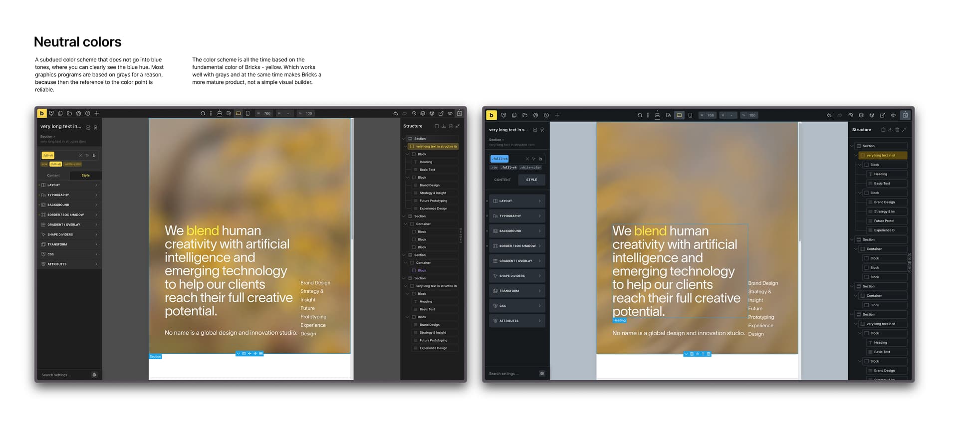
Neutral colors
A subdued color scheme that does not go into blue tones, where you can clearly see the blue hue. Most graphics programs are based on grays for a reason, because then the reference to the color point is reliable.
A subdued color scheme that does not go into blue tones, where you can clearly see the blue hue. Most graphics programs are based on grays for a reason, because then the reference to the color point is reliable.
More compact interface
When you work on a small screen Bricks has really large interface elements. You can make the padding and spacing of many elements smaller to scroll less and get to editing functions faster.
The red box shows how many more elements can be in one viewport height.
Input fields do not have to be one width. They might as well fill the entire free space of the line. In addition, reducing line-height and gap or spacing in general will also give us more space so that more fields are available in a single view.
A more concise structure list, thanks to a smaller height and smaller font size. Less contrasting structure item outlines. Smaller icons for loops, conditions and interactions so they don’t overlap.
Long text in the structure item name is not cut off.
Instead of two columns with elements and large gaps in between, we have a 3-column view without unnecessary spacing. Less scrolling to see the essentials in one view.

More micro-interactions (input states)
Input fields respond to hovering and clearly indicate which field is currently being edited through a yellow border.
Select buttons also change color when hovered over, and a different style than the usual input field immediately indicates that we are dealing with a drop-down list. The buttons are active (the given state is on), and we have a clear indicator which option is selected. Dropdown list is also lower.

Classes and indicators
The color information of the class styling or id element styling should be clearly visible.
All of these changes are possible within what is currently rendered by Bricks in the html structure. I think there should be a distinction when we style id elements - and they are always shown in blue as a element id in the class selector and as a blue little indicator that shows the change.
Similarly, there should be a clear distinction when we style based on classes. then we have yellow pointers and yellow classes in the class selector. then we maintain consistency.
The class selector could also be more separated into colors. We can see which classes are active, we can see what id element we have, we can see what classes we still have to choose from, and which are locked.
This approach should also be reflected in structure items. When we style the item id then the color should indicate the styling by id. (blue or other), and when we style it by class then in the structure we have the item pointed to the color of the class. (yellow)

