Bricks - request for improvements related to UX/UI (currently status: draft)

This is a topic I’m going to use as a container for my suggestions regarding potential UX/UI improvement (this is based on my daily work with Bricks),

Why?
Because sometimes it’s hard to work with the tool (a few headaches during this last month).

Rationale
It’s hard for me to create a new post every time, I spend a lot of time to do it ( frankly for this reason sometimes I decide not to publish), it’s faster for me to edit a post already created.

The current status of this post is DRAFT.

I hope this doesn’t break any forum rules, is helpful and constructive.

Content

  • Color for Focused/Active Elements and Changed Options in the panels: I love the Bricks brand colors, the yellow and black make a great contrast. But I can’t figure out why it’s not used within the tool panels for focused/active elements and changed options. Instead for example of the whitegray color used for the small dot.

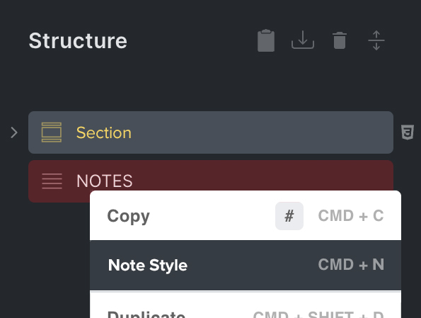
  • Change the icon of the structured panel that indicates the area for moving the element: a square is not clear (looks like a checkbox), when I pass the element the mouse pointer changes shape, please use the same shape, it would draw my attention more and give me a hint about the type of action expected.

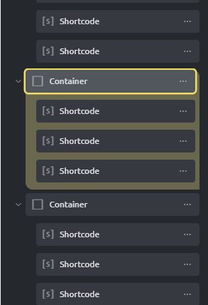
  • Structure panel: add a background color and borders to the elements I’m working on the canvas, it is difficult to work with this panel when the structure of the site becomes complex, this is the style I applied with two CSS rules (I used the yellow Bricks brand color), it is not the best solution but it works:

image

7 Likes

Wow, great post and good suggestion. I’ll also like these improvements included.

1 Like

I don’t know why I’m unable to edit the original post, at this point I’ll continue here:

  • Element Settings/Style: make the element’s default style visible in the style options panel. Let me explain: the container added to the canvas has 100% width set by default, I “as user” want to know that the container has 100% width. I spent 10 minutes (again opening the browser console) figuring out why the container margin wasn’t applying as it should.

What could be the solution? My suggestions:
1- add a description to the single option with the default set by the product.
2- add a placeholder to the field (in yellow color Bricks) with the value

2 Likes

I agree and it would be nice to have more customization options for the structure panel. If you have lots elements it is very cumbersome to manage. Color coding, (option to style it yourself), maybe resizable and it would be super cool if you could detach the structure panel for multiple monitors

1 Like
  • Elements option guide: consider adding a small button with an exclamation mark icon next to the title of the option and when I hover it, the explanation of the command and the default settings will appear. Some options are set by default by the product, users are not aware of them and have to open the browser console to understand the reasons why they expect one result and instead receive another.
1 Like