Hi Team 
I’d like to suggest a few improvements for using Components as Blocks in Bricks:
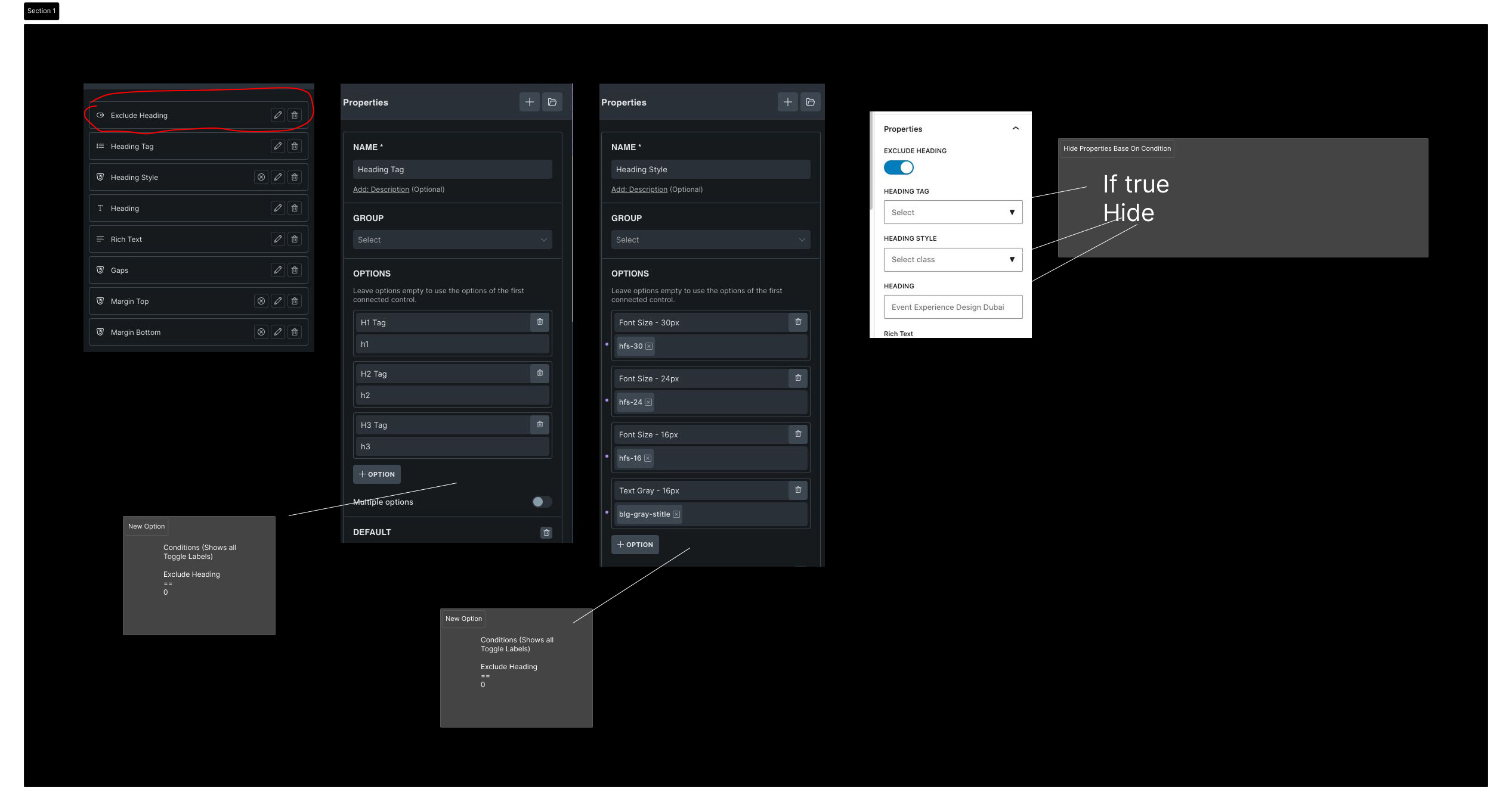
 Conditional Property Visibility (Toggle-Based)
When adding properties to a component, it would be very helpful to have conditional logic for showing/hiding related fields.
Example:
- Exclude Heading (Toggle)
- Heading Style (Text Property)
- Heading Tag (Select Property)
 If Exclude Heading = True, then
• Hide Heading Style
• Hide Heading Tag
If Exclude Heading = False, then
• Show Heading Style
• Show Heading Tag
This would keep the UI clean and prevent unnecessary options when a feature is disabled.
e.g.
 Better Styling Control for Components as Blocks
Currently, the only way to adjust styles such as gap, margin, padding, font sizes, and spacing is by using Global Classes.
However, when using Components as Blocks inside content, we often need different spacing and typography per usage, depending on layout context.
Creating separate global classes for every variation quickly becomes difficult to manage.
Suggested Improvements:
- Allow connecting Text / Number properties directly to styling fields such as:
- Gap
- Margin
- Padding
- Font size
- Line height
OR
- Introduce a new CSS Property Type that allows dynamic control of layout and typography values directly within the component instance.
This would:
- Reduce dependency on excessive global classes
- Improve reusability of components
- Provide better flexibility per block instance
- Keep styling more modular and scalable
This enhancement would significantly improve workflow when building dynamic layouts with Components as Blocks.
 Wrapper Element for Components in Post Content
Right now, when using multiple components as blocks inside post content, they are wrapped by the default Post Content wrapper, and we cannot:
- Add a nestable wrapper component
- Dynamically control spacing between components
- Apply shared layout logic
If we could add a custom wrapper element (similar to how GuternBricks Innerblocks behave), it would be a game changer.
This wrapper could:
- Control spacing between components
- Support the conditional property logic mentioned above
- Allow dynamic layout control
These improvements would significantly enhance flexibility, reusability, and clean UI logic when building dynamic content with Components as Blocks.
Final Note 
If any of the above features already have a proper solution or recommended approach, I’d genuinely be happy to learn. I might have missed something.
Currently, the workarounds I’m using are:
No conditional property visibility
There’s no way to truly hide properties based on conditions. Even if a condition makes a field irrelevant, it still shows. It’s manageable for now, but conditional visibility would make much more sense.
Using many Global Classes
To control spacing, typography, and layout dynamically, I’m creating lots of global classes. It works — but it becomes hard to manage at scale.
No Wrapper Element
Since there’s no wrapper for components inside post content, I’m adding spacing using component margins instead of controlling gap from a parent container.
That said, I truly appreciate how far Bricks has come and the direction the team is taking. The growth and performance focus have been impressive 
These suggestions are just ideas to make an already powerful system even more flexible.
Thanks again for considering