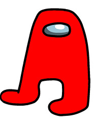
Totally random, but we need a redo on the icon for icon typography, shown in this image:
On first glance, it looked like a male body part (which I won’t name) shown twice. On second glance I thought, “Can’t be that, maybe it’s the index and middle finger pads.” I finally realized it was two uppercase A’s in a rounded font, both rotated slightly.
If you like the A characters, please don’t have them rotated like that!
Anyway, feel free to blush or laugh at this post if you like, but it had to be said!

