#editor-hack #tutorial
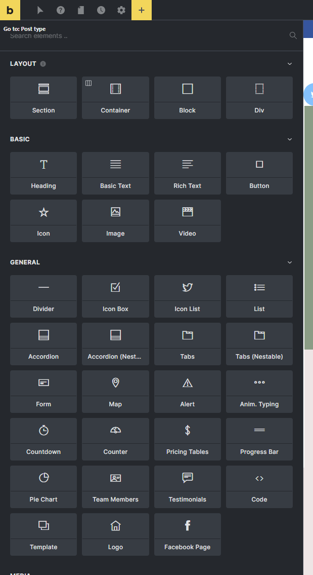
When I work on a large (4K) monitor, the elements panel is quite confusing for me because it contains large boxes, it can have a maximum of 2 columns and you have to scroll a lot in some cases.
That’s why I modified the CSS of the panel a little, so that several boxes can fit in one row in a responsive way.
/* --- Bricks elements panel better grid for big screens */
#bricks-panel-elements .sortable-wrapper {
    display: grid;
    gap: 10px;
    grid-template-columns: repeat(auto-fit, minmax(115px, 1fr));
    margin: 0 0 15px;
    padding: 0 20px;
}