Best practice for space on either side of all screen sizes?

How do I make sure there is a bit of white space on either side of any and all pages and content, on all screen sizes?

I have set a global margin in the past, in the Theme Styles template. Like this:


But that cant be correct, because it only works on the left.

My image and text go right to the right edge of the screen on mobile.
image

How do I do this? What is the best practice?
Thanks in advance!

I may have found the answer.
Theme Styles > Elements > Section > Padding

I suppose that will work always, as long as every element is in a Section.

Does that sound correct?

That’s how i do it.

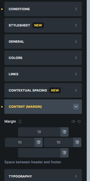
Adding margin to everything like your first post can shift everything aside because of window size rendering, where then the margin is applied to.

Adding margin to the section should push everything inwards, and the section is normally the outer box. (you can put other elements as outer box, but a section is the normal way).

1 Like