The tabs should be closed by default and only open when clicked. It should close again when the same item is clicked, similar to an accordion element.
Using the “Nested Tab Element” for layout creation does not provide an option to close all tabs automatically and also close an open item when clicking on the title.
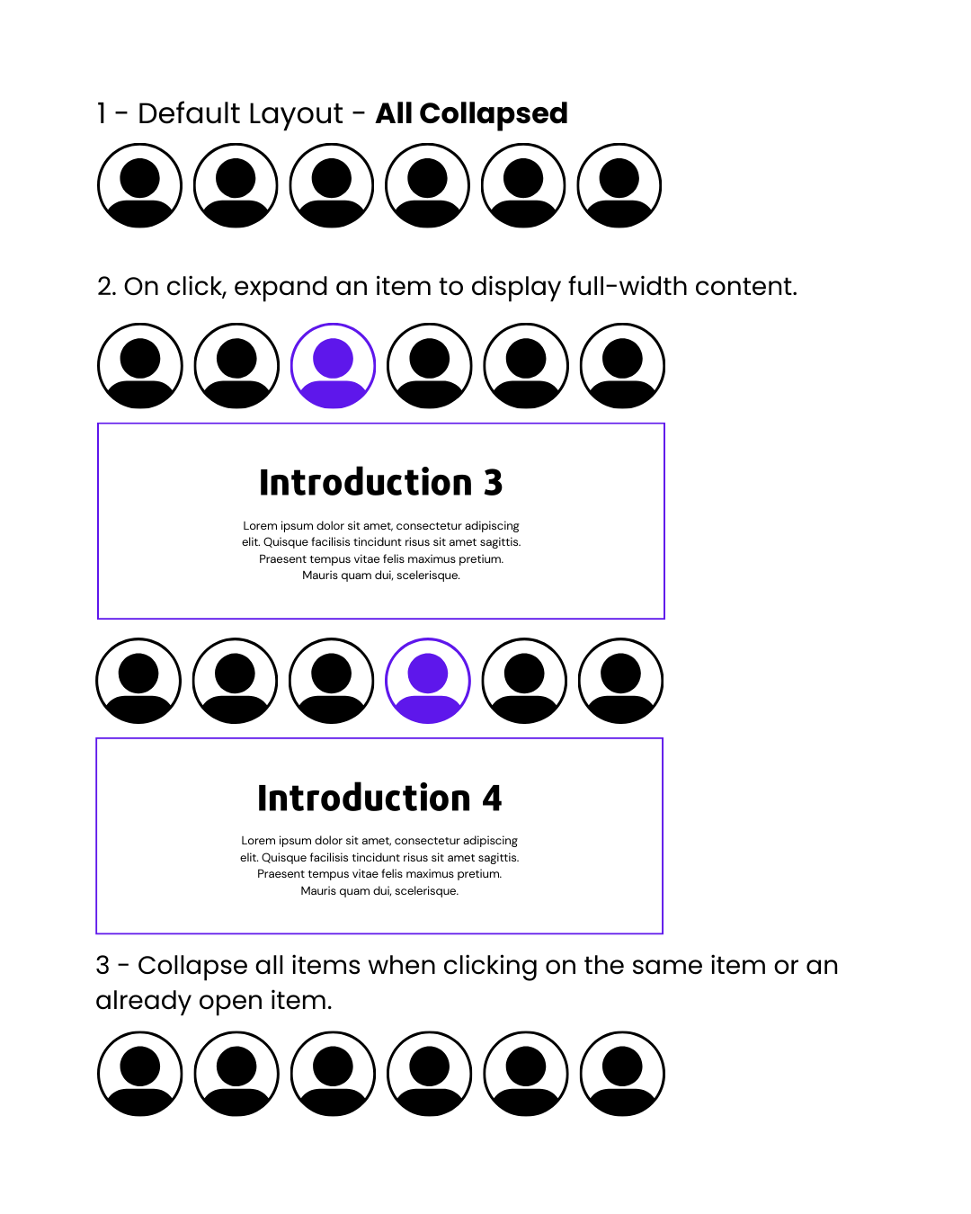
In the accordion element, bricks have the above-mentioned functionality. The accordion items are vertically stacked. I would like the titles to be horizontal and the content to take up the full width.
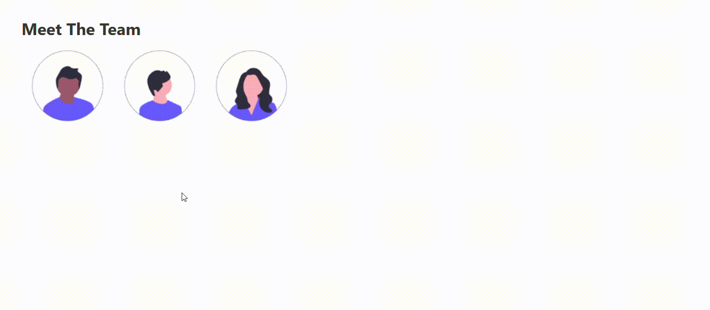
I have attached an image to explain the layout and its functionality.
I have a few questions.
-How to auto-close all the tab items by default and also close the open tab by clicking on the title/image?
-How to set the accordion titles horizontally and load the content in full width below the titles?
Does anyone know how we can make a responsive and functional layout similar to the image I attached?
jQuery(document).ready(function($) {
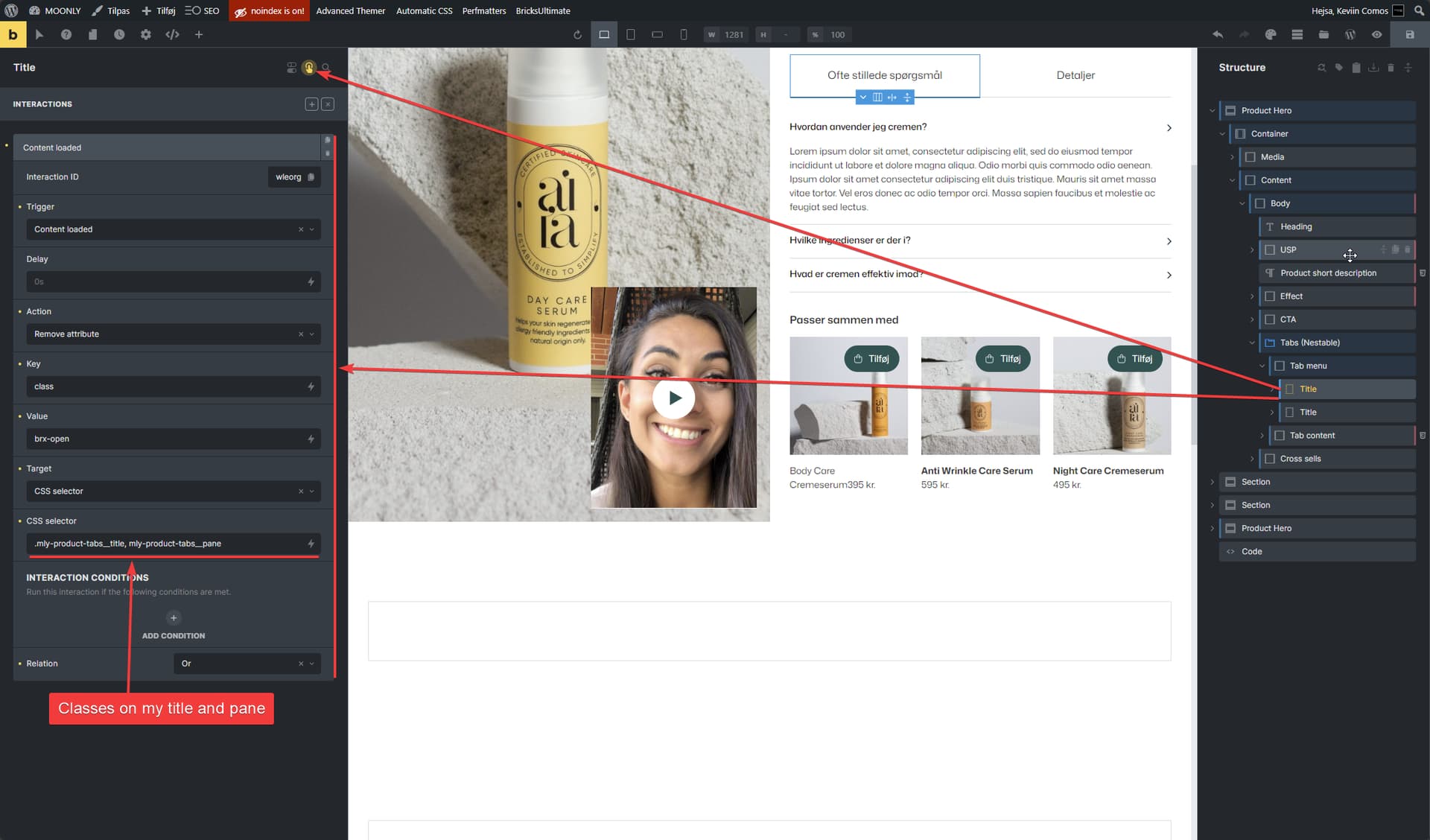
var tabTitle = '.mly-product-tabs__title';
var tabPane = '.mly-product-tabs__pane';
$(tabTitle + ', ' + tabPane).removeClass('brx-open');
});
Closed by default and close on click
Now that you want the tabs to close again on click i recommend to use the below only so you don’t mix’n’match interactions in bricks with code. Can be difficult to maintain and remember.
jQuery(document).ready(function($) {
    var hadClassInitially = false,
        tabTitle = '.mly-product-tabs__title',
        tabPane = '.mly-product-tabs__pane';

        $(tabTitle + ', ' + tabPane).removeClass('brx-open');

    // Capture the initial state using mousedown
    $(document).on('mousedown', tabTitle, function() {
        hadClassInitially = $(this).hasClass('brx-open');
    });

    // Perform the action based on the captured state using click
    $(document).on('click', tabTitle, function() {
        if (hadClassInitially) {
            // Remove the 'brx-open' class from both 'tab-title' and 'tab-pane'
            $(tabTitle + ', ' + tabPane).removeClass('brx-open');
        }
    });
});
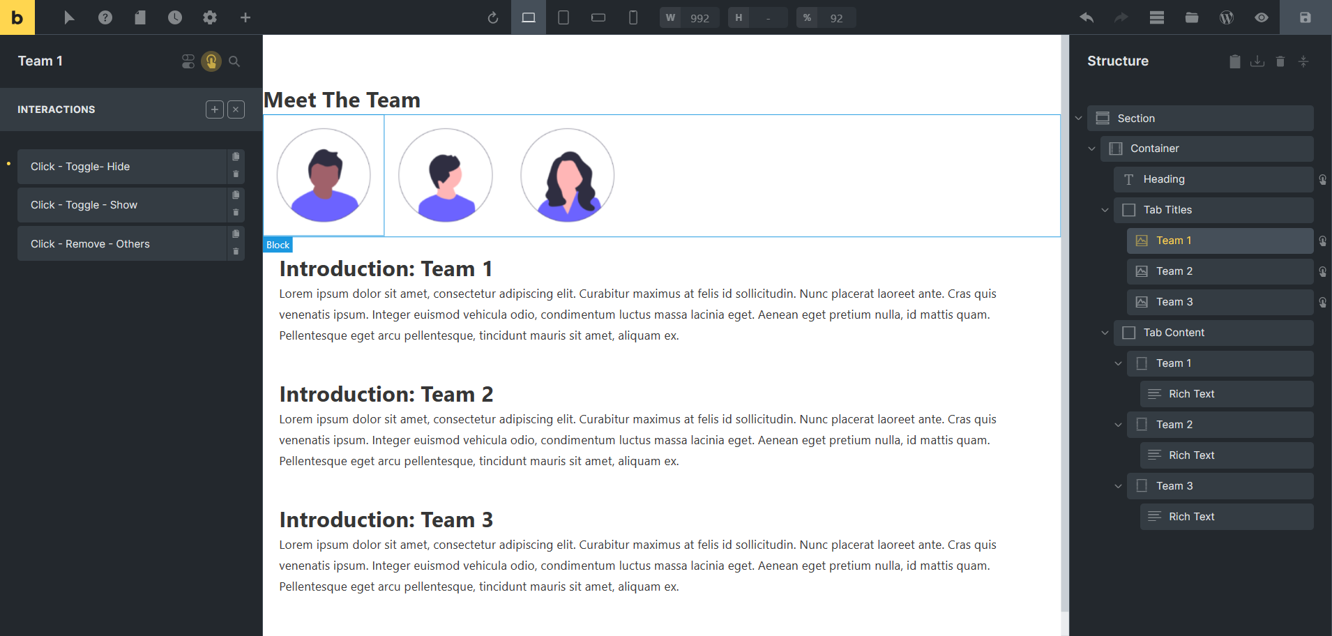
Here are the interactions details:
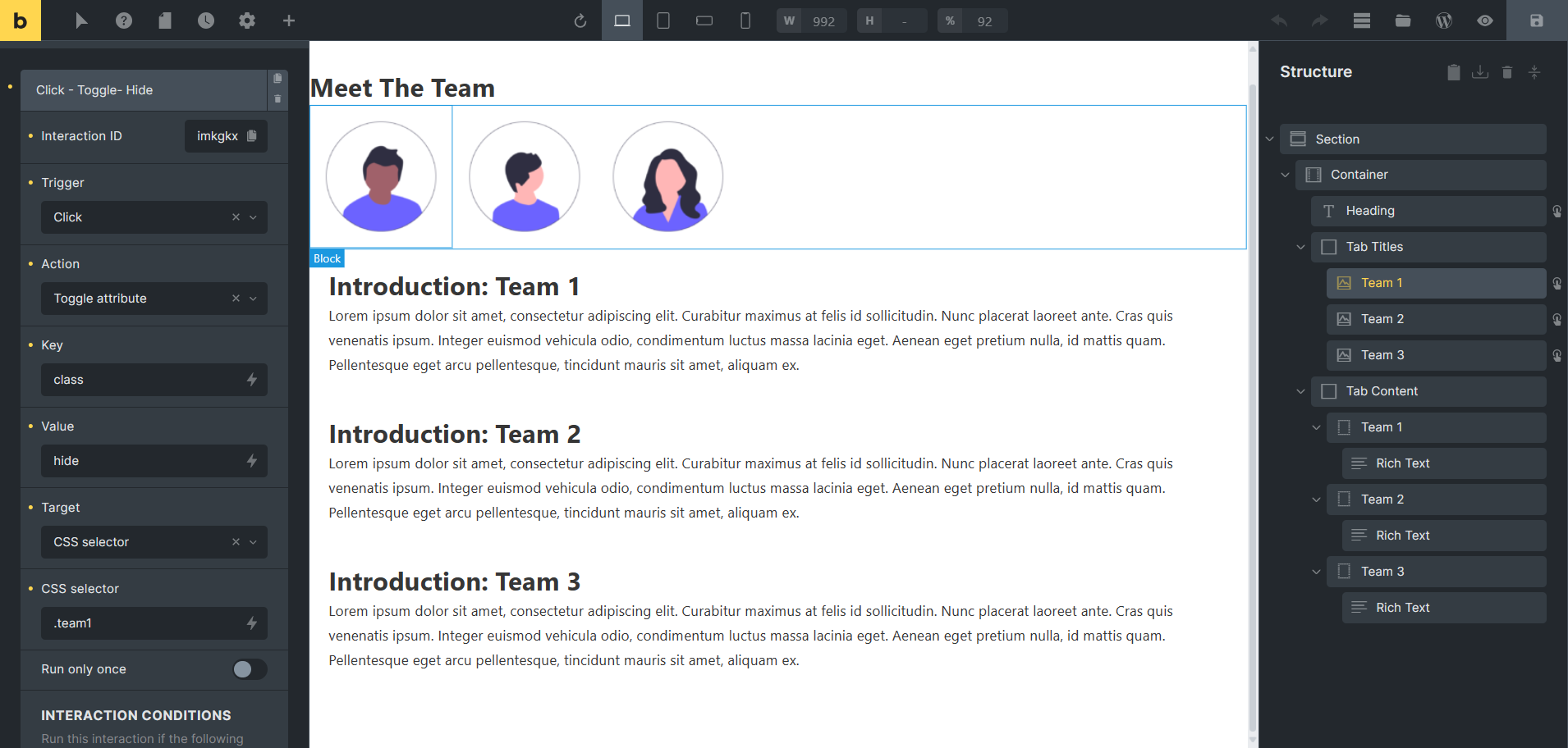
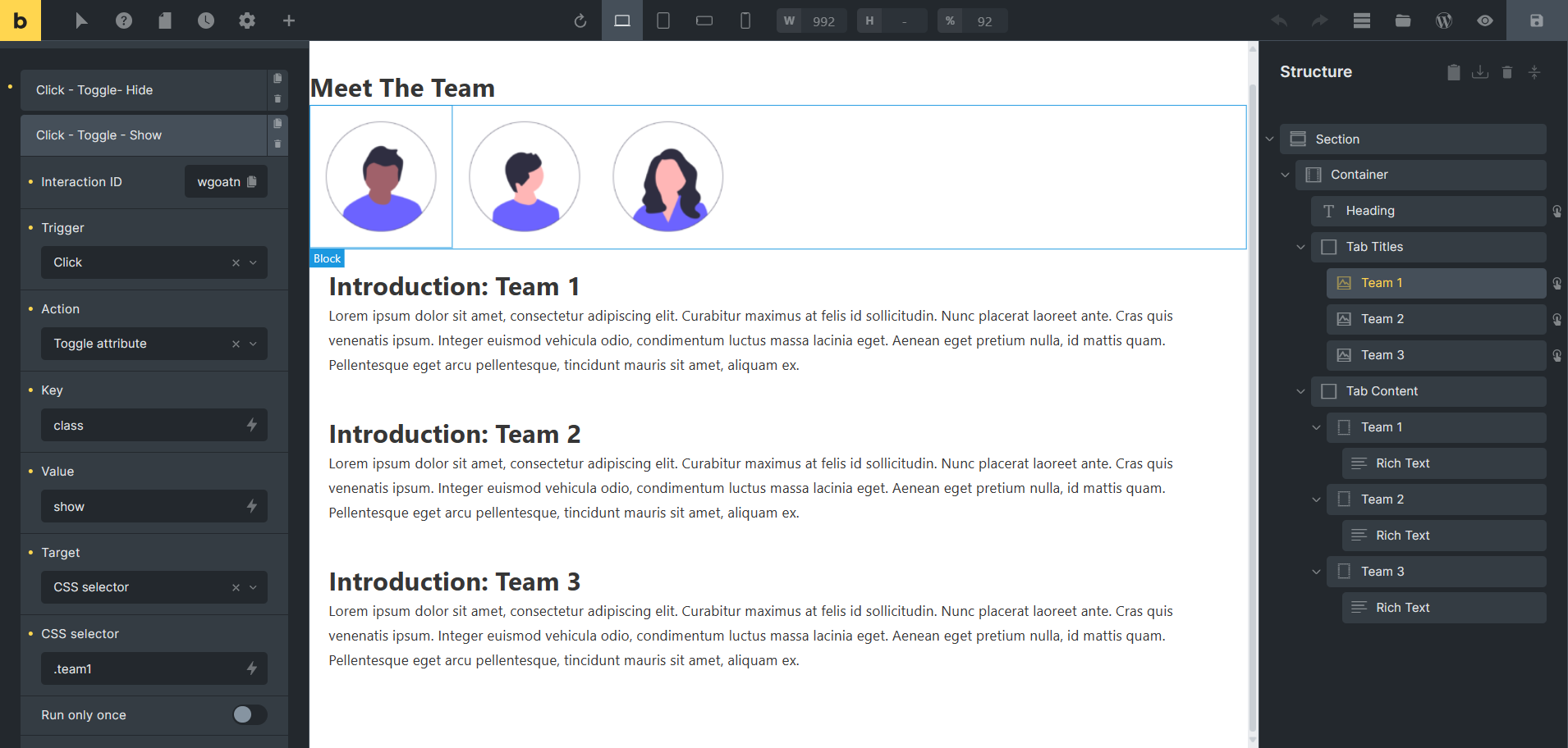
-Hide all the “Tab content” sections when the page loads, using the interaction on the heading.
-Toggle the “show” and “hide” classes on the “Tab Title/Image” when clicked, using the “toggle attribute” interaction. Remove the “show” class from other content tabs by using the “remove attribute” interaction.
Hey This is exactly what I am trying to achieve … can you give us more details how you did it? This would be so great. Maybe some screenshots of your settings. THX
Here are the screenshots of the interactions that helped me to create this section. Please check and let me know if you have any questions; I would be happy to help you.
Thank you so much!!! With your help I was able to solve it!! Thank you so much!! Now I am trying to add some buttons but it´s not as easy as I thought it would be.
Hello,
Forgive my English, it is very poor, can you tell me in your first “screen” on which elements you apply this?
I have little knowledge of css and I am starting with Bricks builder.
Thank you!!!
You need to hide all the elements on loading by using interaction on the heading.
Here are the interactions details:
-Hide all the “Tab content” sections when the page loads, using the interaction on the heading.
-Toggle the “show” and “hide” classes on the “Tab Title/Image” when clicked, using the “toggle attribute” interaction. Remove the “show” class from other content tabs by using the “remove attribute” interaction.
Please check this and let me know if this works for you or you need any help. I would be happy to help you. Thank you
 This is exactly what I am trying to achieve … can you give us more details how you did it? This would be so great. Maybe some screenshots of your settings. THX