Alternating Rows/template query loop

Hi,

I’m working on doing some migrations from E to B and I’m not quite sure how to achieve the following in B.

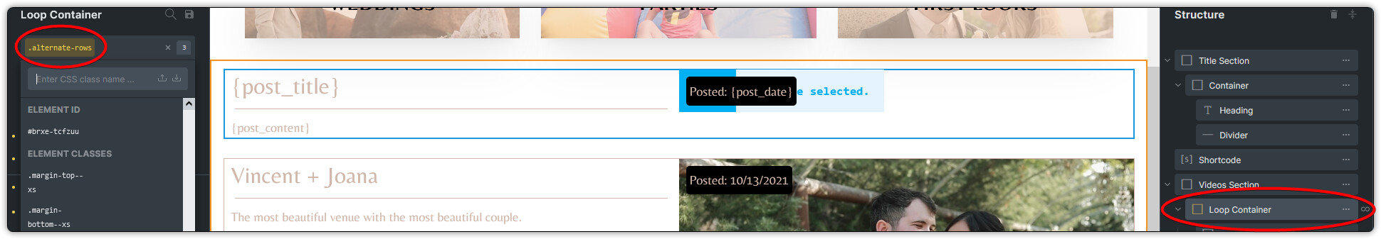
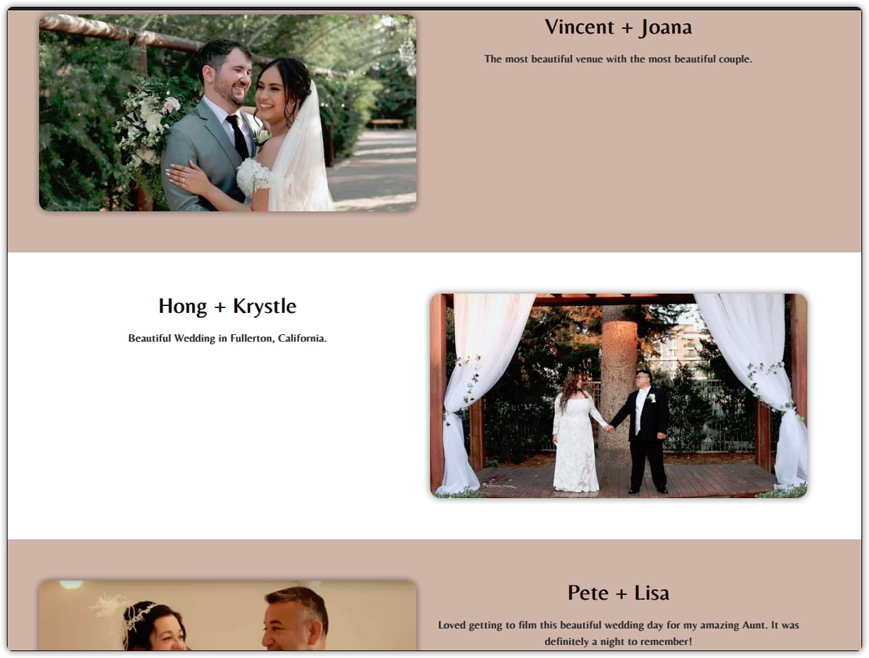
I want to use a single template and have it alternate(reverse) rows. I didn’t see an option for multiple templates, so I presume I’ll have to do it in the CSS, but I can’t for the life of me remember what the CSS is to do it.

On top of this, can I use a single template for multiple categories and have it only show those categories? I can’t seem to see how to have it only show the posts from a specific category if I remove the term. Then it shows all the posts. Can it do that, or do I have to create 3 different templates one for each category. Ugh.

Thanks for any advice.

Lyle

Let says the direct parent element for the left column and right column for each row has a class named myContainer

Assume that myContainer style should be

.myContainer {

            display: flex;

        }

Just add one more css rule as below.

 .myContainer:nth-child(even) {

            flex-direction: row-reverse;
}

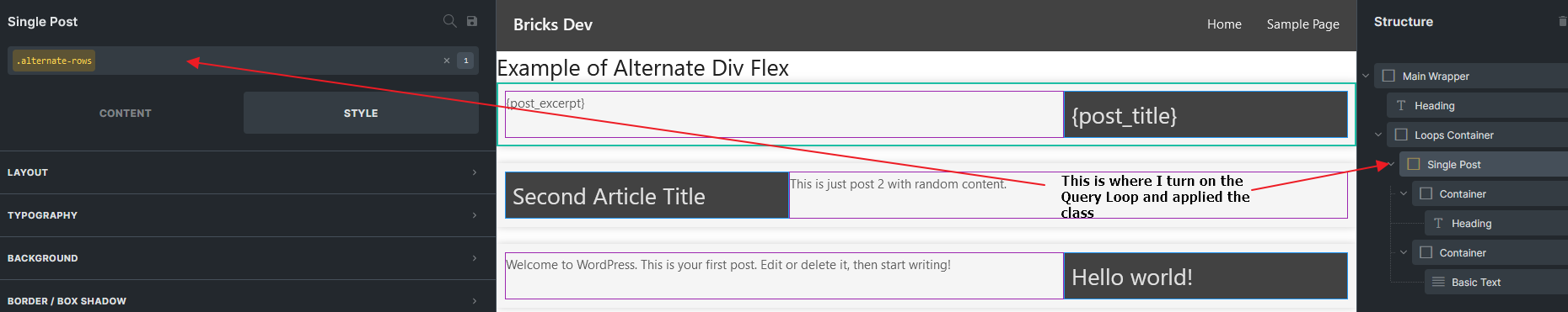
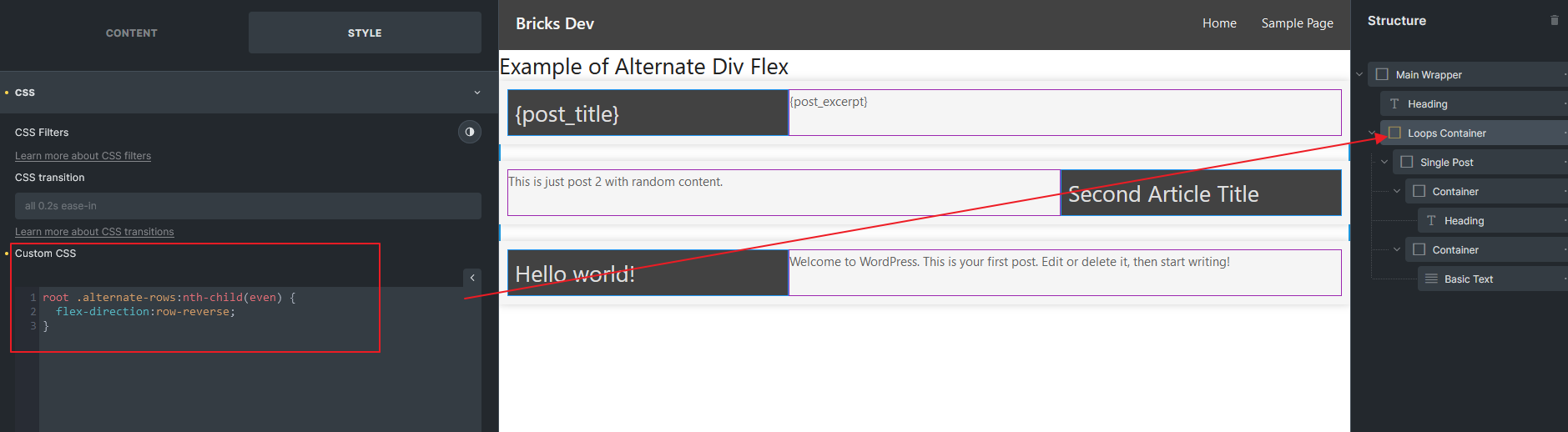
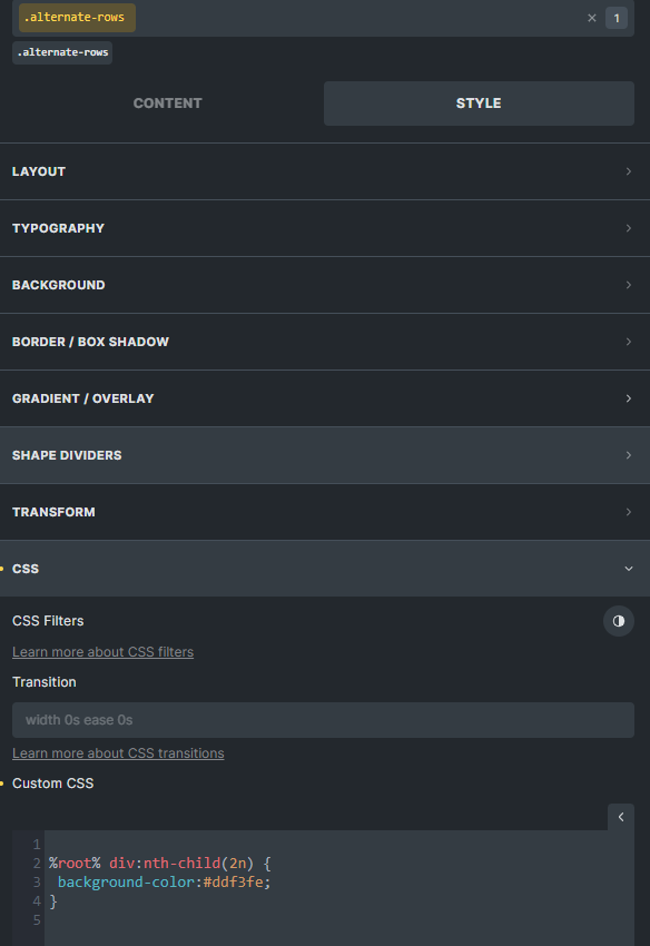
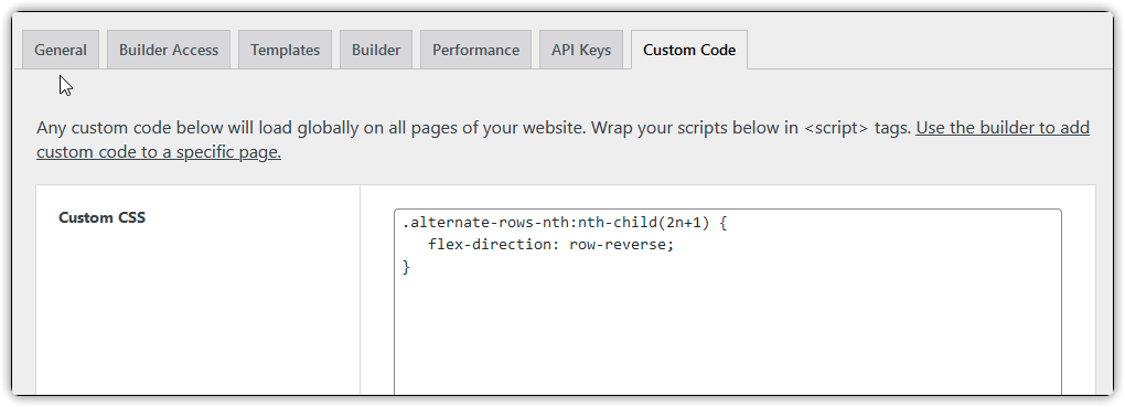
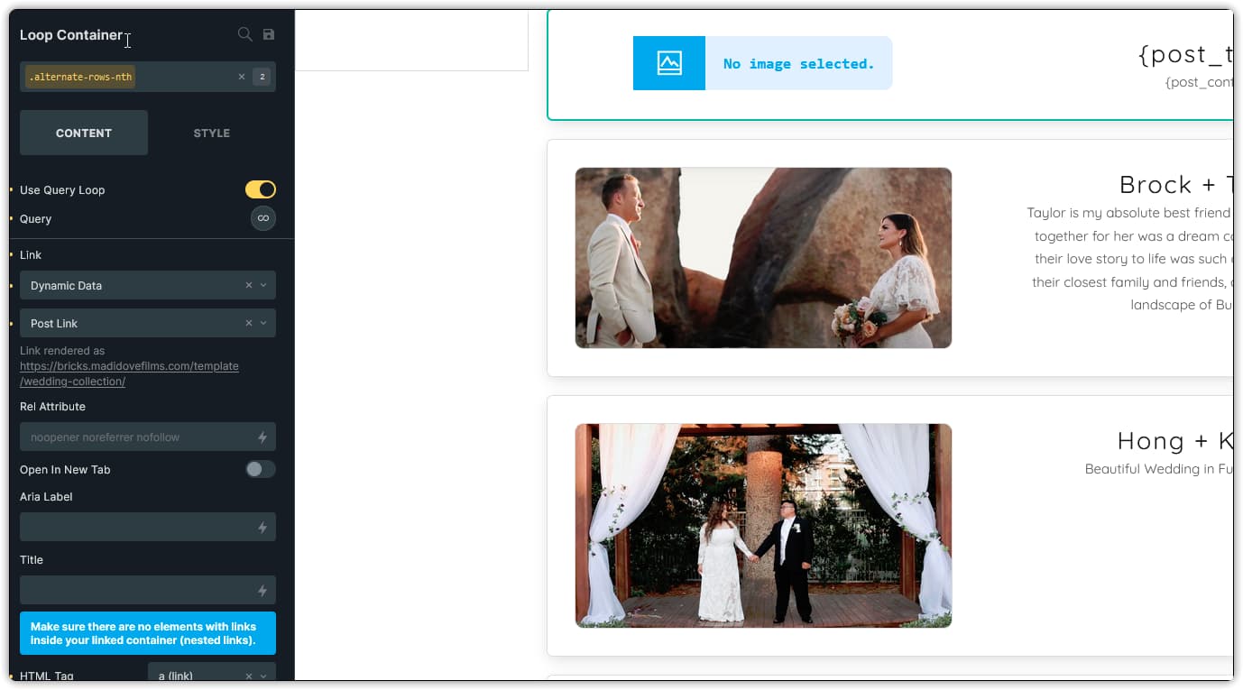
Thanks. I got the code, but I’m probably not putting in the nth line correctly, or in the right location. I’ve tried to add it in custom CSS settings, and directly on the element as a class, and in the elements CSS properties, but it doesn’t appear to work so I guess I’m probably doing something wrong. If I edit the page in Dev tools and add it manually, it works. This is on a query builder div that I’m trying to do this. Here’s some images…


1 Like

If you could provide a public accessible URL, I could take a look and see if can help :slight_smile:

@itchycode Sorry, had a slight sidetrack for a while on this. Here’s my test page I made.

https://stage.madidovefilms.com/template/video-test-layout/

I have this in my settings → CSS

.alternate-rows:nth-child(even) {
flex-direction: row-reverse;
}

And I have the class attached to my loop container.

Tried to work this out on my own for the last week, but I’m not getting it.

Hi, the link is not accessible.

May I know are you turning on the Use Query Loop on the Loop Container with .alternative-rows class div?

If yes, you should select the Video Section (The loop parent), and in the Style CSS field, try this

root .alternate-rows:nth-child(even) {
	flex-direction:row-reverse;
}

That did it putting the CSS in the parent container. I’m curious why I can’t add it to the custom CSS area in the settings though?

If you want to put into settings custom CSS field. You just need to inspect the parent ID #brxe-xxxx or add a class to the parent then write like this.

/*Bricks ID way*/
#brxe-xxxxx .alternate-rows:nth-child(even) {
	flex-direction:row-reverse;
}

/*Class way*/
.alternate-rows-parent .alternate-rows:nth-child(even) {
	flex-direction:row-reverse;
}

@itchycode One more question on this if I may. How can I ‘remove’ the alternate at a specific break point. I’m wanting it to revert to a stacked view, but it appears to still be using reverse-row in the smaller breakpoints so it doesn’t look quite right and I’m not sure how to ‘not’ use that. I tried going to the smaller break point, and removing the class, but it removes it for the entire element at all breakpoints.

Thanks,

Try example below.
Means only activate the CSS rules if the screen width bigger than or equal to 1024px (target only desktop)

You could go search for media query in google for more tutorials :slight_smile:

/*Bricks ID way*/
@media screen and (min-width:1024px) {
	#brxe-xxxxx .alternate-rows:nth-child(even) {
		flex-direction:row-reverse;
	}
}

/*Class way*/
@media screen and (min-width:1024px) {
	.alternate-rows-parent .alternate-rows:nth-child(even) {
		flex-direction:row-reverse;
	}
}

I am using Grid–6 from ACSS… Will this work the same ?

Hi John,

I am sorry that not familiar with that CSS class.
You could provide your URL in the reply and elaborate what or which part you wish to achieve.
We will assist.

Regards,
Jenn

Itchycode - I have used your above advice in my site, however I am having a strange result.

This is my structure:

image

I have applied the class to the Domestic Parent container:

This is the result:

It is good except for the entire middle column having the blue background.

Any ideas?

Thank you.