Hi, I followed the tutorials from Cracka YouTube on how to make alternate overlapping columns (with CSS root:nth-child(even)) and it worked. But when I tried to do the same with(in) a query loop, it didn’t work. Anyone who can think of a solution?
My best bet would be that you’re targeting odd and even on the wrong element or didn’t put the wrapper div in front of the selector. If you can share a link to the site we can figure it out pretty quickly 
Hello manc, nice of you to have a look. This is the site Blog – Hypnosis
Haven’t seen the video so not entirely sure what the desired outcome is but in order to target even or odd posts you’d need to set the :nth-child selector on the li items of the ul which is .bricks-layout-wrapper. I’m assuming you’d like to switch up the layout within the .bricks-layout-inner div.
To target that inner div for even or odd blogposts, you’d use something like this:
.bricks-layout-wrapper li:nth-child(even) .bricks-layout-inner {
    background: firebrick;
}
Hope it helps but if not, feel free to post back
Thanks for the reply. The first image shows the desired output

The second image is the structure in the backend.
and the CSS in the container is: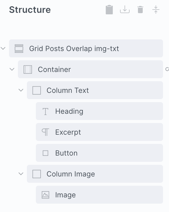
@media (min-width:478px) {
root:nth-child(even) .grid-overlap–card {
grid-column: 6/-1;
}
root:nth-child(even) .grid-overlap–bg {
grid-column: 1/9;
}
First of all you’re missing a hyphen in your class names 
.grid-overlap–card should be.grid-overlap--card, same for the overlap–bg class.
via inspector, doing this:
section#brxe-86a4ec .grid-container--overlap:nth-child(even) .grid-overlap--card {
    grid-column: 6/-1;
}

section#brxe-86a4ec .grid-container--overlap:nth-child(even) .grid-overlap--bg {
    grid-column: 1/9;
}
results in at least having somewhat of an alternating layout:

Now I’ve been too comfy with flexbox to ever do a grid deep dive but changing the values like so:
section#brxe-86a4ec .grid-container--overlap:nth-child(even) .grid-overlap--card {
    grid-column: 1/6;
}

section#brxe-86a4ec .grid-container--overlap:nth-child(even) .grid-overlap--bg {
    grid-column: 11/4;
}
results in:

so in theory, this should do the trick:
root:nth-child(even) .grid-overlap--card {
    grid-column: 1/6;
}

root:nth-child(even) .grid-overlap--bg {
    grid-column: 11/4;
}
Hope it works even if it’ll most likely require some further tweaking
This worked! Many thanks for looking into this.
