Hi @thomas
I always feel like I lose track of active elements due to the high volume of grey UI.
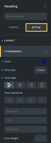
Here is a screenshot of my recommended improvement by adding the yellow accent to track active UI elements as well as change the yellow dots to blue to help with contrast:
2 Likes
Yes. And the equivalent in Light mode too please.
thomas
September 29, 2022, 6:55am
3
Welcome to the forum, and thank you so much for this suggestion, Nathan.
It’s one of those builder UI changes that is best addressed on the individual installation. As we won’t implement it in core.
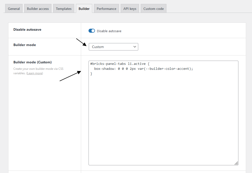
You can accomplish it via the following CSS:
#bricks-panel-tabs li.active {
  box-shadow: 0 0 0 2px var(--builder-color-accent);
}
2 Likes
Wario
September 29, 2022, 1:38pm
4
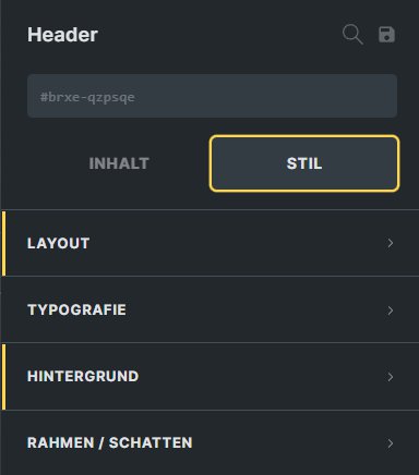
i did the same thing
#bricks-panel-tabs li.active {
    box-shadow: 0 0 0 2px #ffd64f;
    }
.bricks-panel-controls .has-setting .indicator {
    border-radius: 0px;
    height: 50px;
    width: 2px;
    margin-left: -16px;
	background-color: #ffd64f;
	}
1 Like
Would it possible to add this as an option in the builder settings where the user can choose either the standard grey or yellow?
I guess the purpose of Custom Builder Mode is for everyone to have their own preferred style.
3 Likes
Ah! I forgot about this option! This is much better than a switch, I agree. Thanks!
Here is my recommended code. It has helped a lot for me regarding UI:
.control-group.open .control-group-title { border-left: 3px solid var(--builder-color-accent); }

.control-group .control-group-title { border-left: 3px solid #ffffff00; }

#bricks-structure .element.active>.structure-item { outline: 1px solid var(--builder-color-accent); }

#bricks-panel-tabs li.active { box-shadow: 0 0 0 2px var(--builder-color-accent); }

.bricks-panel-controls .has-setting .indicator { background-color: #0D98BA; }
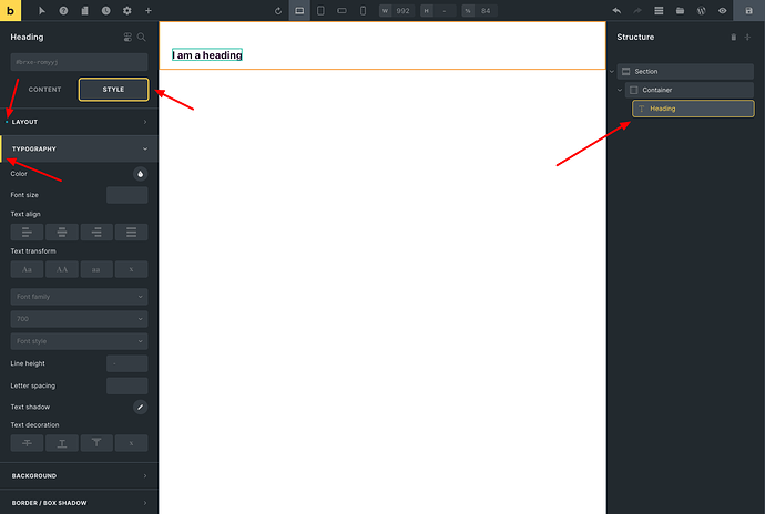
Thanks, Thomas. Here is the code I implemented on my installation. Try it out sometime and let me know what you think!
.control-group.open .control-group-title {
border-left: 3px solid var(--builder-color-accent);
}
.control-group .control-group-title {
border-left: 3px solid #ffffff00;
}
#bricks-structure .element.active>.structure-item {
outline: 1px solid var(--builder-color-accent);
}
#bricks-panel-tabs li.active {
box-shadow: 0 0 0 2px var(--builder-color-accent);
}
.bricks-panel-controls .has-setting .indicator {
background-color: #0D98BA;
}
Can you share a screenshot of what this makes the UI look like?
1 Like
It’s very subtle, but effective.
2 Likes


