EDIT: Thank you very much: Color variation swatches are keyboard accessible now. BTW, shouldn´t there be a visible label for the color swatches near the swatches to be EAA/WCAG 2.2 AA compliant? As far as I know color-swatches alone aren´t enough (WCAG 1.4.1 - Use of Color).
FR: Maybe there is a way we could also show the color-swatches inside of the standard dropdown (select) with the color swatch left of the color-name → this would make it “EAA proof”?
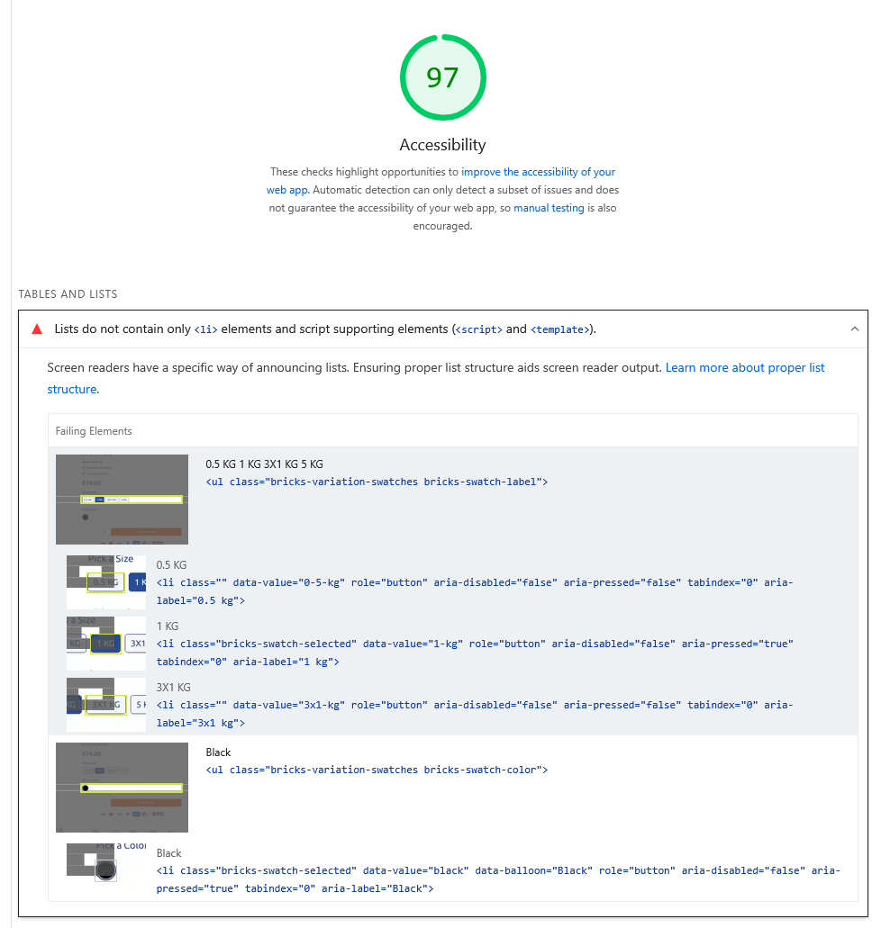
I think this is related, so I won’t make a separate post. But @timmse maybe this should be in the Bugs section? Because after today’s 2.3.3 update, the PageSpeed Insights accessibility score went down.
Hi @Patrick ,
It’s almost impossible to follow your initial post, since you’ve edited it a whopping SEVEN times…
BTW, shouldn´t there be a visible label for the color swatches near the swatches…
Not that I know of—the aria label should actually be sufficient. If you have a reliable, clear source on this (accessibility feels always a bit vague, at least to me), please let us know.
That’s not possible right now, but it shouldn’t be a requirement for meeting a standard. That would really limit you in terms of layout, wouldn’t it?
––
Hi @drigis3, it’s not related since this thread is or was about keyboard accessibility – not about the structure itself. Please create a bug report in the bugs category.
thanks for the clarification. Sorry for editing my post as often.
WCAG 2.2 AA says: “Color is not the only way of distinguishing information.” That means communicating colors with color-swatches only is not compliant with the European Accesibilty Act/WCAG 2.2.AA. Understanding Success Criterion 1.4.1: Use of Color | WAI | W3C
I would be curious what you guys think about this. Am I wrong?
People who doesn´t use screenreaders BUT are color-blind have problems recognising the true colors (therefore it should also have a text-description). And the hover-tooltips aren´t enough, because it shouldn´t rely on hover events to show further infos. I am sorry for being such a pain in the ass with this - but if penalties from the EU are that high I just need to be a stickler with such things. SORRY
It certainly depends on how one interprets the WCAG accessibility principles in this case. Personally, I would consider them met, but as I said, I find this topic extremely vague in general…
That’s why I’m asking you again for specific sources, ideally ones that address this exact use case.
I don’t think there is much room for interpretation here. According to WCAG 2.2:
SC 1.4.1 (Use of Color):”Color is not used as the only visual means of conveying information, indicating an action, prompting a response, or distinguishing a visual element.”
Application: Our color swatches intrinsically use only color to communicate the product options and trigger an action (selection). Without a visible text label, we rely solely on color, which fails this criterion.
Level A Requirement:“Success Criterion 1.4.1 prohibits using color alone to present meaningful content or instructions.”
Application: Choosing a product variant is “meaningful content.” A user with color-blindness cannot distinguish between similar shades (e.g., Dark Grey vs. Black) without a secondary visual cue like text.
Industry Standard:WebAIM explicitly discusses this in their Contrast and Color Accessibility guide. They highlight that for users with color-blindness, a scenario where only color is used to communicate options is a direct barrier.
WebAIM: Contrast and Color Accessibility - Understanding WCAG 2 Contrast and Color Requirements → in this link at “1.4.1 Use of Color” you will find an example who discusses the use of color with colorblind users and that color alone is not enough to communicate a state. From the Website: ”In this table of school assignments, the only indication that an assignment is missing or late is a background color. This is inaccessible to someone who is blind, and it may be confusing or inaccessible to someone who is colorblind or overrides page colors. This fails 1.4.3.”
I am SO SORRY for stealing your time. I would wish for this being more a best-practice guidline than required by law.

 Sorry for editing my post as often.
