Taking feedback ![]()
2nd Bricks Site. I had to development this site really quickly. Loving how rapidly I can develop with Bricks over other builders.
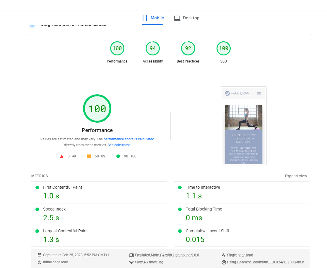
Great Core Web Vital score too.
Taking feedback ![]()
2nd Bricks Site. I had to development this site really quickly. Loving how rapidly I can develop with Bricks over other builders.
Great Core Web Vital score too.
Good job! Site looks very clean.
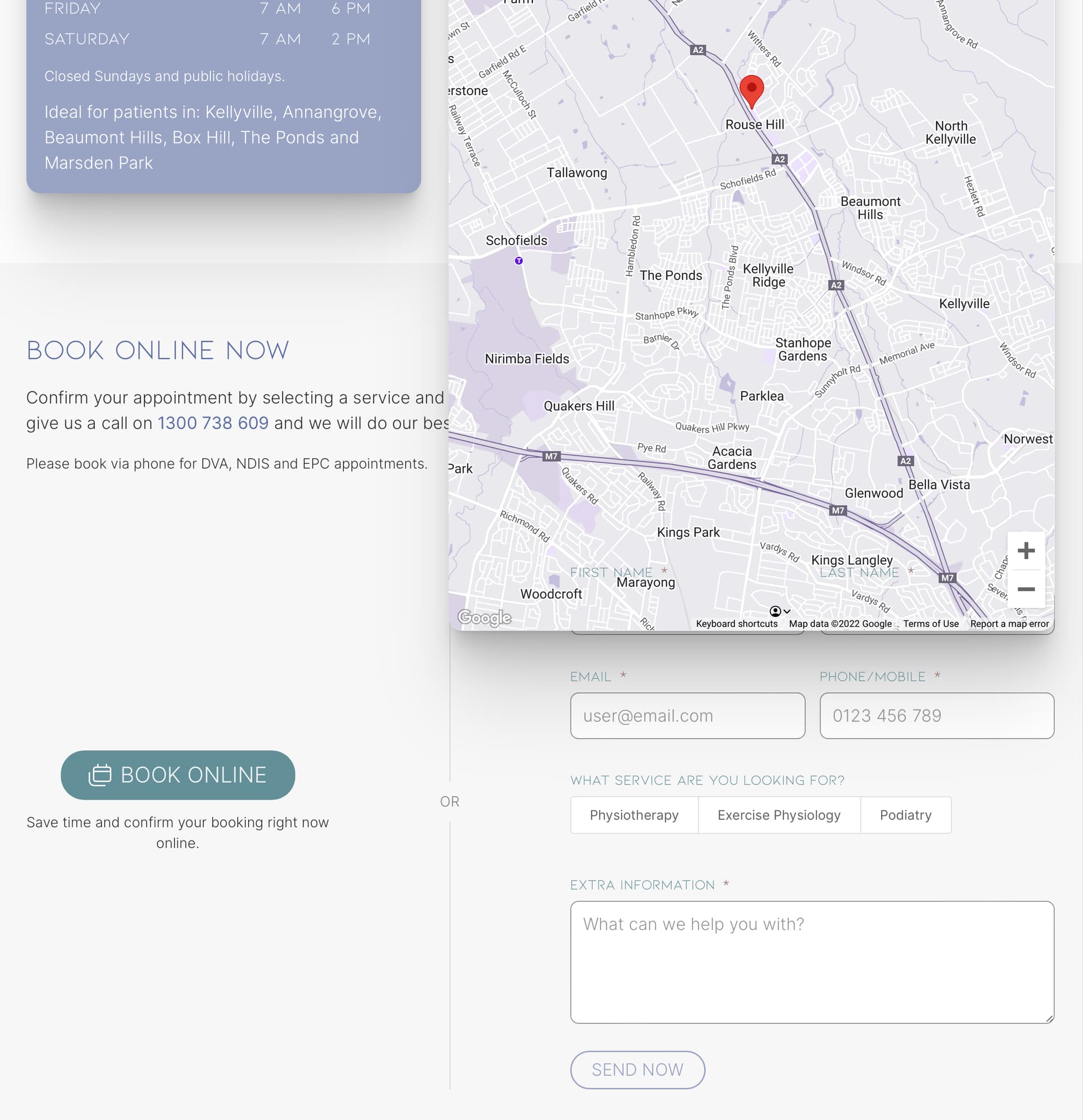
Only remark I can make is that the google map covers the form in dekstop view. Not sure if it’s only for me. I attached a screenshot of the issue. Viewed on: Safari 16.1 - Ventura 13.0.1
Edit: only appears to be a safari issue, looks good on brave and firefox
Good pickup! I fixed that, just needed to wrap the Map in a Div.
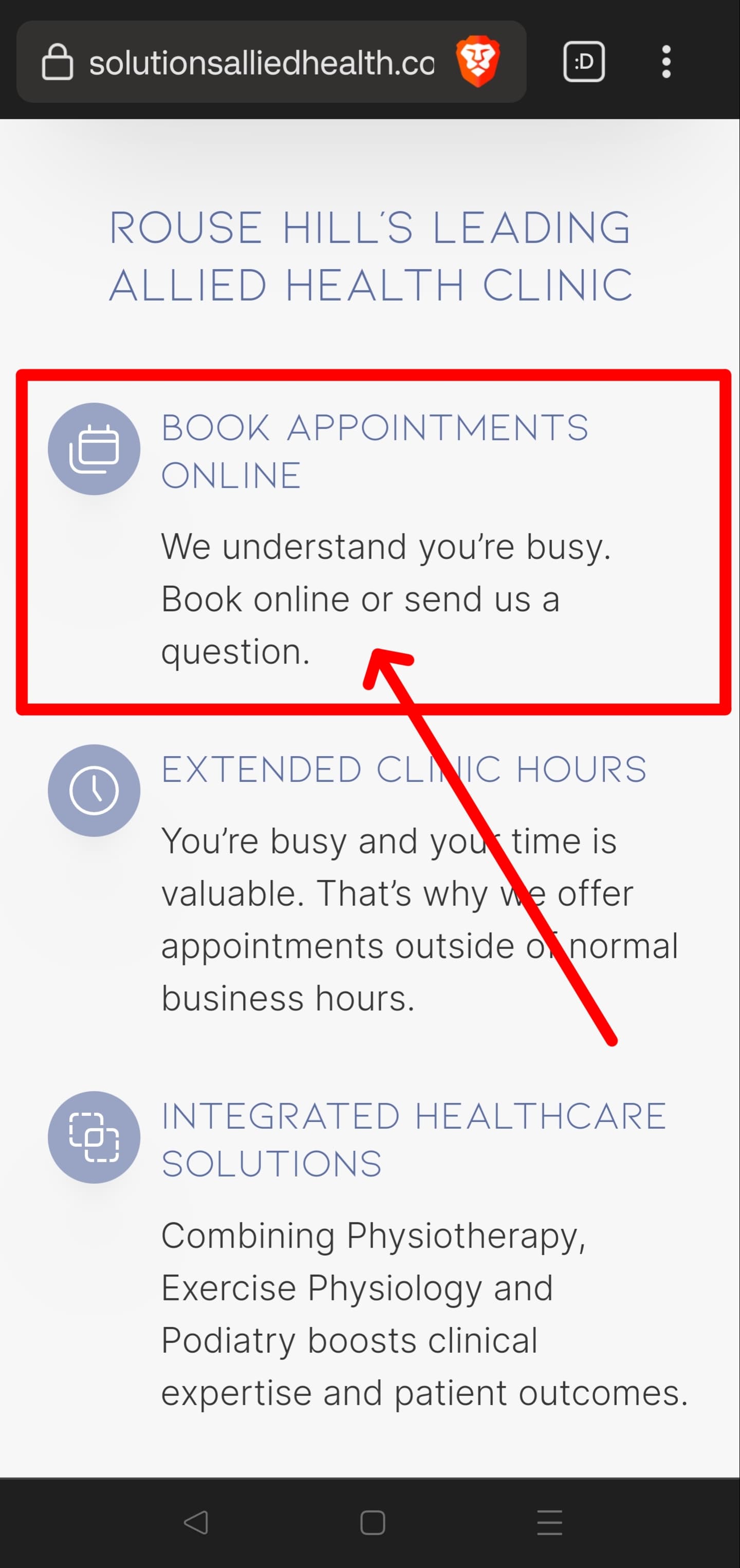
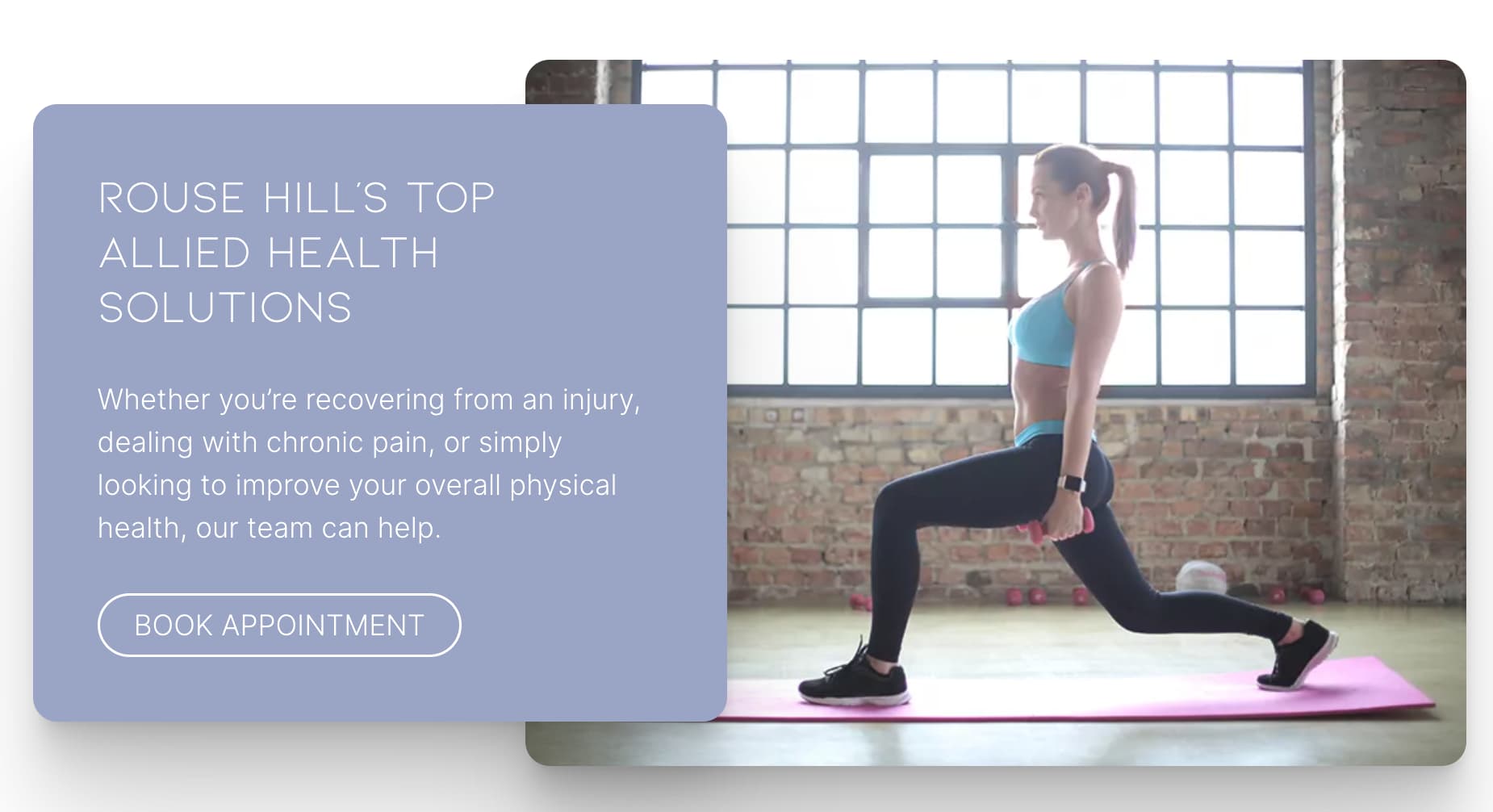
This is a usability suggestion, but I absolutely expect a link at a section such as this. It’s a missed opportunity to basically list a CTA without enabling it. Both “book online” and “send us a question” should be links.
That’s great feedback. Thank you.
I have made that change.
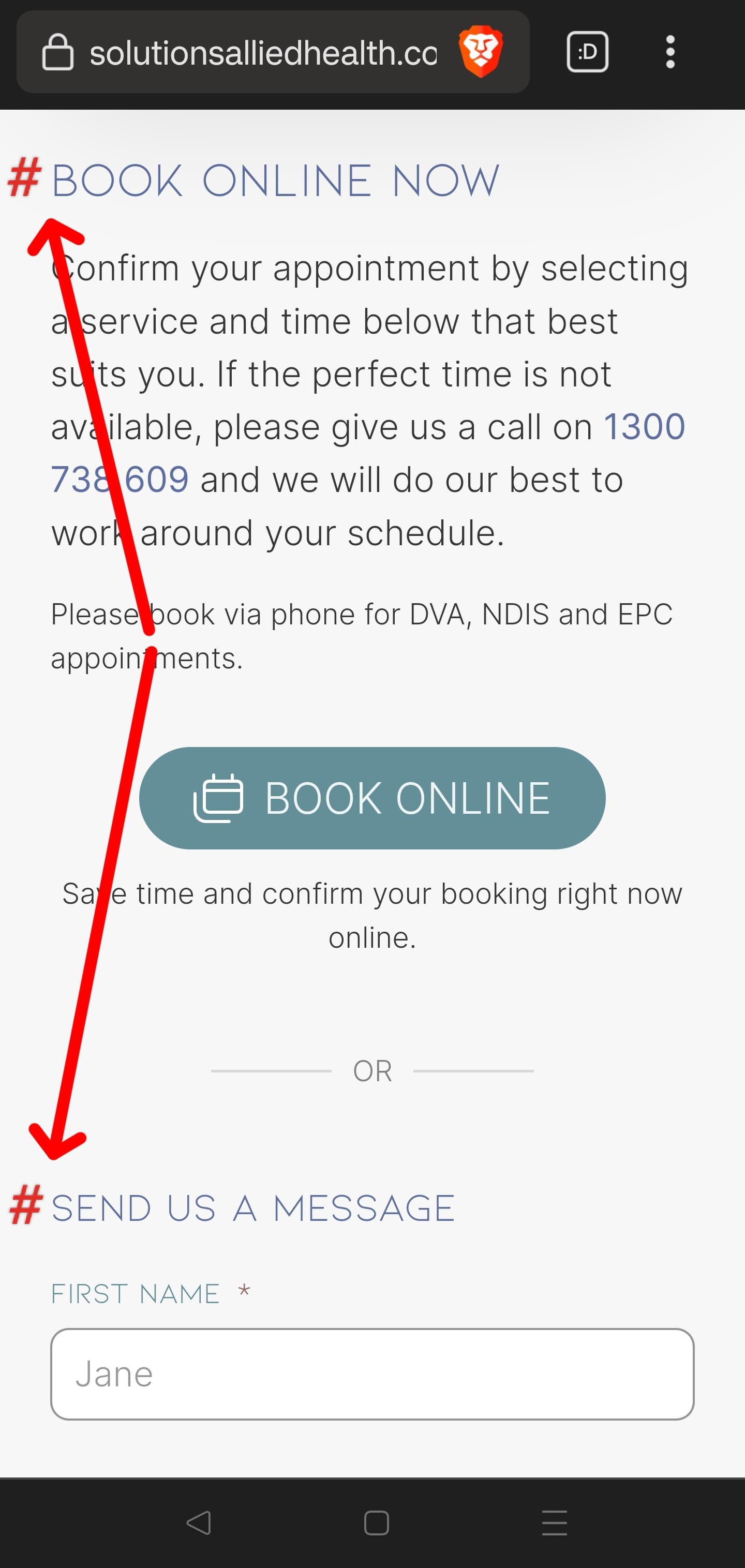
Me again. Additional suggestion for the same issue: instead of a single link, I would make each of them separate links to separate anchors on this page.
So a link to “book online”, and a separate link to “send us a message”, and then on the target page add an anchor to each heading. This way if a visitor wants to do either of those actions they’re taken directly to that section without any flow resistance.
Got it. Thank you mate.
Nice work! Looks great!
Hey the site looks great. Nothing too fancy and it still looks amazing.
Love it Pixite! And a fellow Aussie as well ![]() Looking forward to building some Elementor sites soon in Bricks!
Looking forward to building some Elementor sites soon in Bricks!
Nice site. Only suggestion is that I would make the body text just a tad smaller. May I ask you how you got the blocks to overlap in the top hero section? I like how it looks and how it responds.
It uses a grid with a 6 grid layout. The first column set span 3, then the second column set span 4 and starts at 3rd col.
The site looks really clean and nice. ![]()
![]()
![]()
A little feedback.
The map on the appointment page is not draggable. When I zoomed the map, I couldn’t find the pinned location as I couldn’t drag.
Good catch. If they really want to be centred, then make them centre aligned.
Hey @jornes,
What is the appointment system in this project?
Hi @hosi
I just checked they are using this.