Dear Community,
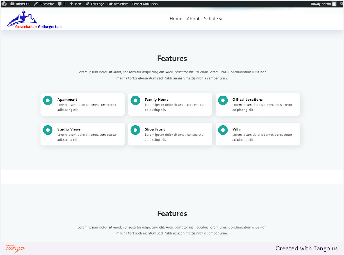
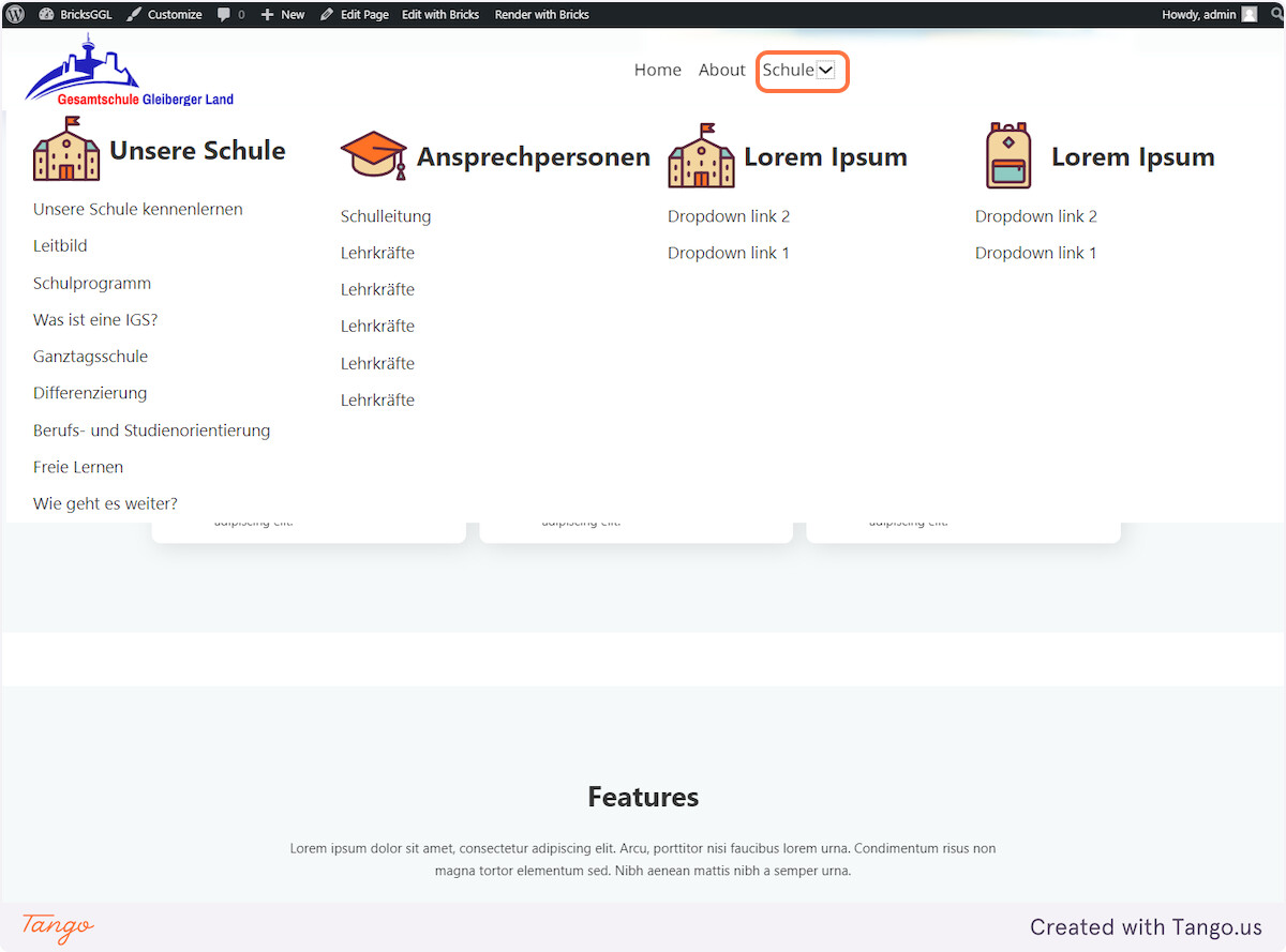
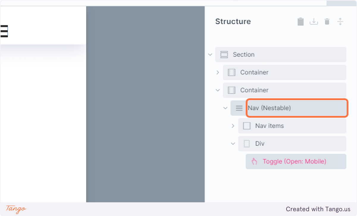
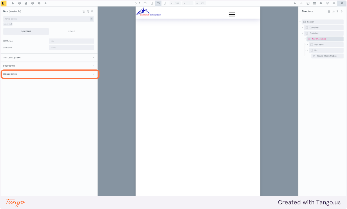
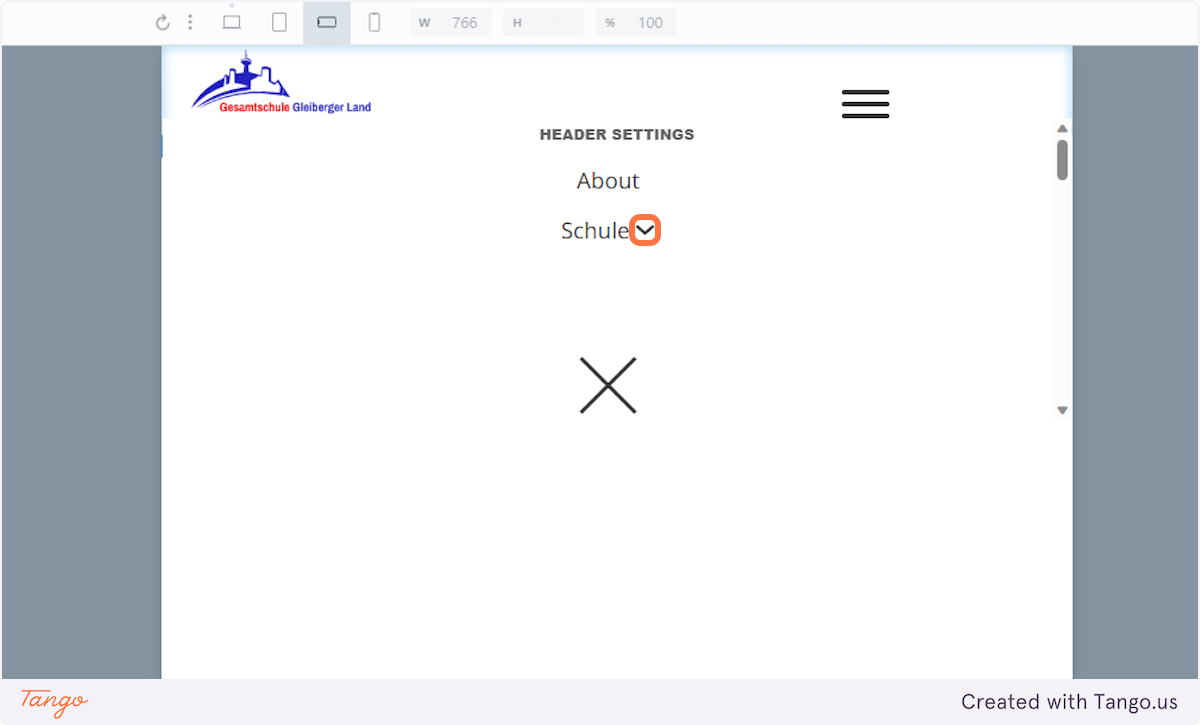
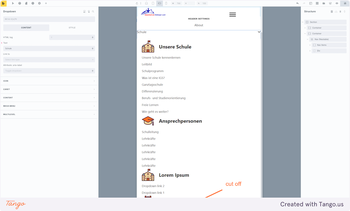
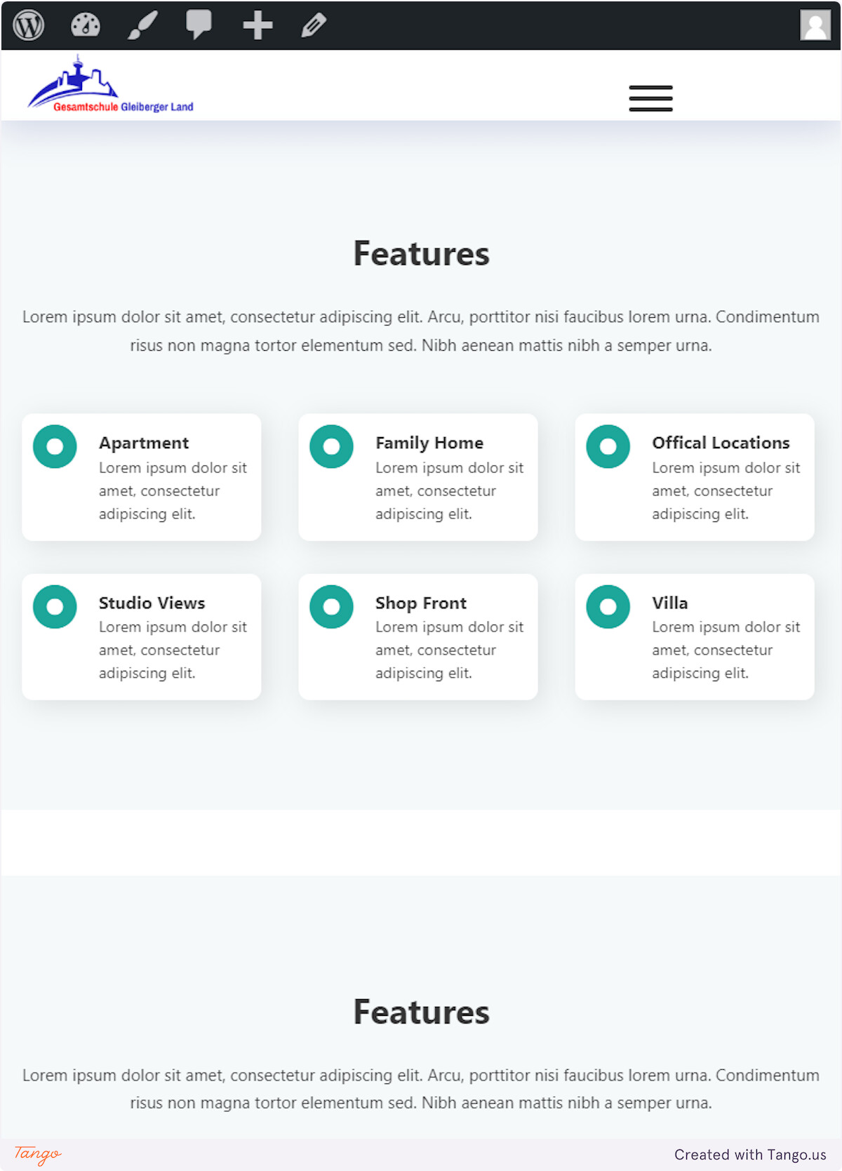
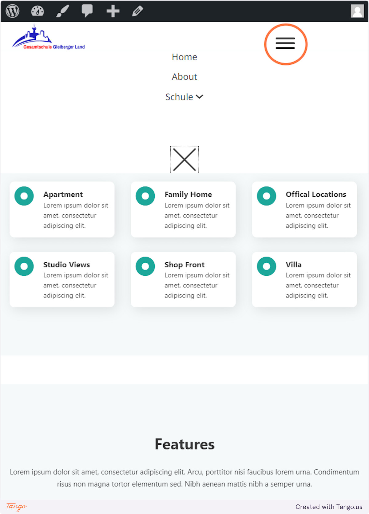
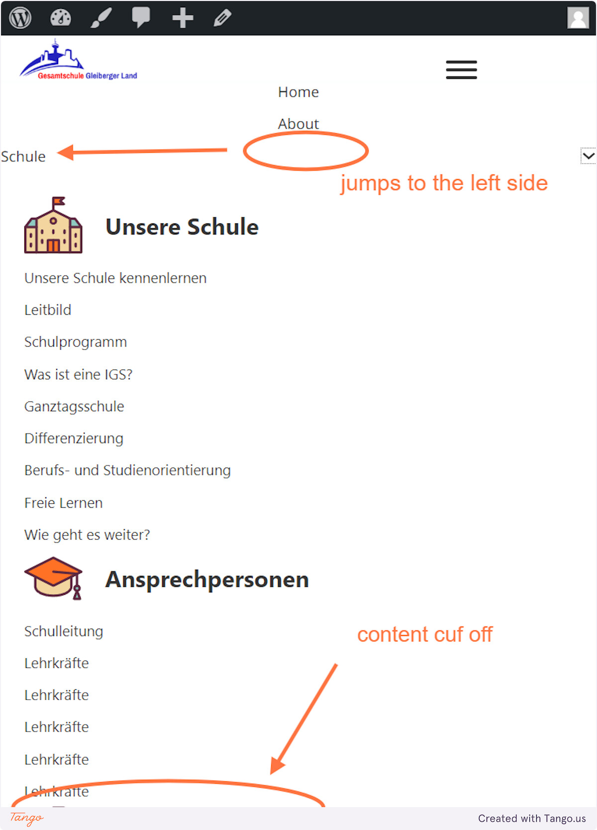
I can’t manage the styling of the Mega Menu to the Mobile Menu. In other words, I can’t get the columns of the Mega Menu to display correctly in the Mobile Menu.
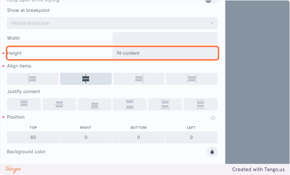
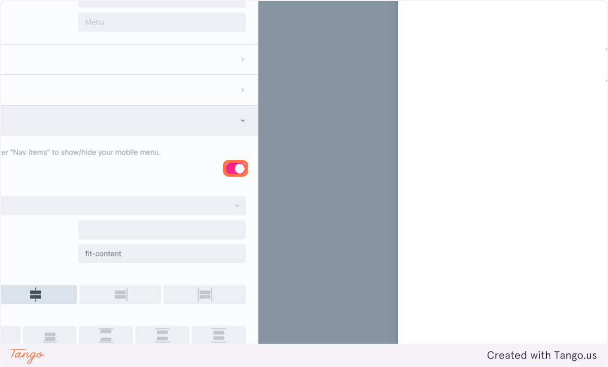
Once filled with actual content, the columns will exceed the available viewport. How do I now get the correct display to adjust the height according to the actual content?
If the approach is fundamentally wrong, please let me know.
I have included a flow below that I hope clarifies my dilemma.
If this has already been answered, I apologise. Unfortunately, I did not discover a suitable thread, and I would also ask you to refer to an existing or potential thread.
Cheers
Sebastian
1.8.4 mega menu vs mobile menu
Creation Date: August 6, 2023
Created By: Sebastian
Created with Tango.us