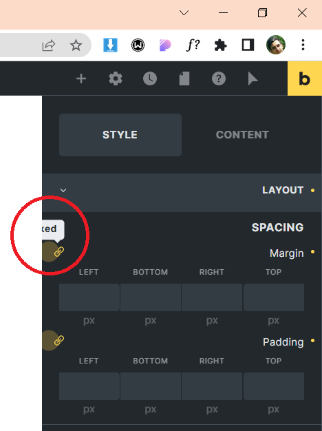
What’s wrong with the width? As far as I see, the problem is the same as 1) - the position of the tooltips.
Margin (left/right) cannot work with the current setup of the container, because the width of the container always has priority. We will simplify the container in the next version and add additional sections and divs( that will allow you to use left and right margins). What you can do now is to set the width of the container to “auto” - then the margins will work as expected
Yep, this has been addressed a few times on the forum.
A matter of taste I think. Currently you do not have to click at all
Hi @timmse
About Issue Number 2:
When panel is dragged toward main designing area it should expand.
This is working as above in LTR mode but in RTL mode it has reverse result. When we drag panel in order to expand it the panel shrinks and when we want to shrink it the panel expands.
Regads,
thank you for reply
I faced some issues, please watch the video i linked below
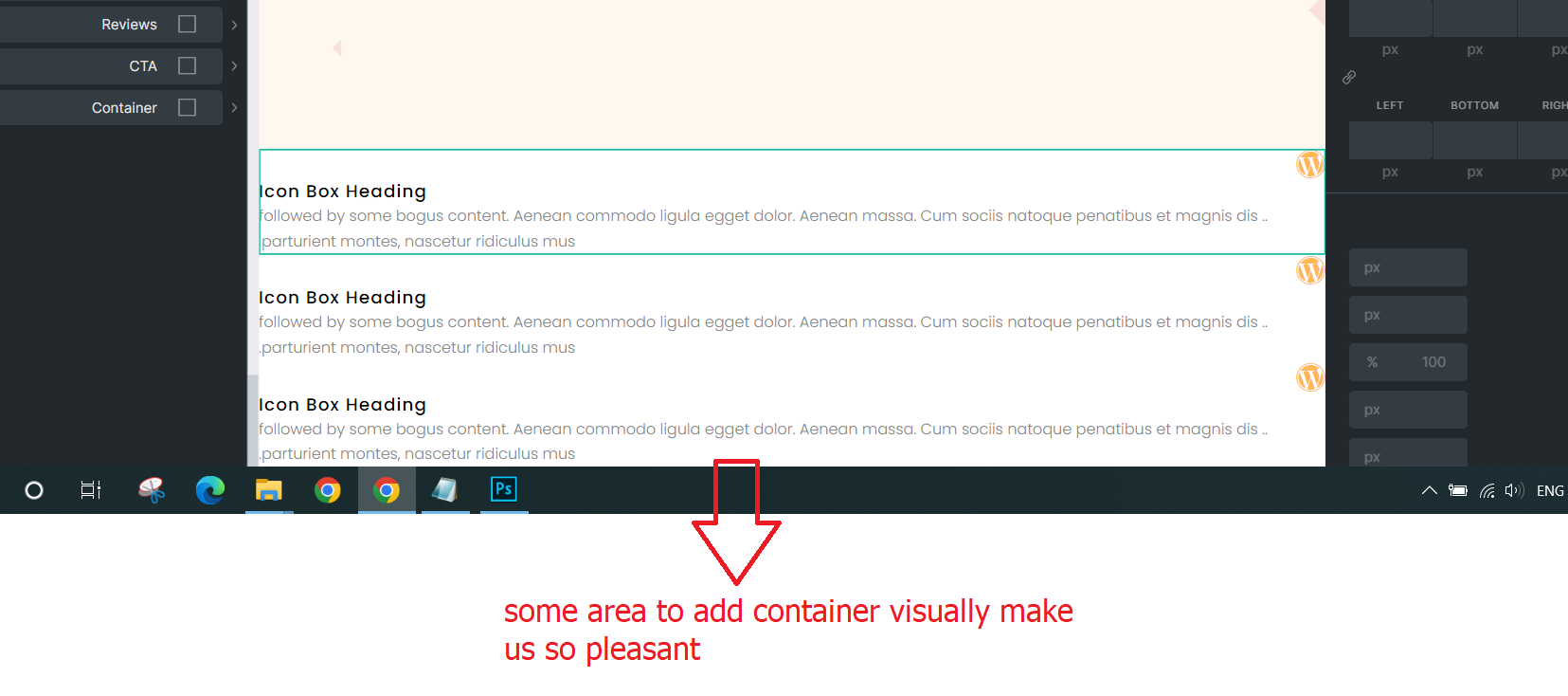
6- when i add a container (no wrap) and set the direction horizontal, it should place all the element inside of it equally, but when i add some images they are not placed in the container
For example when i try to put 4 images in one container (no wrap) it should divide the width to four 25% but this is not happening
Also when i activate the wrap option and set the width of elements to percentage, its a bit weird sometimes its working fine and sometimes not working
7- the another issue i faced, when i set color in gradient/ overlay part, the size of the images changed! i think it has some problem when the width of images set with percent %
I dont know if they are bug or not but it seems a bit so much weird
9- I set a container to horizontal (wrap) and then add 4 elements (each element 25%), when I add 20px column’s gap, the forth element go to the next row! But it should count the 20px gap as the 100% of the container
The another problem is that how can i set row gap when i set the container to wrap?
Please watch the link below to understand what i mean (its a bit hard to write )
Thanks for the explanation @Sharif_Payenda ! Now I understood RTL is often confusing for non-RTL users…
@Mehdimoradi In general, it makes sense to create a separate report for each (possible) bug since threads of this kind with 9 problems by now quickly become confusing and, above all, difficult to follow. Besides, it doesn’t make sense to start at 1 again - that’s why I increased your list so that people can follow your reports. No offense
Generally, yes, but with images, it’s a different story. Images have an initial size that is always treated preferentially within the Flexbox model. It is not a Bricks bug but can easily be solved by using a wrapper for the image (div, figure, whatever you like).
You’re right, the image inherits everything from the wrapper, which shouldn’t be the case. I’ve added it to our bug tracker. In the meantime, it seems you can use the following custom CSS to fix the issue:
Not a bug, as 4x25% equals 100% . If you then add 60px gap (3x20px), it’s more than a 100% in total You can use calc to determine the exact column width including the gaps by subtracting the column width (25%) by the number of gaps (3) multiplied by the gap value (20) divided by the number of columns (4). It sounds complicated, but it isn’t
 )
)