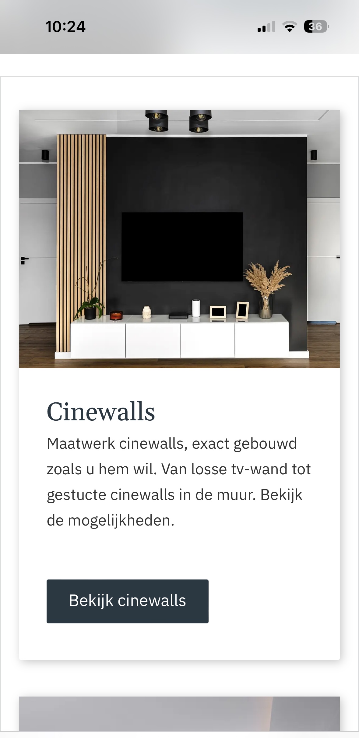
Something odd is going on with Grid. It’s correct on desktop & tablet, but on mobile (landscape+portrait) the second block is displaying NEXT to the grid block.
To be able to reproduce the problem 1:1, it would be helpful to know the grid settings. If you export the template and the corresponding class styles, I can reproduce the problem even faster
Hey Michael,
I exported the template and the styles and found a new problem with CSS Grid during the import that needs further investigation. I’ll get back to you early in the week. Have a nice weekend!
Yes, it was your settings You gave the content block under the image a height of 100% (presumably to compensate for possible differences in text length), which caused it to break at a certain point. I have accordingly removed the height and all stretch settings, which should be superfluous.
I cannot explain 100% why Flexbox does this… However, this is not a bug, as I was able to reproduce the problem 1:1 with pure CSS.
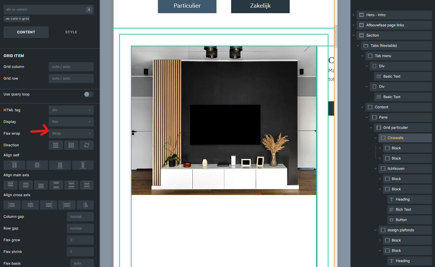
that had a reason - indeed to keep the box & buttons equal height on scaling.
Inside the builder you can’t simulate it since the scale no longer works.
But just before the tablet mode things looked bad.
So therefor I added a 100% height to both the block beneath the image as the grid card itself.
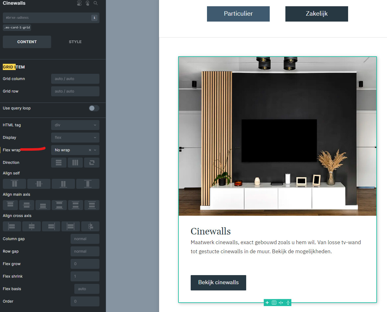
(redid this and set the card to no-wrap.)
Seems to work well on all devices + I keep the height equal everywhere now.
 You gave the content block under the image a height of 100% (presumably to compensate for possible differences in text length), which caused it to break at a certain point. I have accordingly removed the height and all stretch settings, which should be superfluous.