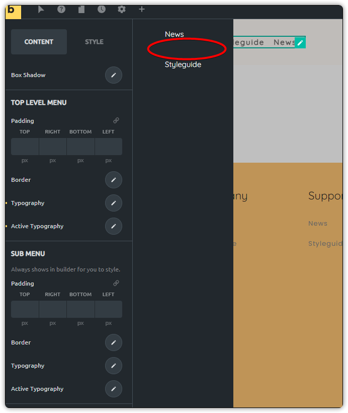
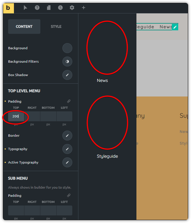
Creating a basic menu and configuring the padding for the sidebar menu items(Top Level Menu). It appears that when adding padding, in my case, trying to push the menu elements down in the bar a little bit, it’s applied to each menu item, not the menu as a whole. See pictures below.
Nothing applied. I wish these could be spaced closer, but not sure how to achieve this.
the padding gets applied to each menu item. This is the intended and correct behavior. To move the whole ul-element down, you can use a single line of CSS:
@timmse Really? That looks really odd by doing that and I’m trying to envision why I would want to space everything out when all I wanted to do was push the entire menu down on the slideout. I can see if you want to spread it ‘evenly’ between the top and bottom for that kind of effect, but this just doesn’t look right to me.
I’m going to suggest this should be a feature request update without having to add additional code manually. Do you want me to make an additional post on the feature request or can you move this thread?
Well, you wanted to push them “a little bit down”, not entirely
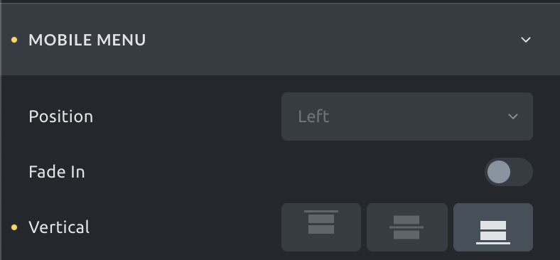
If you wish the whole menu to align to the bottom, change the vertical position to bottom.
Feel free to submit your request to the idea board, as this is the official way to submit requests. However, the category inside of the forum is meant to discuss ideas, not to submit them officially.
Yea, I just wanted a little more space from the top was the intent. I was just thinking the spacing options should be similar to anything else. The menu as a whole is a ‘element’ singular, and you can ‘adjust’ the elements within it. I’m viewing this simliar to having a ‘container’ and then adjusting things within the container. If that makes sense.
I’ll post it on the suggestion board. More flexibility can’t be a bad thing.
Flexibility isn’t a bad thing at all, but you are the first user asking for this specific setting.
So I’ve provided a ready to use solution in form of a single CSS property, that would be generated either way, even if there would be an option for this right inside of the builder. The generated CSS will probably look exactly like this (except for the value):
I hear ya, but it doesn’t necessarily have to be only the ‘top’. I mean, couldn’t this evolve into being able to create a more styled psuedo mega menu of sorts. Especially if you wanted to place other items? Just more of a thought on implementation from the builder standpoint to make it like a flexbox approach, that’s all.
Hi Yan,
yeah, you’re right. The nav menu element is one of the toughest ones, as it contains so many settings and so many things to think about… so it regularly causes a lot of headaches