I have a small problem, I don’t know if it happened to anyone else. In mobile view, it is a full-screen search. In the basic case, the overlay layer of the search panel with the input field is displayed well (100% wide, but it could be only 90%). However, if the keyboard appears when you click in the field, it is as if the overlay extends beyond the mobile screen. If I hide the keyboard, the correct appearance is restored.
Unfortunately, I cannot reproduce the issue because I don’t have an Android smartphone.
Have you tested whether the problem also occurs without touching the styles of the element?
Hi there. Thank you for looking at the site. In the end, I couldn’t do anything else - since I couldn’t find a fix for the error -, so I put the search field in the header, it works fine there now.
However, there is another interesting phenomenon, but it only occurs in the Microsoft Edge mobile browser. The last letter of some single-line text elements is broken and this last letter is moved to the next line.
I’ll post pictures so you can see what I’m talking about.
The mobile menu also had this phenomenon, but I managed to solve it with the code placed in the style.css file of the bricks-child child theme. I copy the CSS code here.
/* VZ Mobil menuitem width (Edge) */

  #brxe-vxmfly .bricks-mobile-menu > li > a {
    width: 100%;
  }

  .brxe-nav-menu ol, .brxe-nav-menu ul {
    width: 100%;
  }

/* END VZ Mobil menuitem width (Edge) */
I just can’t figure out the behavior of mobile Edge, but I think that since many people use it, it’s worth looking for a solution so that the elements are displayed well for them too.
Hi Zoltan,
Edge probably thinks there is insufficient space (which is not true) and wraps the button text. You can prevent this by adding the white-space: nowrap property to the button.
root {
  white-space: nowrap;
}
By the way: Where did you get the information that many people use edge mobile? The statistics say something else
Thanks for your help, but it didn’t change the situation. On the other hand, I noticed that in the mobile Edge, after refreshing the page once or several times, everything appears just fine at the same time. It seems that all the CSS elements sometimes fail to load. This is obviously an Edge mobile error, because I have not experienced this on any other mobile browser, not even in the case of Elementor or Divi before.
I read in several articles that the mobile version of Edge is used by many people, along with Chrome and Firefox. For me, Chrome crashes due to security, and Firefox is quite slow on mobile.
Thank you for checking. I find that it sometimes appears well in the Android Edge browser, but I have to update the loading several times. This might be a bug in the android Edge browser.
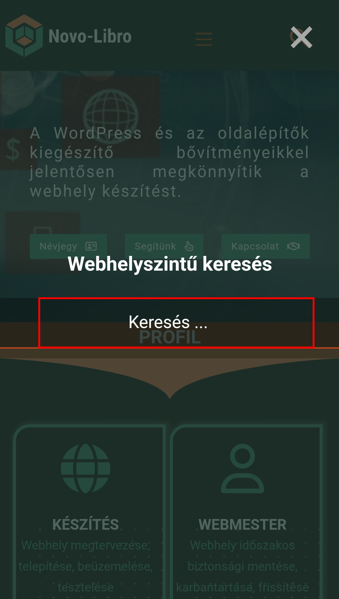
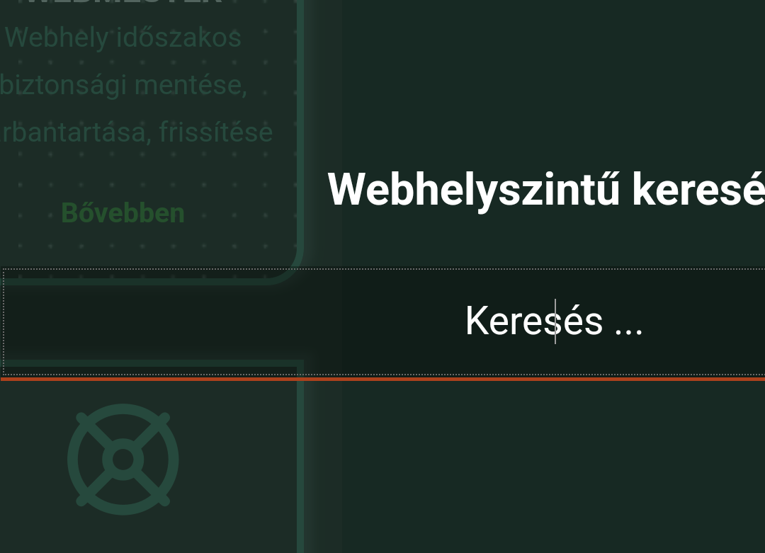
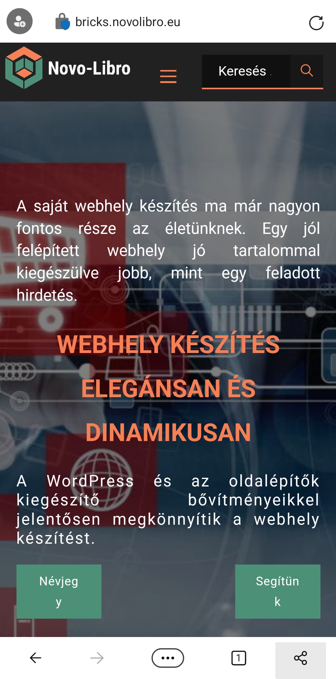
However, it looks like I solved the search problem I wrote at the beginning of the conversation. When calling up the search engine, things were fine until the ticket pin came up when typing. Then some elements slipped, as you can see in the picture.
The solution was that I assumed that the appearance of the keyboard changes the value of the height, therefore the page breaks. I set the height of the section to 94 vh (because the header is fixed), but the minimum height to 700px. In other words, it cannot be lower than this height.
It looks like this stopped the page from breaking and you can use the search engine, which I set to full screen size with an overlay color.