I can confirm the issue. We’ll provide a fix in the 1.5-stable next week by adding margin-left: auto & margin-right: auto to the Section element (.brxe-section).
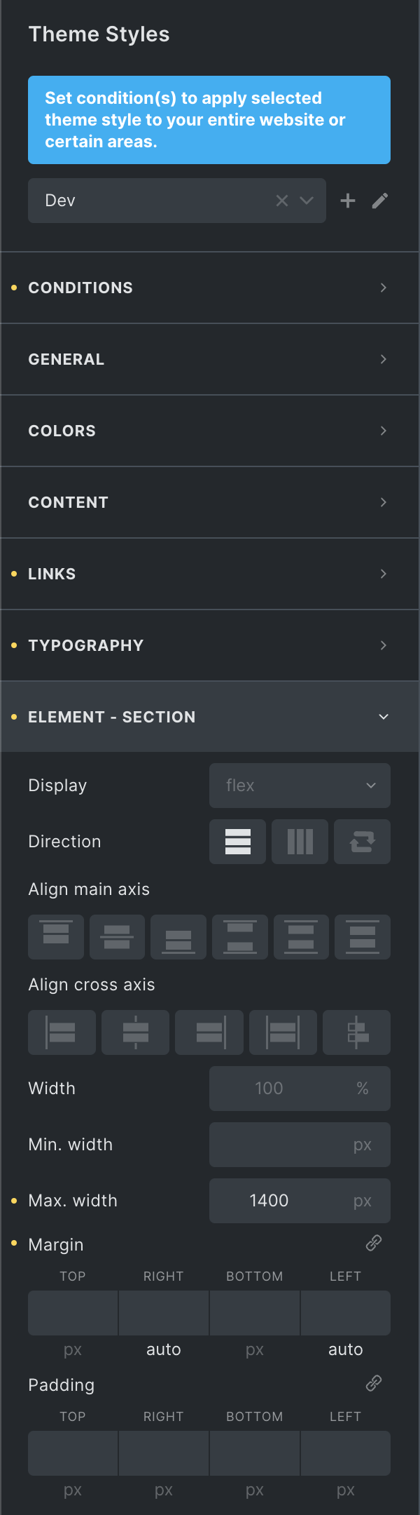
In the mean-time you can quickly add those auto margins yourself via the theme styles here:
Hey Jornes, It’s a workaround that saves me from adding a class to each non-full-width section (container) to apply a gutter margin when the 3rd element was introduced. However with the intro of the 4th layout element, I am about to create a feature request that would make it more perfect which will explain more.
If you plan on using the section with your custom max-width of 1400px and you also want to allow for it to stretch, then I’d recommend setting the width to 1400px, instead of the max-width. That should work. The max-width for every Bricks element is automatically set to 100%. So even on viewports smaller than 1400px, the section shouldn’t overflow.