Browser: Chrome 110
OS: Windows
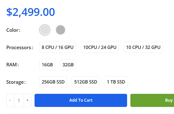
On the product page, there is a lot of extra space between the label and the variation swatches. This is not good from a user interface perspective because with just 4 variations the buttons will be stacked on top of each other while there is plenty of space.
Please see the difference in Bricks and Woodmart theme.
Bricks

Woodmart