SOLVED: Label styling with Gravity Forms

If I’m correct this css file:
wp-content/themes/bricks/assets/css/frontend-light.min.css?ver=1674506292

is a native Bricks file.

After some debugging why I couldn’t get my Gravity form to work, I found this contains a style for labels:

label {
    color: var(--bricks-text-light);
    display: block;
    font-weight: 400;
    margin-bottom: 5px;
}

Having display block makes gravity forms labels stack, instead of displaying inline.
With label display on:

Unchecked:

I’ve done some GF before, but hadn’t run into this before?
Is this something new - or did I mess something up?

Coming back to that, needed 2 classes to change:

To get it right, I needed to add:

.input, input:not([type=submit]), select, textarea {
width: auto; (set at 100% in
display: inline-block;
}

#gform_1 label {
display: inline-block;
}

1 Like

Hi Michael,
As far as I know, we haven’t changed the default styles, so I’m surprised it worked before. It would be helpful if you could give the version numbers that it works with and which one you are currently working with.

Can you provide me with a link where I can see your form once without, once incl. your custom CSS fix?

Best regards,
timmse

Thanks for looking into it Timmse,

I’ve send all the info to you in a PM since private data :slight_smile:

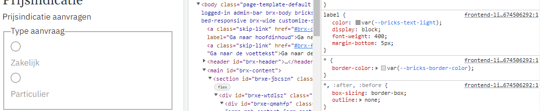
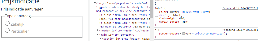
All right, the width: 100% that’s added by default to every input:not([type=submit]) causes the issue.
For checkboxes, we’re already setting the width to auto and we’ll do that for the radios too.

The fix is to add:

input[type=radio] {
  width: auto;
}

Best regards,
timmse

Hi Michael,
We’ve fixed this bug in Bricks 1.7 beta, now available as a manual download in your Bricks account: Account – Bricks

Please let us know if you are still experiencing issues.

Best regards,
timmse