There is something that could speed up the way that we check the different breakpoints when we are doing the responsive design.
I will try to explain it with examples to try to be clear.
What happens now:
ACTION: We push the preview button for responsive design (for example “mobile landscape <768px”).
RESULT: We see in the editor the size of 766px.
What “should” happen:
ACTION: We push the preview button for responsive design (for example “mobile landscape <768px”).
RESULT: We see in the editor the lower size of this responsive point (in the actual case 479px, that is the last before jump to the next breakpoint)
In this way, every time that we check this point we see that is working until the end of this point.
I post that in a bad moment because was the same day that RC came out.
Let me push a little bit because it’s a subject that is related with an item that is in the “next”
As you design from the highest breakpoint down I think its best to keep the breakpoint width at the max-width value rather that the min-width value as you proposed. So I don’t think we’ll change that.
I agree with @marcorubiol,
Current system shows maximum width of current breakpoint, so there’s no way to know if display is broken for smaller sizes in same breakpoint.
If minimum size would be used, we would not have bad surprises on frontend.
It would be safest.
But I also agree with @thomas, and I find it sometimes frustrating to work on a small viewport like with Oxygen.
Maybe a medium value inbetween?
For instance, for mobile landscape: 640px
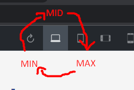
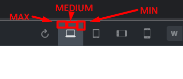
Or a more luxurious solution with 3 small buttons to preview min, medium and max size in breakpoint?
I also agree with @marcorubiol, we should see the smallest width for each breakpoint. If something looks good on 360px width, then it will also look good on 480px. But that’s not always the case the other way around.
I was always dreaming to have a slider for breakpoints. So I could just slide to 800px and website would change design instantly and then I could update CSS for 800px, and then I could slide to 1000px and change again…