Came here to support the needed implementation of adding a connection to background images for components, but in general setting custom CSS property values may prove useful.
Having now rolled out our first large site using components I have some more thoughts on the image property.
Exposing the object position control mentioned above is absolutely essential. I don’t think this should be a separate text/value property that we can connect to the value in the components Image, I think it would be much better if we could turn on this field in the property settings. If we add extra value property fields rather than combining them into the actual property control then it will create a lot of extra UI for that component as there’s a lot of space between separate properties.
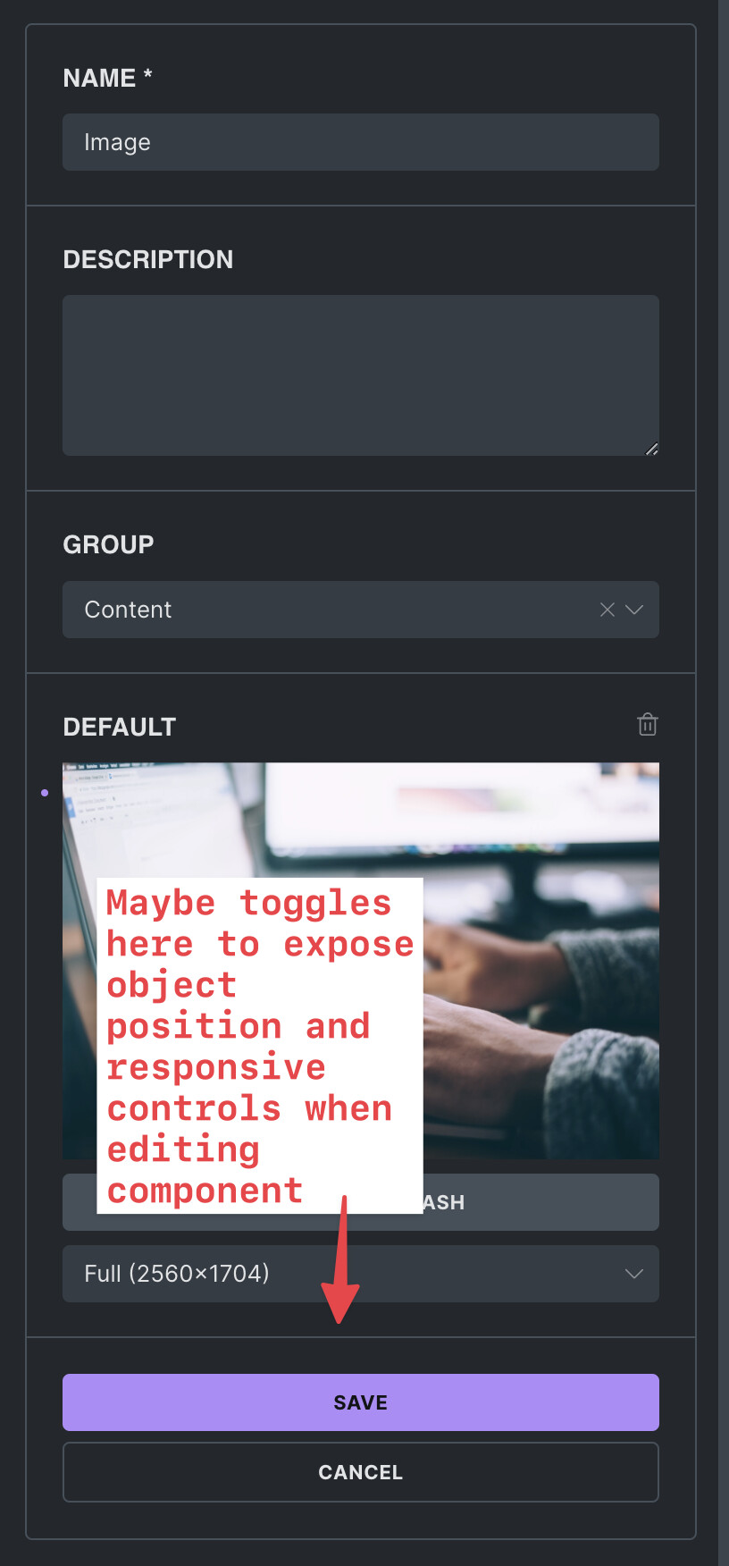
When used across a large number of pages, being able to set object position on images is crucial for certain designs to work properly at different screen sizes. Especially break points in and around tablet sizes.
In addition it would be REALLY helpful if we could also access the responsive image functionality so we could swap out an image at different sizes in the property set in the component. Again this really needs to be able to be turned on in the property as connecting multiple image properties to the various sizes is silly from a UI perspective and given that conditional logic doesn’t work at the moment would cause a lot of issues.
The two other properties it would be great to expose in this way would be aspect ratio and object fit.
We wouldn’t necessarily use them on all components but object position I’d use on 90% and I’d be happy to see that just added by default to be honest without an option to disable it.
I didn’t notice missing options on other property types at all but the image ones really required me to work hard to avoid pitfalls and required several versions of components to be created which slightly defeats the purpose.
3 Likes
Ok this is cool
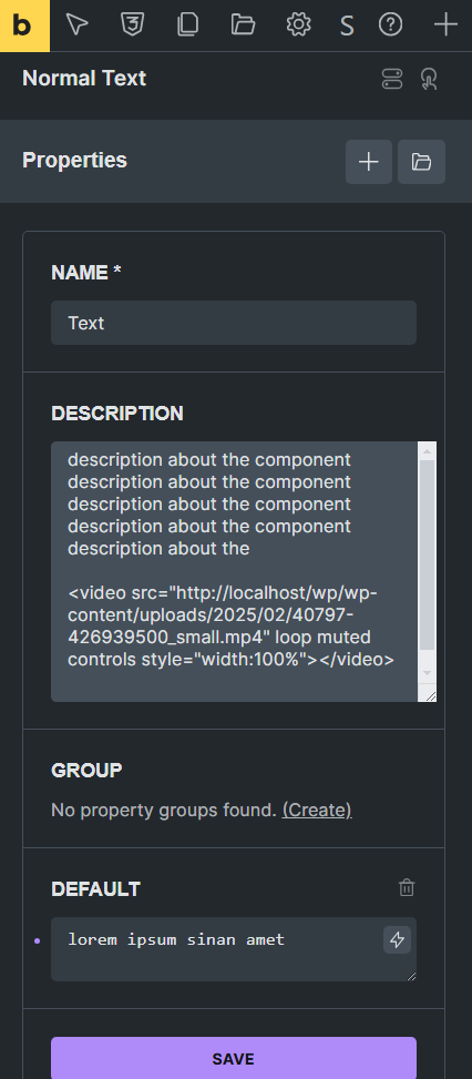
description supports html and we can do cool stuff with it.
Embedding Tutorial Video inside Component Description 
In coming weeks and months I am getting ready for a very big client site build. I was thinking about variables and some classes but I think it is the time to use components
I will still need some variables but components almost eliminating my global classes needs
I was testing some random stuff and came up with this video desc
I think these type of tutorials are perfect since we dont have to create external tutorial page or documents both agency interns and/or clients can just dive in and start using components easily.
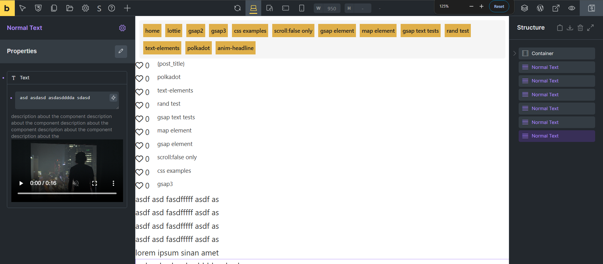
simple video html element in property desc thats it
1 Like
There’s no way to return the value of the property currently right? So we can’t put the values in things we’d normally use ACF for? (i.e code blocks, image loops, grab image URLs from gallery property and assign then to individual image tags in the structure panel/post loop?)
Trying to use components for the first time instead of templates but they feel super limited still and like I need to use ACF a lot. Even things I am linking them to within filters in query loops are not returning the values as expected, unlike ACF or plain text do.
NO.
Components are not here to eliminate Custom Fields. We can use dynamic tags and get customfields with dynamic tags sure but That is not the problem components are solving.
Components are here for you to create a design/feature/section/block/loopitem just ones and use it multiple times/ multiple place/ multiple page and only edit or change ones globally almost like a Custom Element.
Sure, understood. But there’s education needed from Bricks I think for use cases for when you’d use one over the other - i.e templates, ACF, Bricks editing itself, Components.
I’ve always used Templates and conditions, with ACF. This has never really felt limiting to me, other than like others have shown if you have an area or hero that you want to add a small HTML change to - classes alone won’t do that so the component makes perfect sense.
It’s the addition of fields and encouraging use of the components to edit ‘some things’ - but then using ACF for others I think is where I struggle with the line on that. If I need to go to two places to edit things it’s a bit sluggish and I might as well just use ACF with Bricks’ conditions in templates.
1 Like
Don’t use any ACF fielt when building a component and you are perfectly fine.
The connection to ACF is made on the instance, where you actually use the compenent. Then you have a indepently reusable component and no problems.
Yeah I’m probably not explaining myself well, sorry. I’ve been using components with ACF for instances and it’s working fine.
I mean more when you’d start using fields over properties, given the limitations of properties it’s still largely easier to just manage most of it with ACF and conditions.
Ok now I am sure.
Atleast for layout elements we need nestable. Section, container, block and div.
Components have power to create better class based elements. Since every component creates classes instantly and because of that it has great power. every component instantly becomes global classes.
Definitly needed. This feature completes the components. it is that important.
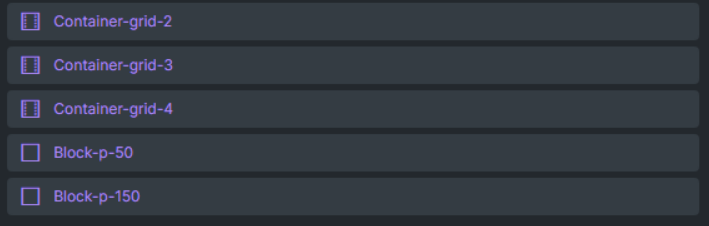
semantic layout components examples;
section-s
section-m
section-xl
section-xxl
container-s
container-m
container-xl
container-xxl
imagine having these semantic nestable layout components and using them again and again. create ones use multiple times.
I find this type of global component/class management easier, simpler, cleaner and even less work then classes…
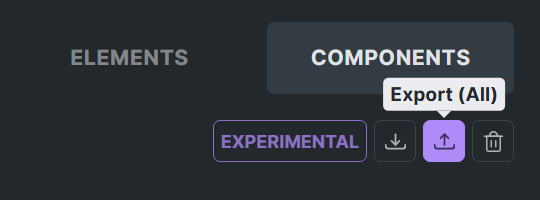
since we can export and import components this will become the new way of global class/component library for our workflows.
3 Likes
100% agree. Nestable components are definitely a must to create any sort of properly reusable complex layouts. Without nestability, components lack a core aspect of their appeal.
2 Likes
@robp The way I look at components in general is like pre-built elements.
So, instead of creating a custom accordion, card, or button with PHP to be accessed in the Bricks elements panel, I create a component.
The advantage is that if you ever want to recreate the design with modern HTML/CSS or change the layout, you simply recreate the design; the properties in the individual instances will remain as they were.
Then, on those individual pages, you decide whether you want to use ACF fields or static data, just as you have already been doing.
1 Like
Just to keep a note for nesting will drop this here.
4 Likes
Video Feedback.
I talked about what I mean by nestable components.
I think this explanation makes the idea clear to see a bit.
This way we can create 100% component/class based workflow sites and hide all native elements with the new hiding feature (so they are forced to use only components nothing else) and keep the workflow cleaner for the agency, interns or clients short term and long term.
1 Like
We fixed this issue in Bricks 2.0 alpha, now available as a manual download in your account (see changelog).
Please let us know if you are still experiencing issues.
As with any pre-stable release, please do not use it on a production/live website. It is only meant for testing in a local or staging environment.
1 Like
Hi guys,
Bricks 2.0 alpha, now available as a manual download in your account (see changelog), allows for nested components.
Please let us know in the bugs category if you are experiencing any issues with it.
As with any pre-stable release, please do not use it on a production/live website. It is only meant for testing in a local or staging environment.
that is not the nesting I am talking about
please watch the video and read my messages about it.
Issue is using the layout nestable elements like section, container, block or div still keeping their nestable ability even after they become component. This is very important.
I think the idea is to have slots on components so you may drag and drop elements to component without editing it. Something like in etch? It would be cool.
2 Likes
We were talking about this long before etch first demo video but yes sure.
Bricks Components idea is when we want to or need to we can create complete component based workflow and I think that is the most professional way to control the quality of the output. Otherwise people will just pick things randomly move things randomly break stuff or make stuff ugly… same old story we all know this. This is not just estimation or anything I face this problems everyday.
But when we hide all the native elements and show only components they (interns, clients, agency team) will forced to use curated components and this will force everyone to keep the standard and this will help avoiding tons of mistakes too ofcourse
For this we need the nestable elements atleast for layout elements for now. Otherwise 100% component based workflow wont be possible.
7 Likes
I have to agree, this isn’t real nesting. What’s even the point? You can nest the component, but it always shows everywhere. Just take a look at how different builders have integrated it.
I’d like to share a few improvements / ideas to make Bricks components more flexible and scalable—entirely within the native visual editor.
1. Flexible Styling Variations via New Property Types
- Select / Dropdown
- Support multiple variant axes per component (e.g. one Select for Type: Primary/Secondary; another for Size: Large/Small).
- Use Label/Value pairs so the editor shows friendly names while the underlying value—often a CSS class like
btn--primarythat can be connected to the component’s CSS Classes field, or any other value.
- Toggle / Checkbox
- A native boolean control for flags such as
has-iconordisabled, making on/off states immediately clear and preventing input errors.
- A native boolean control for flags such as
2. Dynamic CSS Class Rendering
Components already allow you to connect a property to the CSS Classes field and pass any class name (e.g. btn--primary). However, if no element on the page has that class assigned through the builder UI, Bricks only adds the class attribute in HTML and never injects its styles. The current workaround is to add an invisible helper element in the component with every possible class variant so Bricks loads their CSS. It would be fantastic if Bricks automatically rendered styles for any classes passed into a component instance.
3. Live Preview for Component Conditions
I’m using Bricks’ native Conditions API together with component properties to control elements visibility on instance level. Now, even when an element has a condition that should hide it (for example, has-icon is false), that element still remains visible in the builder —understandably, this is helpful when you’re editing the main component so you can see every part of its structure. However, for component instances, it would be fantastic if Bricks could respect those conditions in the editor itself. In other words:
- Component Editor: Continue showing all elements so you can design and configure every possible state.
- Component Instances: Honor the Conditions API in real time, hiding or showing elements based on the instance’s property values right inside the builder—exactly as it appears on the frontend.
This feature would let designers and developers iterate quickly with immediate visual feedback right in the editor—no switching to the live page required.
2 Likes