I think we need a scalable solution for element states…
My suggestion (either):
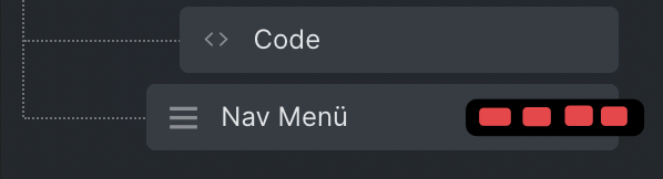
The column grows to the left for the entire structure panel
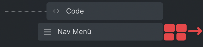
The icons float in a small overlay that grows from the right to the left
Thoughts?
I think we need a scalable solution for element states…
My suggestion (either):
Thoughts?
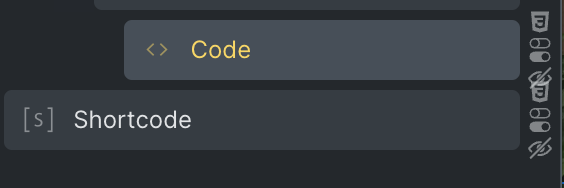
I think that it is even more relevant few hours after your post as interactions are now coming in 1.6beta bringing a new icon to the right ![]()
So true, when you enable all the options, they are currently stacked on top of each other. Who would have thought, that just a couple of hours later the icons multiply. Funny coincidence. Certainly, something to address before 1.6 loses its beta status.
From the suggestions, what is the favorite so far? Obviously, Thomas will come up with something, but maybe us users providing some feedback helps.
I love your suggestion but from my point of view, I would say that is pretty rare to have all the icons on a single element.
Consequently, I would not give them to many importance from a UI perspective by not choosing any of your option as:
Option 1: Will reduce to much the space of the elements in the panel especially if we reach 5 icons one day (or more)
Option 2: Will potentially lead to conflict reading if the element name have a too long title.
So, I will suggest another option:
Option 3: If there is one icon, you show it. If there is two, you also show them. But if there are more than two, you show only one icon (the most important maybe css?) plus a plus icon tooltip hover when you pass your mouse on the plus icon!
Just a new more idea to your great suggestion.
Have a great day,
Thomas
That is actually a cool idea, on the other hand it isn’t “glancable” anymore and that was the whole point for these little icons (for me at least). Meaning, I value them because I can quickly see what node has what type of modifiers on them. In programming, you would try to avoid such a scenario and have much of the things central, but in a builder one runs unfortunate into the situation that many modifiers are located at their source or trigger. Hence, seeing them becomes important.
Take software like XD or Figma switch over the entire view to make room for a dedicated tree and panel for interactions and animations. It might be something Bricks will have to consider maybe at one point as well. Just to receive a “fresh” canvas for controls and a dedicated structure view.
Food for, though! Keep it coming…
The “bug” persists in 1.6 beta…
I saw in some screen recordings that people enable an always present delete and duplicate icon.
So, the only option remaining seems to be:
Or some hover option, but at cost of being glancable.