Not sure if this is a bug or just a design flaw. If I enter custom CSS (using the Custom CSS control group) for an element at the desktop breakpoint, then switch to the mobile breakpoint, the same custom CSS is still applied. Quite often the custom CSS that is needed for one breakpoint needs to be different at another breakpoint.
A workaround is to just write out media queries, but this would be a lot more intuitive as it would keep with the rest of the UI design in that styles can be set for each breakpoint. The same should apply to hover states and pseudo classes also.
It isn’t a bug. It’s just not implemented. This is intentional because Bricks is a visual page builder where most of the settings are created just through the interface.
No offense, but the number of users who use different media queries in custom CSS is vanishingly tiny. And those who use media queries are easily able to write them themselves.
Another question is how the interface should be structured when switching between breakpoints. One field per breakpoint? The desktop value greyed out on lower breakpoints? Maybe just a button that allows inserting the media queries for the remaining breakpoints?
OK I can can understand how it wouldn’t be considered a bug if it hasn’t been implemented yet, but because it is a behaviour inconsistent with the rest of the UI, at very least it’s been overlooked and can cause confusion.
The interface should be handled exactly the same way one sets different styles using other controls: that is, when a style (like width) is set for a larger breakpoint (like “Desktop”), that style is displayed greyed out in the input field after switching to a smaller breakpoint (like “Mobile Portrait”), indicating that the style will be inherited but can be overridden in the smaller breakpoint.
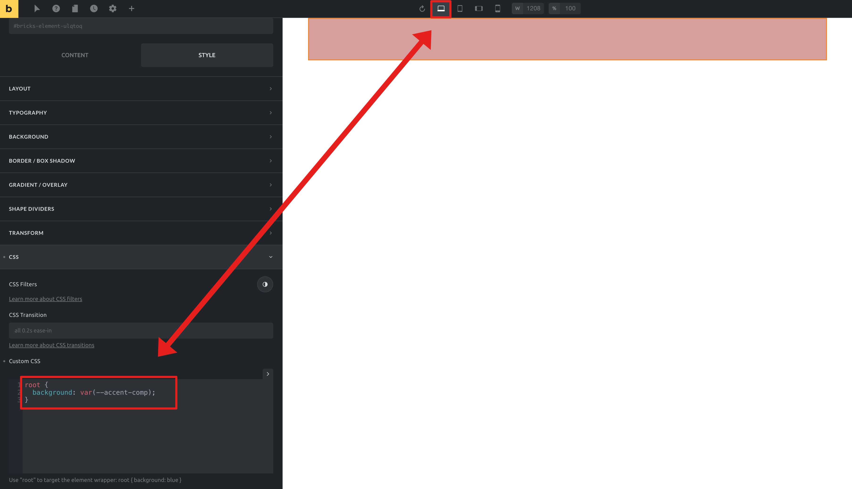
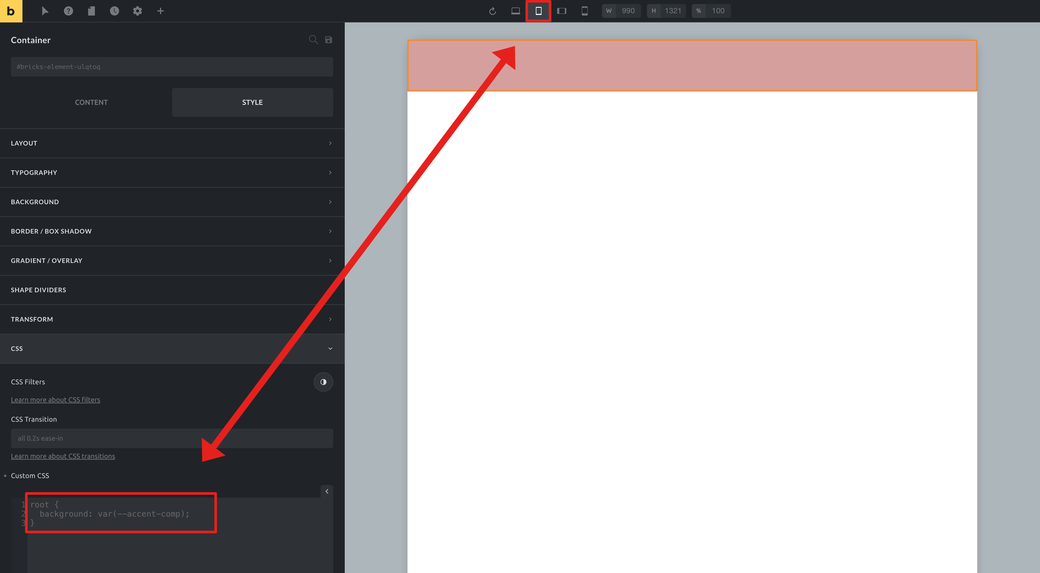
Here’s how I imagine this working with Custom CSS. First enter some custom CSS at the Desktop breakpoint:
Then switch to a smaller breakpoint. Notice how the Custom CSS field contents are grey out, indicating it will be inherited at this smaller breakpoint, but you can enter different CSS rules for the smaller breakpoint which will apply to this breakpoint only. Rules may or may not override the larger breakpoint’s rules (depending on what the rules are).
I’m not sure how you can say the percentage of people who set different styles at different breakpoints is tiny…I mean, I have done it on virtually every site I’ve created.
Hi Eric,
Happy holidays and thank you so much for your extensive answer!
Don’t get me wrong, I understand your point, and I don’t want to block it or say that this will never be implemented.
Well, then we’re at least two of us But again, you are the first user who asked for this, which shows that it isn’t that much needed by anyone else.
We have another breakpoint topic on the idea board with a high number of votes. Possibly it would make sense to combine this, as it belongs together thematically. When exactly we can’t say right now, because we are working on other features for Bricks 1.3.7 and 1.3.8 (be excited, this will be pretty cool).
Enjoy your holidays and thanks again for your reply!
timmse
Great, thanks I glad you understand the concept. it’s not a big deal as I can easily add the media queries into the single “static” Custom CSS field, it’s just not intuitive, so this feature would likely help others in the future.
I’d love to have Custom CSS for general and specific for each breakpoint. Setting breakpoints with @media (max-width: 991px) ... is quite annoying with the result that CSS isn’t used at all and some user experience is missing.
Just an additional textarea individually for each breakpoint would be enough and I don’t think that the implementation is too complicated.
An alternative is to use different classes or attributes for each breaktpoint. Elementor e.g. has data-elementor-device-mode="tablet" (with mobile & desktop) as attribute in the <body> tag and it changes by resizing the window. So you could use CSS like body[data-elementor-device-mode=mobile] root .my-class {}.
I think there is an easy way to add classes like .view-mobile-portrait .view-mobile-landscape .view-tablet-portrait .view-tablet-landscape to the <body> tag.
With this we could save us to use @media and some extra thoughts or errors. And even with a future possibility to edit the breakpoint pixel by pixel, you don’t need to change it at every page.
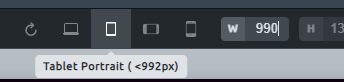
Here is another irritation: when “Tablet Portrait (<992px)” is active, the width (W) displays 990. Now setting the 990 to 991 (and hitting enter), the editor changes automaticly to “Desktop: Base Breakpoint”:
In the meanwhile, I double checked it: there is a gap of 2 at any breakpoint: Mobile Landscape (<768px) ≙ 766 and Mobile Portrait (<479px) ≙ 477
Great, thanks I glad you understand the concept. it’s not a big deal as I can easily add the media queries into the single “static” Custom CSS field, it’s just not intuitive, so this feature would likely help others in the future.
Quick update about the breakpoint widths: We had to change them slightly as the breakpoints on some machines shifted (due to browser scaling or pixel rounding). I am afraid we have to stick with this fix, as it solves much more problems than it creates
Hi guys,
With Bricks 1.5.1 RC, now available as a manual download in your account, it is possible to add different CSS per breakpoint. In addition, the media queries are generated automatically, so you only have to concentrate on the actual code.
Please let us know if you are experiencing any issues.
 But again, you are the first user who asked for this, which shows that it isn’t that much needed by anyone else.