Hi bricks team,
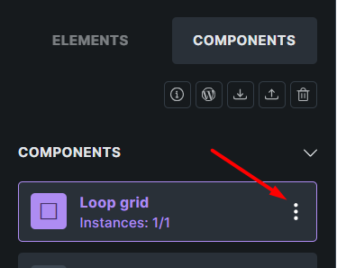
Currently, action buttons appear on hover over each component and take up a lot of space in the component box. This can often lead to unwanted clicks on actions, while most of the time the goal is to add a component.
As a suggestion, I think it would be better if the action buttons didn’t appear on hover. Instead, there would be a button to show the action buttons. Just like the behavior of the structure panel in early versions of Bricks.
Thank you