Bricks Version: 1.5
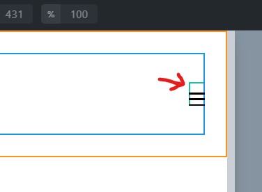
I’ve got a simple header which has the Bricks Nav Menu in a container of a section. The Menu is fine and aligns center properly but the burger icon has this extra space on top so when it aligns center it is shifted slightly down. It seems to be the result of the div wrapper (with class brxe-nav-menu) of the nav element missing a display of flex.
Adding this code fixes the issue:
.brxe-nav-menu { display: flex; }